Hudson Gate - 200517 2nd Exterior Paint-over progress

Originally published at: https://www.ronenbekerman.com/?p=127508

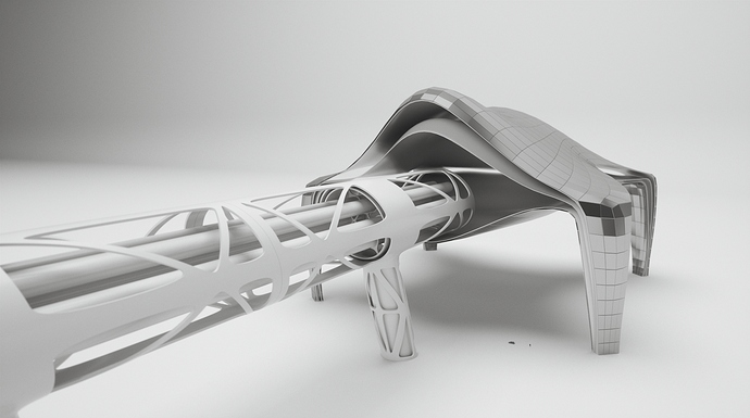
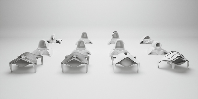
This progress update focuses on nailing down a direction for the form. The purpose of doing this is to explore a form that is futuristic but yet doesn’t give the impression of a Sci-fi building in year 3100 AD. To do so, I have created 12 different forms with different degrees of variations, and they can be roughly divided into 3 categories: The Far Future Sci-Fi Type, The Sculpture type, and the Hybrid type.

– The Far-Future-Sci-Fi type are the ones that you would typically see in movies such as Star Trek or The Martian. I have created 8 Sci-Fi types that I know I won’t be using in the end. The reason why I spent the time in creating them is because, to know what is feasible for a design, we must first know the boundary; And to determine the boundary, we must push the design far enough in the first place.

– The Sculpture type are forms that are driven by symbolic reasons or an architectural style such as Zaha Hadid.

– The Hybrid type are forms that are inspired from the sculpture type, but added a slight treatment to the material to give a futuristic look that is completely within the reach of 2040.

3 Likes

Hi mate, good job. I find the first on the right the most interesting af all!
I thing it could give some nice light effect.
Very zahahadidish!

1 Like

Hey thanks Francesco, I’m thinking about either using that one or the one on the far left


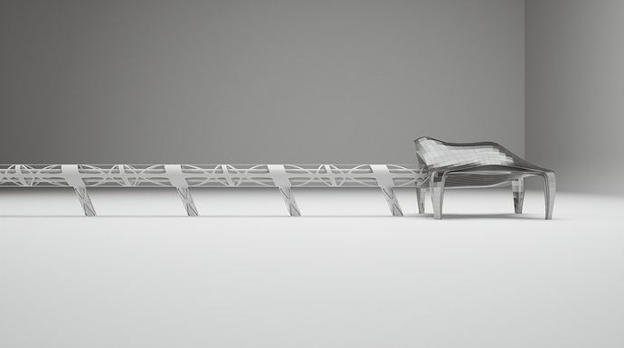
A small update on the design progress, the transportation tube. The tube is designed with the same language in mind as the main building, and it features an exo-skeleton like structure to hold and reinforce the smaller transportation tubes within. Due to advancement in material technology, this exo-skeleton structure is made with a synthetic material that exhibits properties such as high flexibility, very light weight, and twice of the steel’s bearing strength. This allows architecture in 2040 to grow larger in size, but without the concern of overloading.

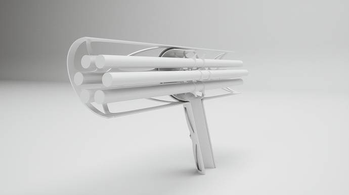
In the section render of the transportation tube, it indicates that the light weight synthetic material is also applied to build a web-like structure, using to hold the smaller transportation tubes in place. For those smaller tubes, the top two are for passengers, the two on the side are for emergencies or maintenance, and the bottom two are for cargos. In the center of those tubes, it will house the maintenance deck and all the E&M.
I will post another update once the smaller transportation tubes and possibly the passenger pods are designed.

Thank you!

2 Likes

Wow @tony.lai this is taking shape really intriguing! I can imagine the addition of your design will mark a new forward-thinking point on New York skyline.

Glad that you brought the light weight synthetic material on as I am also looking for strutural solution in my proposal!

Very keen to follow your coming updates!

All the best,
Duy Phan

Hi @duy-phan, glad that you found the inspiration you needed for your ARM proposal.

I think in order to make a concept more immersive, it’s always helpful to include a short paragraph that gives small details about the setting, the technologies they use, and the way people live in that time.

It’s just like video games nowadays, they usually also sell the novel or artbook as a parallel product, which helps enhancing the experience by immersing the gamer into its universe.

1 Like

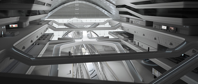
Hi, hope everyone is doing well during this desperate time, and had heaps of fun with working on the competition. This post will be a quick update on the interior.

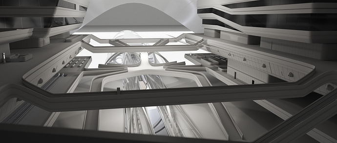
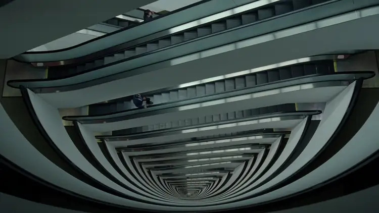
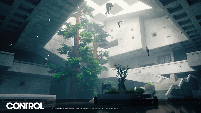
One of the key features of this huge construct is a 150m x 150m x 50m space reserved for the installation of the transportation tube and multiple floors of train platforms. The environment design is inspired from Hadid’s work (obviously), research facilities in TV series Westworld, and the Central Research level from the game Control. The references mentioned above have demonstrated that the treatment to a void in an architecture is achieved by more than just populating the environment with props, but also by adding layers that leads the audience thinking outside of the frame there are much more awaiting to be explored, and the space is much larger than what they perceive.

2 Likes

Hi, I think you have done a very good work. If I can give you a little suggestion I would have stretched the size of the image in height in order to see more roofing.
However I like a lot the shapes and the layered concept of the station.

1 Like

Hi Francesco, thank you for your little tips, I will try to play around with the aspect ratio and the camera angle tonight. In general many of my shots, even for exterior, are cut off in this way to emphasize on its sheer size, but I do agree for this shot the ceiling deserves a little bit more room

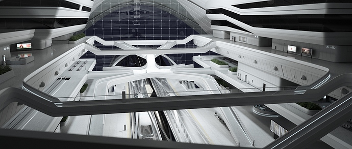
Another small update on the interior progress. With most of the props in place now, the next step will be some paint-over work on the interior, adding additional details, and then do a matte paint for the exterior view.

1 Like

Hello Tony Lai,

Great update. This is a really nice looking interior and well balanced composition.
As I can see, the progress is obvious, keep on with the great work.

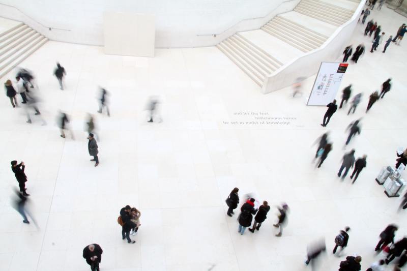
Maybe soon you will have to add population for your scene. I don’t know how you will manage to update this view later, but let me show you some nice references for this point.

The images are from www.masterclass.com. By using motion blur, you will be able to add some extra dynamics and sense of “Big City Life” a little bit easier.

I hope that this makes sense and will hape you for the future development.

Best,

Stefan

1 Like

Thank you Stefan, those are some great references for lighting and color. Actually I might as well cut out some of the people from the image above. But yea I’m going to mix 3D people and 2D cutouts. How’s yours coming along?

Hello Tony Lai,

Thank you for your answer. I hope the references about are going to make the final result even better.

I am working on the updates on the semi-aerial view right now. I hope to be able to finish all of the three images on time. Extending the deadline with two weeks was not expected at all. Maybe this is the first time :smiley:

Good luck. I am at your disposal if I can help.

Best,

Stefan

Looks so Zaha hadid interior from the Maxxi https://images.adsttc.com/media/images/5012/0d8a/28ba/0d55/8100/03cc/slideshow/stringio.jpg?1413944118

Yeah I am curious how you will populate , or is it necessary to populate . With the whole COVID19 situation maybe it will be cool to show empty terminal with just few essential work people walking through .

Lovely internal shot @tony.lai :+1:

What a massive amount of work you have done here! Really admire your modelling skill! :ok_hand:

Would be great if you can share any other camera angles within the space! I doubt that it will be very interesting!

Curious and look forward to seeing your next post!

Warm Regards,
Duy Phan

1 Like

@duy-phan Thanks, what a compliment :slight_smile: But I’m afraid I can’t show other parts of the interior.
2lhzmp

Pretty accurate depiction of what you see and what you don’t see haha

Ahahahah I think at that scene every time I click on render button! :joy:


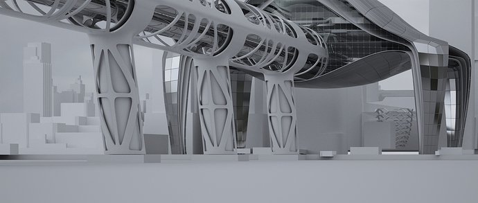
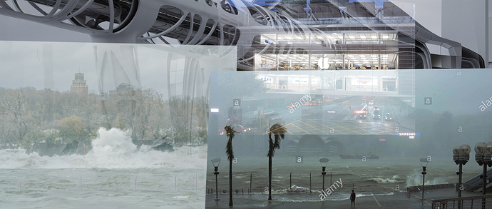
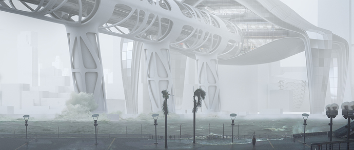
Quick update on the progress. The 2nd shot focuses on depicting the interaction between the architecture and its external environment, which in this case depicting how the future hyperloop terminal overcomes the exterme weather conditions with her sheer size, standing her ground and remain in service under circumstances like hurricanes.

This shot was originally planned to be accomplished by matching camera with a backplate, ideally a photo of the site shot with a telephoto lens. But as I spent hours yesterday trying to find such photo, only to realize it’s almost next to doesn’t exist. The closest one has a workable angle, but it was shot in 2009. :exploding_head:

With that said and I have barely modeled any context models, this will be a paint-over 3D render, and the progress here shows I’m slowly chewing through from the foreground. Will post more once I have more progress. Thanks for reading and have fun :wink:

1 Like

Wow! @tony.lai
It is not yet the final image and your proposal is already communicating a lot of strength
it seems to me that you are doing very well posing something totally different outside the box
keep it up tony.lai!

That’s epic @tony.lai

Now that you have put the design into context I realized how massive it is! So much potential with the painting you are working on, to be honest I think you don’t really need to model much for the background buildings though since we can fade them out by dust and moisture particles then!

Look forward to seeing more from your work! :ok_hand::+1:
Cheers,
Duy Phan