@duy-phan Yea It is massive.
In one of my previous updates, if you look closely you will find a car and human on the ground that I put in for scale.
I know, it looks like a dirt that is stuck on your screen and easy to overlook

@duy-phan Yea It is massive.
In one of my previous updates, if you look closely you will find a car and human on the ground that I put in for scale.
I know, it looks like a dirt that is stuck on your screen and easy to overlook

This update mainly is to show how the painting progressed chronologically over the course of the last few days. i started the painting from the foreground as I reckoned those parts entail the most details, and getting them right with the right reference image helps setting the tone of the overall painting. Throughout the painting process, I also find myself constantly adjusting the fog layers A LOT, especially in the last 2. In the last 2 it’s like suddenly I hit an epiphany that, I was working towards a foggy scene the whole time, and forgot my original intention was depicting a storm.
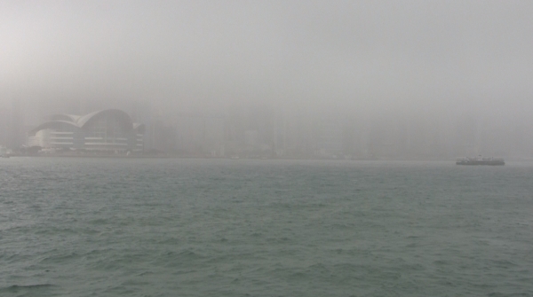
Hi Tony. You’re doing a nice work with paint over. What about making some water reflections on the pillars and the lower part of the structure? Maybe it could be interesting.
Hi Flow, thanks for your feedback. I didn’t add any reflections to the pier because in real life concrete tends to absorb water like a sponge and precast concrete has a rough surface as well, but I did add more detail to the pier with overflowing water from the wave splashes.
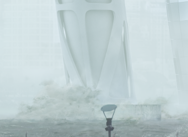
Ok I thought it was steel…sorry.
A few detail added since yesterday’s update:
It - is - AMAZING @tony.lai! 
The more you show the update for this work the more it stuck in my head obsessively! 
Can’t wait to see your touches with all other shots!
Best,
Duy Phan
@duy-phan Thanks mate, good to hear that  . The grass is always greener on the other side, I’m sure you feel the same sometimes. After staring at your own work for awhile, that euphoria in the beginning when you first put the shot together, has completely worn off and you can’t tell whether the shot is good anymore.
Just started working on the 3rd exterior shot today. The workflow involves a mix of 2D and 3D workflow including:
That’s it. With 2 weeks left, hope everyone is well on their schedule and wrapping up soon. Take it easy, no pressure, this is just a competition for fun and self-exploration purpose, focus on what you have on hand, and finish up with enthusiasm. GLHF:sunglasses:
Cheers,
Tony
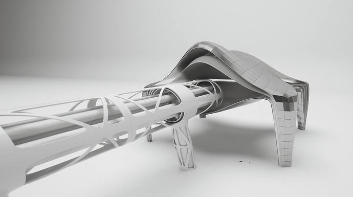
Part of the challenge of doing a night scene, was highlighting the unique features of your architecture, carefully guiding where your audience’s attention wanders, but without overdoing it. For this image I had a very hard time choosing the point of focus to light up, because my subject spans across 2/3 of the image, and every part of it is kind of important for the overall concept. If I lit up only the terminal, which I did in the beginning, then I have wasted 2/3 of the image for the transportation tube that could barely be seen; if I lit up everything equally bright, then the focus is lost.
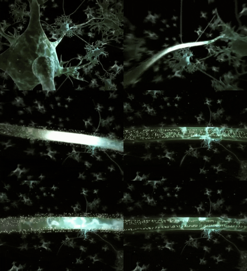
Everything was a hard stuck until today at work, l saw this GIF of neutral signals transmission, which inspired me to translate the idea to my scene lighting. It isn’t just visually applicable, but conceptually as well. Since my entry was focusing around the idea of the Hyperloop terminal that connects between DC and NYC in 2040, the capsule therefore is a metaphorto the neutral transmission signal, that carries electrical information between the nerve fibre or axon. When a capsule passes through a segment of the transportation tube at night, that segment is going to brighten up and it follows the capsule’s location as it moves. With a short departure time between capsules, visually the transportation tube will look like pulses of electrical signals, constantly sending streams of bright light in and out of the terminal.
Hope I have used the right metaphor and explained the concept simple enough 
A small update to image 3:
This image is probably the most fun to work with out of the three entries, mainly because the direction of the capsule (the glowing part) can only be hinted through suggestive cues rather than being completely literal. I think without these cues, the glow can only be interpreted as still and static. A few cues are used to suggest the direction of the capsule:
The point of focus. The focus of this image is guided by the luminosity, with the capsule (the brightest spot) being the main focus, and the terminal being the 2nd focus (2nd brightest spot). The direction can also be interpreted in 2 ways. If the attention falls on the terminal at first glance, then the brightest spot will be naturally interpreted as moving away from the terminal; if it is the vice versa, then the brightest spot can be interpreted as moving towards the terminal. The transportation tube is the key in this relationship, because no matter the attention falls on which first, it will follow down the transportation tube and therefore connecting both foci.
The city skyline. The ascending city skyline naturally guides the audience’s attention sweeping across the image from left to right, and hence suggesting a direction to the image.
The small boat in the foreground on the lower left corner. This is a very literal cue. By moving parallelly to the capsule (the brightest spot), it suggests both of them are moving in the same direction.
Tony, wow man, its getting amazingly good ! i noticed a nice change to the background of the image used specially with the buildings as you said, some facades started to light up in an amazing way, with windows ! did you do it manyally ? in PS
really good job man
@Muhammed Thank you Muhammed. Yea for the facade I masked a hong kong skyline image at the back in PS, set it to linear dodge mode, and then just paint where it needs interior light. It is a very tedious task, but once you have painted in enough interior light, it really adds a sense of prosperity to the city skyline.
Great visuals and design ! Love the mood that you are developing. R u doing a visual traveling on this thing ? could be cool!