Originally published at: https://www.ronenbekerman.com/showcase/3d-rendering-for-a-kitchen-design-project/
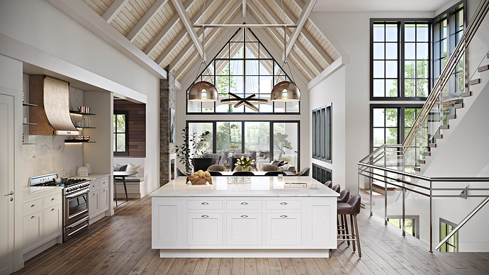
The camera settings allowed to give a general view of the space, letting the audience discover its layout. The smart view choice emphasized the beautiful architecture of the place, which largely contributes to its unique visual impact. As well as that, this 3D rendering for kitchen interior presents amazing lighting scenarios developed for the project. The wall window lets in oceans of sunlight during the day and delight the inhabitants with a gorgeous landscape outside. As for the evening, both cooking and dining zones are equipped with separate sources of artificial light. An elegant chandelier sets a festive atmosphere, while gold-colored pendants add more chic to the kitchen area.
But the most striking thing about this 3D rendering for kitchen design is the way it conveys the unique ambience of the studio. For what our client primarily strived to show was how his beautiful design solutions combined create an interior imbued with the sense of space, freedom and tranquility. So to do justice to this project, our 3D Artists have created high-quality textures so true to nature they look like photos. Then, they filled the 3D rendering with soft and warm daylight which ignited every surface in the kitchen and made it shine. Furthermore, to make 3D visualization really speak to the audience, our 3D Artists have placed small but eloquent details: pretty copper-colored and glass kitchenware, a cup of coffee and a magazine, freshly-baked buns. These serve to spur the imagination and make the viewer see himself actually living in this space.
Need photoreal 3D rendering services for your design? Contact ArchiCGI studio: we will make sure your project captures the heart of your clients.
--
Studio: ArchiCGI / Artist: ArchiCGI
Work: Commissioned
Designer: N/A .
Client: N/A .
Software: V-Ray

