A tower for you and me #3 by Gabriel Radakovitch

Originally published at: https://www.ronenbekerman.com/?p=128033

I have worked on the design of the tower/pavilion that will stand in the middle of the new square. I used a panel of different materials and colours to give it an handcrafted and childish look. Like a kid’s tree house in the back garden.

The structure is made of red painted steel. The floor is painted wood. The platform is accessible by slopes (instead of stairs) so it can be enjoyed by limited mobility persons as well. The walls are covered with pretty plastic upcycled tiles.

See you next week for a new update.

1 Like

I love the shingles. How did you even model that or is it a texture?

Really nice stuff

Thank you tomahawks. Shingles are geometry yes. I used the doc I found on the supplier website to model one tile and then duplicated it and bent it.

I was also able to use the images available on their website for the texturing and that was a great timesaver.
https://www.prettyplastic.nl/sample

Hello Gabriel,

Great work with the materials applied on that pavilion. Is it going to correspond with the context site in some way, or it is going to stand out?

Also, you can try to apply exactly the same red steel on the upcycled reddish tiles to see how It will work.

Keep on with the great design!

Regards,

Stefan

Hi @StefanDimitrov , thanks for encouraging feedback.

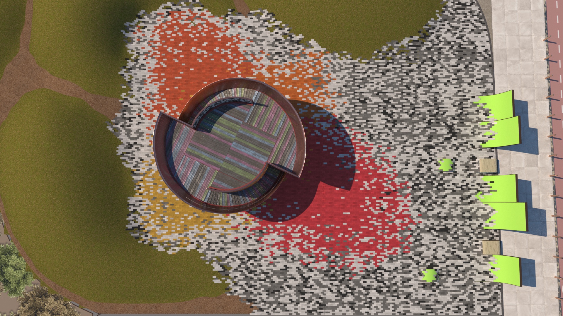
To answer your first question, most of materials does correspond with the context. In the previous update I featured the designs of the square. The paving uses the same colour values as the tiles covering the pavilion. I am considering using upcycled plastic from a different supplier for the coloured paving as well --> https://www.dezeen.com/2020/04/01/daydreamers-design-flame-pavilion-recycled-plastic-bricks/
The grey paving is the same than the one used in the existing vessel gardens. See work in progress below

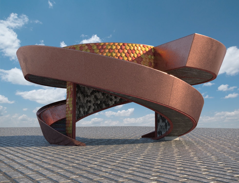
The same corten copper material is used for the balustrade and the urban furnitures of the square. This material is a more modest version of the copper cladding of the vessel. As does the pavilion, it could be considered as an humble and playful version of the vessel itself.

I chose the painted wood planks and painted steel for their cheap and childish aspect. To give the pavilion that handcrafted touch I am seeking for. I don’t want the pavilion to be to perfect, if it makes sense. These materials are consciously disruptive. This is why I didn’t used the same autumnal colours for the planks.

I will try your suggestion for the red tiles, it might look great.

1 Like

Hi Gabriel,

Thank you for your prompt reply. Your thoughts become clearer for me now.

Good luck with the development.

Best,

Stefan

1 Like

Hi Gabriel, I like so much the tiles in the interior, good job! I probably would work on the copper material making it more reflective an glossy similar to the vessel. But it is only a quick impression. I like also the shape of the pavillion. Keep going mate!

Hi @Flow thanks a lot ! The material is non-shinny on purpose as it is part of the handmade style I want to give to the pavilion. But I might rework it a little bit though, I am not a 100% happy with its aspect. It will certainly needs some tweaking, when integrated to the final scene, with the HDRI, lighting, etc…