Originally published at: https://www.ronenbekerman.com/converted-challenge-winners-announced/
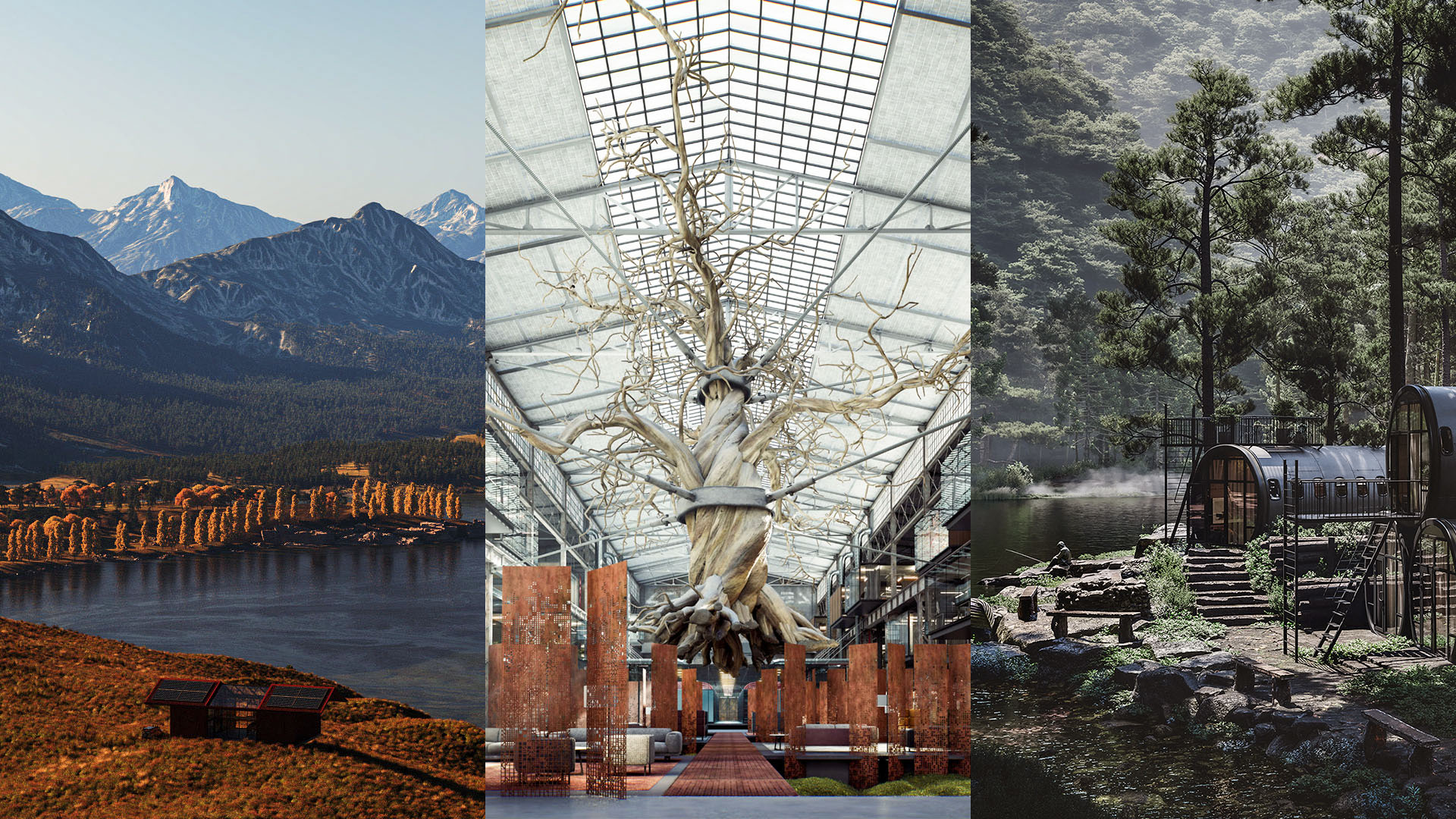
Today I’m proud and happy to announce the winners of the CONVERTED challenge, the 9th International Architectural Design & Visualization Challenge, in partnership with Substance by Adobe and ASUS as primary sponsors.
I’m highly impressed to see all the hard work, talent, and dedication the participants have put into this edition of the challenge.
This challenge was mainly sponsored by…
Substance is the complete suite for object texturing and material authoring for your 3D projects, and you’ll be using it to create your challenge entry. All winners will get a yearly license to Substance Suite and Adobe CC.
An ASUS ProArt StudioBook is waiting for each of the Grand Prize winners in Converted’s three entry categories – Still, Animation and Real-Time. A ProArt StudioBook is a mighty mobile powerhouse with extreme performance. It packs a professional-grade Quadro or GeForce graphics card, a wide-gamut display, and exceptional color accuracy makes it the very best laptop for serious content creators.
And many more great partners, so visit the CONVERTED Challenge Website for all the information!
And without further ado…
CONVERTED – STILL IMAGE Category
Aristotle Gaddi – “The Fuselages Village”
Converted Still Image Grand Prize Winner
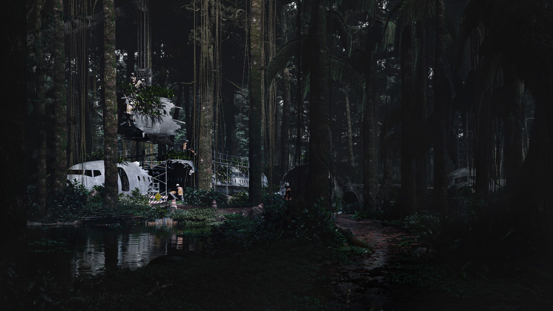
“The first image represents a graveyard for airplanes located in a forest in Nigeria. The concept underpinning this image is to explore all the parts of an aircraft that can be used as a construction method. Fuselages are the main body of an airplane, and the builders used this component to construct habitable spaces.” – Aristotle Gaddi
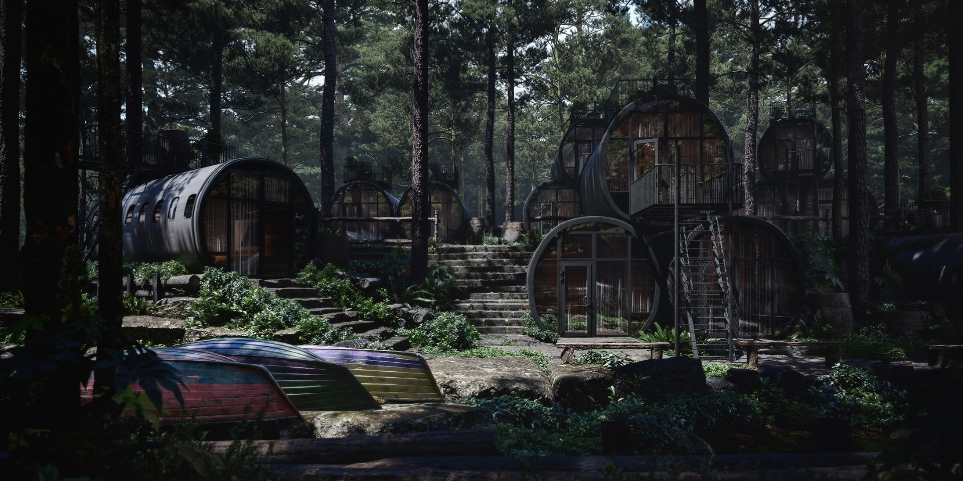
“The second image highlights how an aircraft’s once considered an obsolete part can be manifested into innovative architecture. The fuselages create a physical village while providing a sense of community and hope. This image also demonstrates the synergy between the built form and the natural environment. This concept aims to ensure that housing can be made with minimal impact on the forest, allowing a community to thrive in this context.” – Aristotle Gaddi
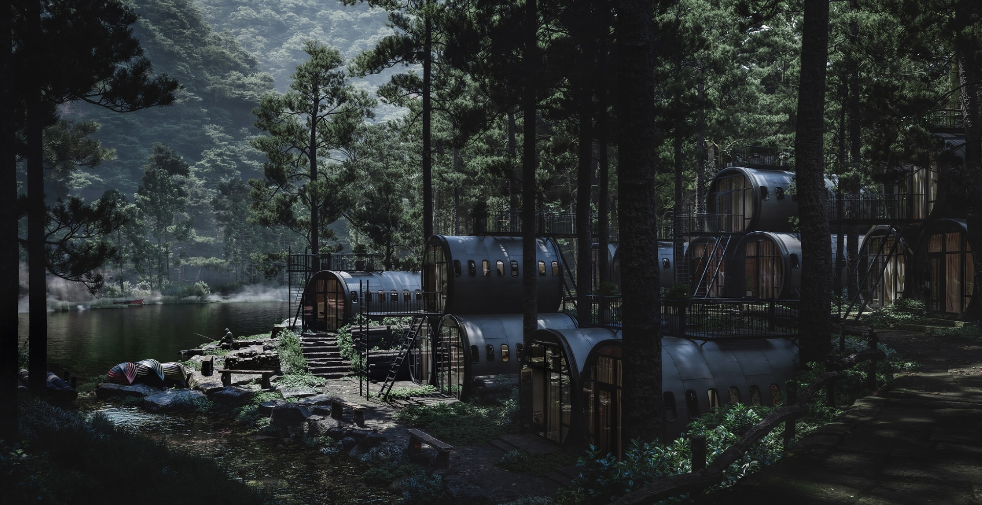
“The third image highlights the links between the built form, amenity, and sense of community. Physically, the fuselages are linked through their architecture. Terraces have been designed so that the connection to nature is strengthened. Also, the fuselages are located near the river and neighbors, which improves access to amenities in remote areas. An essential concept for this project is providing a sense of hope for communities living in remote areas. Designing innovative architecture using obsolete fuselages, having a solid connection to the natural environment, and providing amenities, heightens the sense of hope and community. This project portrays how ambitious architecture can help those around us. We must help those around us, and architecture can facilitate change as well as hope. This project converts unwanted aircraft pieces into innovative architecture that pushes boundaries while strengthening the connection to nature and people.” – Aristotle Gaddi
The Jury :
Aristotle Gaddi’s “The Fuselages Village” has a grand narrative full of symbolism and great ideas and is supported by compelling and thoughtful images.
The work shows the concept clearly and takes the viewer from disassembly to establishment within context. Besides the complexity of the scene and the rich level of detail, the composition is powerful.
Aristotle was thinking outside the box in terms of innovative architecture, yet at the same time feels grounded in reality.
Materials are top-notch, and lighting seems natural and gives a feeling of calm and peace.
Great work!
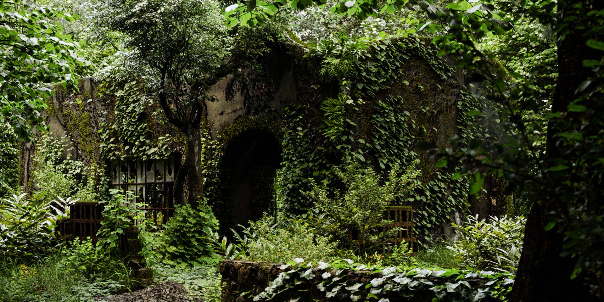
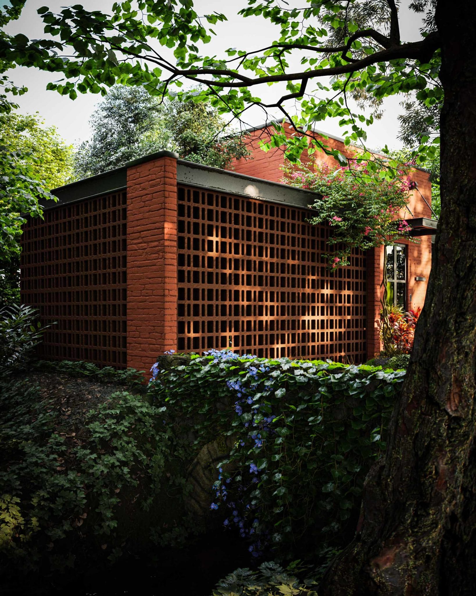
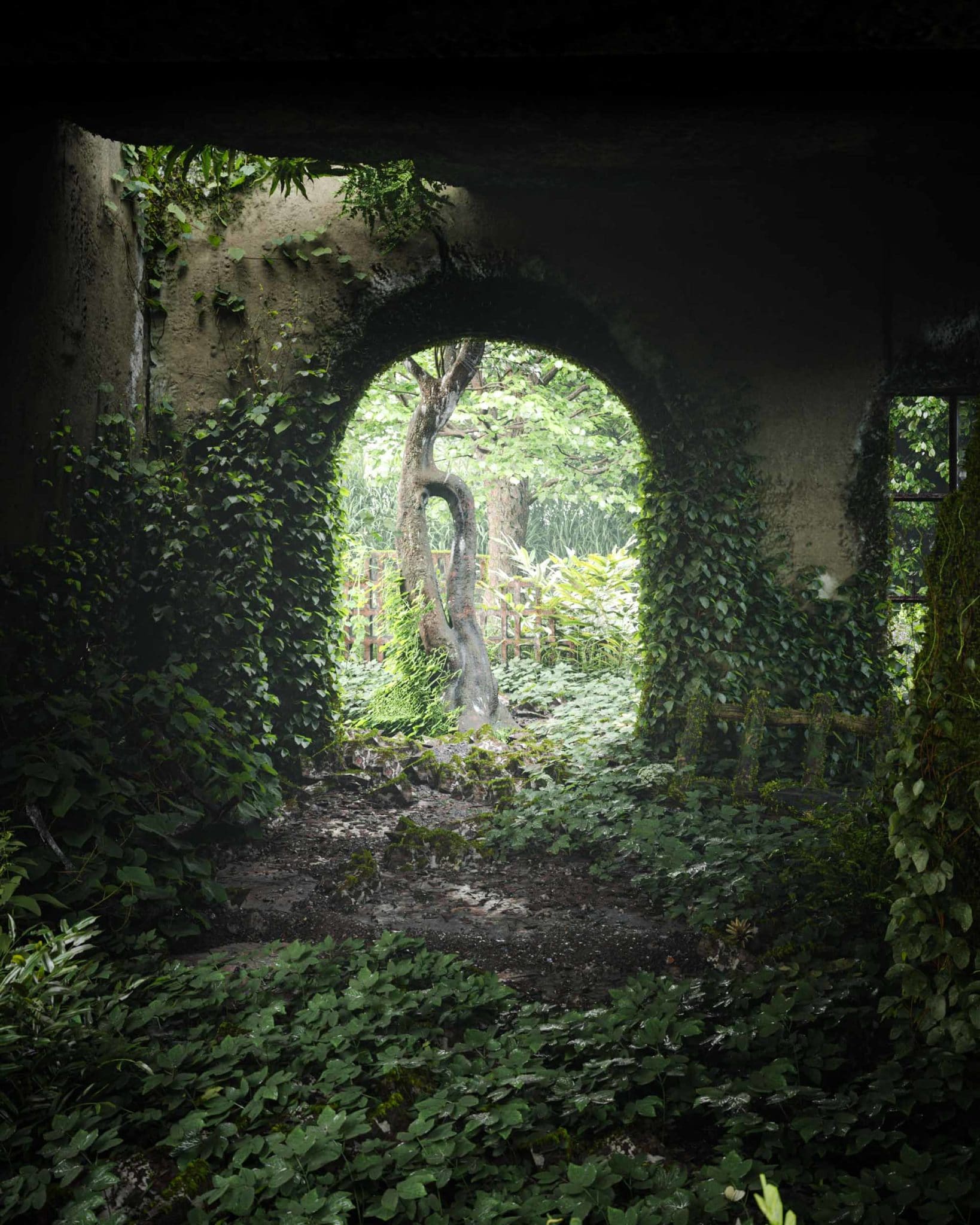
Shiju NK – “The Phoenix”
Converted Still Image Runner-Up
“The Phoenix revolves around converting a dilapidated structure with a rich historic image into a redesigned abode – breathing a new life into the old.” – Shiju NK
“This challenge was, of course, one of the most different and interesting ones I have taken up since it involves designing and visualizing both the old and the new converted structure.” – Shiju NK
“The new design revolves around not stripping the ruins of its historical image and breathing new life. The Smiths’ journey to step into here has been depicted in a few of the design elements used. To create an interest in the subject, I leave it to the viewer’s imagination to find the connection between the old and the new. I hope you all like it!” – Shiju NK
The Jury :
For “The Phoenix,” Shiju NK has produced a beautiful set of images that showed multiple stages of the project in a complete life cycle – the lush, wild images, in this case, can either constitute before or a future after.
In that aspect, Shiju’s images are different from any other as it is the only one possibly not converted by humans but rather by nature.
We’ve enjoyed seeing touches of the old ruins peeking through in the new design and the considered use and rendering of materials.
It shows excellent technical skills, and it makes the viewer feel uncomfortable due to that black hole/door in the center. However, that is a plus since it evokes strong emotion.
Bold idea and excellent execution!
CONVERTED – ANIMATION Category
Jamie Holmes – “Red Barn”
Converted Animation Grand Prize Winner
“Red Barn is a converted utility shed elevated above a lake inspired by Central Otago in the lower half of the South Island, New Zealand.
Ranges and basins dominate the area. Central Otago is a massive block of schist, part of the 85-million-year-old Zealandia continent. I was inspired by the ruggedly beautiful landscape and the rich history when I visited the area a few years ago. From whaling to farming to fruit to gold, the site has had a very diverse past.
Many historic buildings helped serve these industries – some beautiful and some not so, but most are very functional. I took the quintessential kiwi “shed” you see scattered throughout rural New Zealand and reimagined it as a holiday home in designing Red Barn.
Sheds, by nature, are simple structures designed for maximum function at minimum cost. I created a vernacular architecture that honors the essence of the shed without looking out of place nestled into the rural landscape.
Red Barn from the outside is simple in form, clad entirely in corrugated iron finished in red oxide paint containing a mix of locally-sourced iron ore and oil. The barns’ roof and central doors, both front, and rear, slide open simultaneously when in use. When unoccupied, the barn closes to protect itself from the harsh weather. When in its closed configuration, only four windows are visible, limiting the amount of change in material showcasing a more monolithic silhouette. A central glass atrium is revealed in its open configuration, and the roof creates wings that cantilever high above the ground.” – Jamie Holmes
Marina Gretsova – “Wake Up 2051”
Converted Animation Runner-Up
“In “Wake Up 2051″, the idea is to show conversion from our current noisy and busy way of existence to a more relaxed, balanced, and connected one. In 2051 people live together with nature, growing their foods and 3D printing pies at the same time Communication takes place through 3D hologram devices, deliveries and transportations are powered by drones, which in return are powered by solar and wind energy gathered by the households.” – Marina Gretsova
CONVERTED – REAL-TIME Category
Mateusz Sum – “The Foundry”
Converted Real-Time Grand Prize Winner
“My initial idea was the concept of democratized access to sophisticated tools, both hardware, and software, which could be easily shared in an open, collaborative workspace by creatives. I thought it matched the central theme rather nicely as one of many examples of how disrupted modern lives are, stuck in a perpetual loop of constant fluctuations, changes, and conversions.
While I was mainly looking at the context of art and creativity, several associations with industrial revolutions came to mind right away. Hence, I picked an old industrial building for the background of the scene, typical for a 19th and 20th-century warehouse, factory, or foundry.
I then filled the space with arrays of little customizable offices and workshops, with robotic arms augmenting artists’ tools and skill-sets. Such a setup was then fueled with the most valuable resources of current and future times – data. That’s how the data-crunching clusters were introduced in the middle of the foundry, like a beating heart that keeps everything in motion.
Then, as a juxtaposition and balance to the information cloud packaged in the silicon, I put another totem of power, more tangible, probably more powerful too – a giant old tree, dead in fact yet still dominant, hovering over modest lounge garden, almost residual.
Finally, I decided that nature had to be reconstructed and revitalized in this version of the future, rebuilt bit by bit in a chain of biome dioramas that would then return to the original environment and convert it back to its initial state.
For the final output, I decided to utilize all the potential of real-time graphics, specifically in Unreal Engine 4. I produced a set of still images, an animation, a walkthrough video, and a real-time experience.” – Mateusz Sum
Nicolas Orlando – “Bellevue Beach Wellness Center”
Converted Real-Time Runner-Up
“The site is located north of Copenhagen, Denmark. It is a beautiful building from the 1930s, initially designed by the renowned Danish architect Arne Jacobsen. I believe that restorations or repurposing of existing buildings is a very subtle art.
It is essential to develop a concept that will both respect the original design and add some well-deserved functionality to it. This is why many of the changes done are carefully fitted within the existing layout, with no significant changes to the building’s structure and essence. Luckily for me, the interior of the building was mostly empty, so organizing the space once I figured out what I envisioned was relatively easy.
The exterior is in part restored to its original form or very similar to what it was. White panels with thin gaps and white metal windows, but this time I used the modules and the rhythm to create “frames” that emphasize the surrounding landscape (most notably, the massive frame was facing the sea, where the yoga/meditation practices would take place).
As a final touch and to highlight the purpose of the new building, I kept the original standing clock and restored it but removed the needles. There are also several small support modules along the beach that go together with the main building.
This is an area that people already use many activities related to contemplation, meditation, and appreciation of the landscape. Since I thought this is an excellent aspect to focus on and promote (especially after such a grueling last year for tons of people), designing a multi-purpose-wellness-focused building seemed like a sensible approach. For the creation of this project, I used geodata from the Danish government to create a landscape mesh in 3ds Max, then I modeled the rough shapes of the buildings and started sculpting the details. These are also restored and modified to fit the new criteria and aesthetic, using the “frame” shape as the tying element of the group.
I used Unreal Engine 4.26 as my primary tool for visualization.” – Nicolas Orlando
CONVERTED – Honorable Mentions
- Materials – Alex Goray.
- Lighting – Anupamdas.
- Modeling – Iryna Nalyvaiko.
- Vegetation – Alberto Pasqualetto.
- Design – Adonis Gabriel Gumba.
Thank you all once more and see you in the next one!
RB
More on the CONVERTED website!

