
Originally published at: https://www.ronenbekerman.com/making-of-editionparnell/
Edition in Parnell by MR.P STUDIOS was shared on the showcase section during August and now, the making of Edition in Parnell is giving us all a glimpse behind the scenes of MR.P teamwork on two images they delivered for a contemporary building design by Monk Mackenzie. Learn how they used RailClone, GrowFX and gave Corona Renderer their first go!
MR.P is privileged to work with some of the world’s most respected architects and creatives to help visualize their designs. The studio’s team of highly skilled artists spend the necessary time to craft each image with precision and detail.
This is the first project in the studio that the whole team worked on together. It was also the first project in the studio where all images were rendered using Corona Renderer. Thanks to Ronen for spotting great teamwork and asking us to write about the project and our approach.
We wanted to share the production of two images created for this project :
- The Hero Exterior.
- The Garden Courtyard.
as both were created using different approaches.
- Lead Artist – Mark Parsons: shares his workflow using RailClone.
- Lead Artist – Tom Reynolds: shares his approach to custom planting using GrowFX.
MR.P’s Founder and Art Director Philip Horton explains the kick off the process and how the overall mood and concept for this project developed.
Making of Edition in Parnell – Project Kick Off
In an over-saturated property market, where there are many talented render studios creating lovely images, its difficult to create a render that stands apart in marketing collateral.
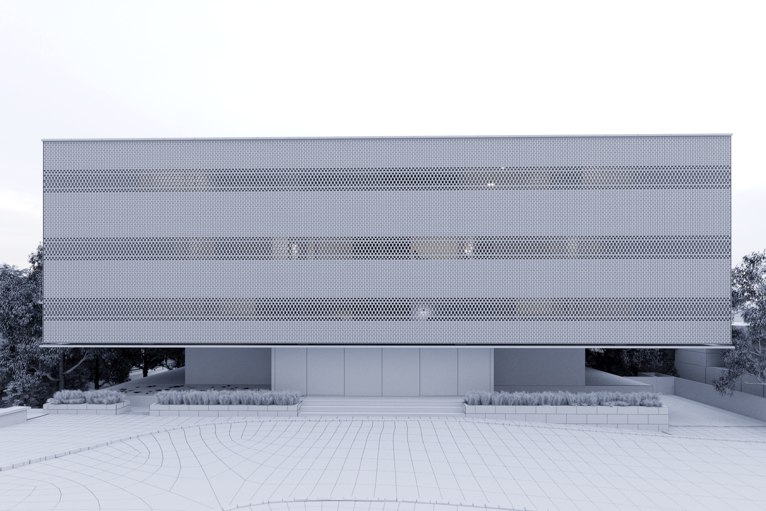
When this bold, contemporary building designed by Monk Mackenzie landed in our studio, we knew it warranted a different formula from the widely seen late afternoon/ sunset images.
The client brief asked for the images to have a sense of elegance, calm and restraint – Perfect!
No people or hot air balloons – brilliant!
This is precisely the type of client the studio LOVES.
We love editorial style; stripped back beauty that you might find in the pages of Cereal or Kinfolk
The project begins with generating an overall concept and mood, and we like to consider the weather and time of year the project is to be launched. Like all good restaurants, we like to keep it seasonal and give a place a true sense of locality. Winter seemed a good fit against Monk Mackenzie bold, dramatic architecture.
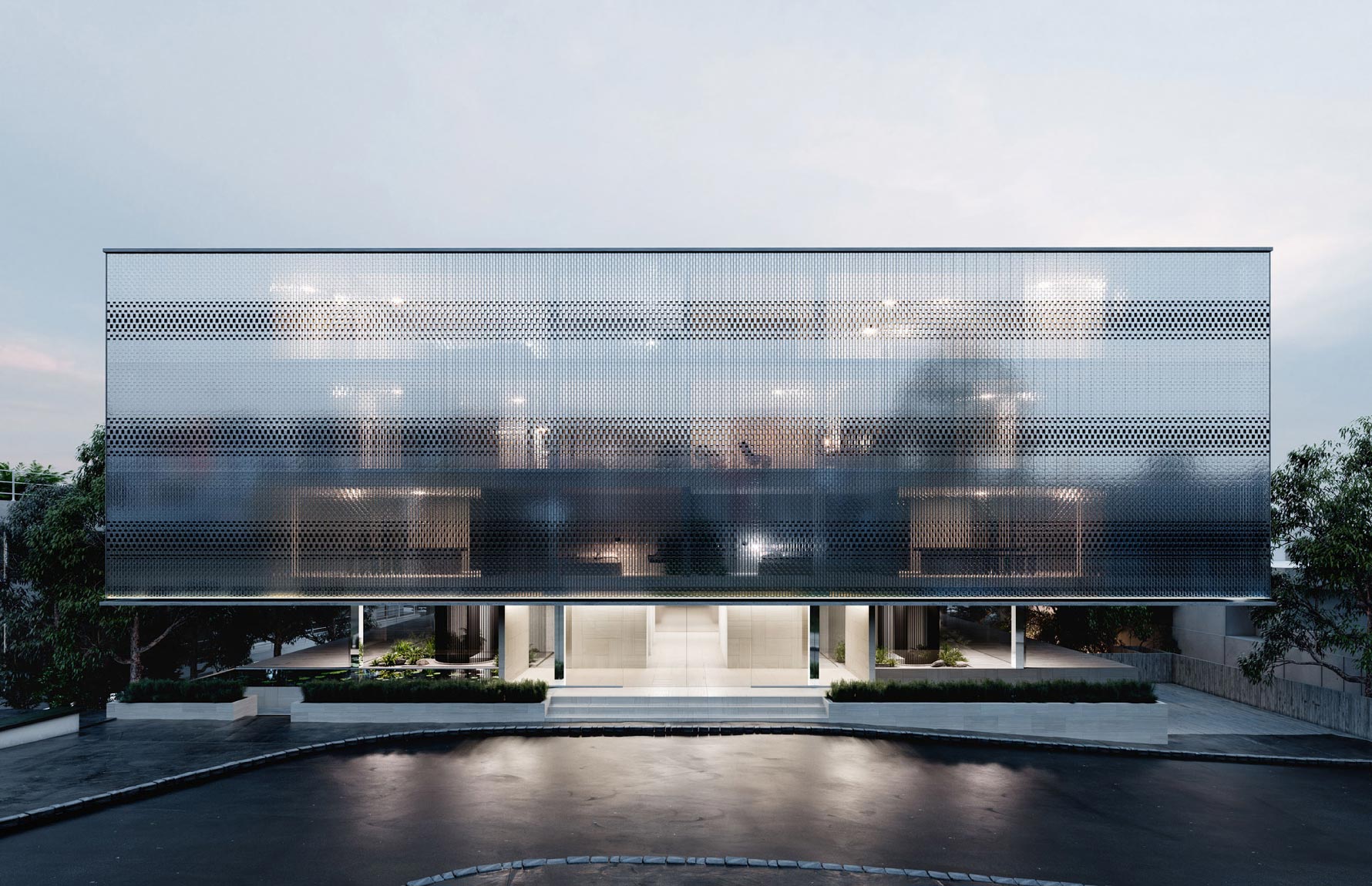
Lead artist Mark Parsons had also recently introduced us to the brilliant photography style of Iwan Baan. Drawing inspiration from him, we felt the soft blue dusk or silver white day tones would compliment Monk Mackenzie’s contemporary design and the feature custom glass brick facade.
Iwan Baan reference
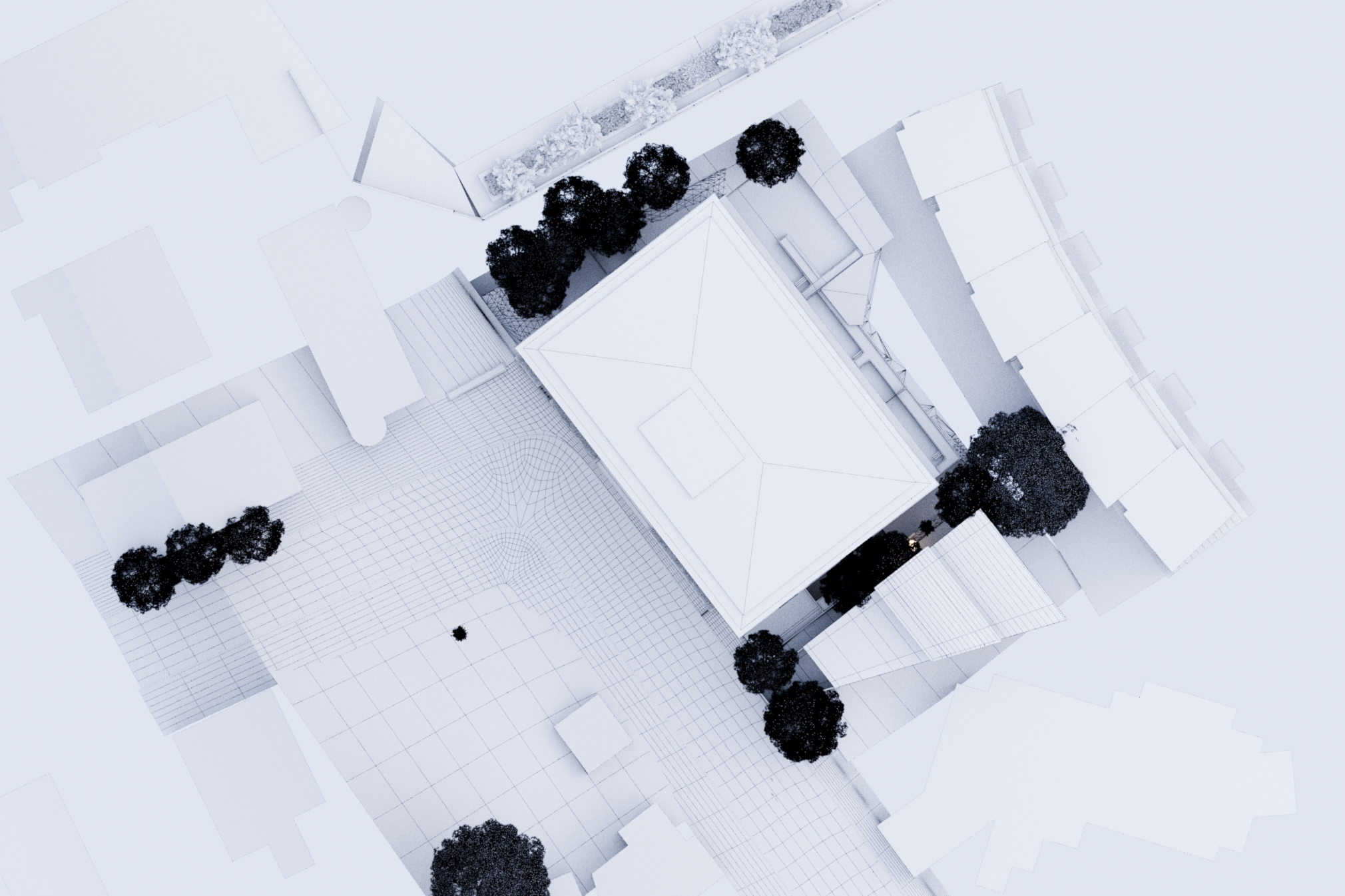
Exterior – Site visit
The short deadline meant there was, unfortunately, no time for a site visit for this project. If time and geographical location allow, we like to see the site in person so we can visualize the building in context and determine if adequate photography can be obtained. A rookie mistake is to set up a fantastic shot that the client loves, only to realize there is a massive tree in the way, or attempting to portray a serene environment, then realizing the building is situated on a major traffic intersection.
If we can’t make a site visit, then google street view is the next best option. For the hero exterior, we quickly identified that there was going to be two giant trees in the way of the preferred single point perspective. The decision was made to scrap photography and create the whole scene in 3D. Its loads more work – but it gave us the flexibility to control the surrounding context.
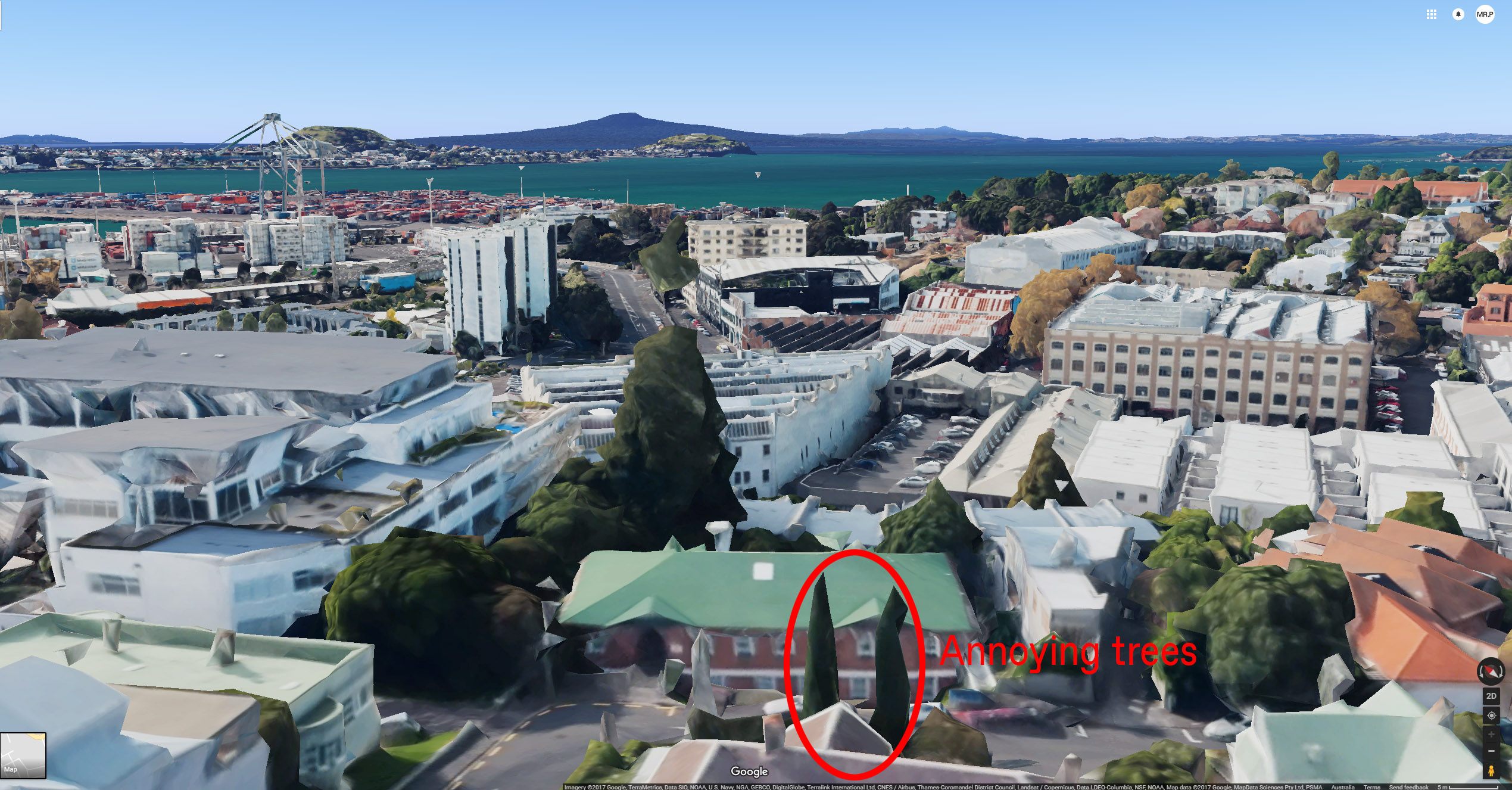
Google map of annoying tree
Composition/Lighting
The most challenging aspect of the exterior imagery was deciding how best to display the facade of the building. The handmade Italian glass bricks on the building exterior were a significant and expensive design feature we had to highlight. We wanted to play up the reflective qualities in the bricks while still being able to see pockets of interior light within, giving the facade an ethereal quality.
The cloudy day and wintery sky helped to display the brick in its best light. This image would not have had the same look if it was set in the afternoon sun as the bricks reflective quality would have blown out. Compositionally, we decided to elevate the camera position; exaggerating the cantilevered volume. The idea behind this was to give the illusion of the upper volume floating above the entrance below, something the architects were keen for us to demonstrate.
Glass brick detail
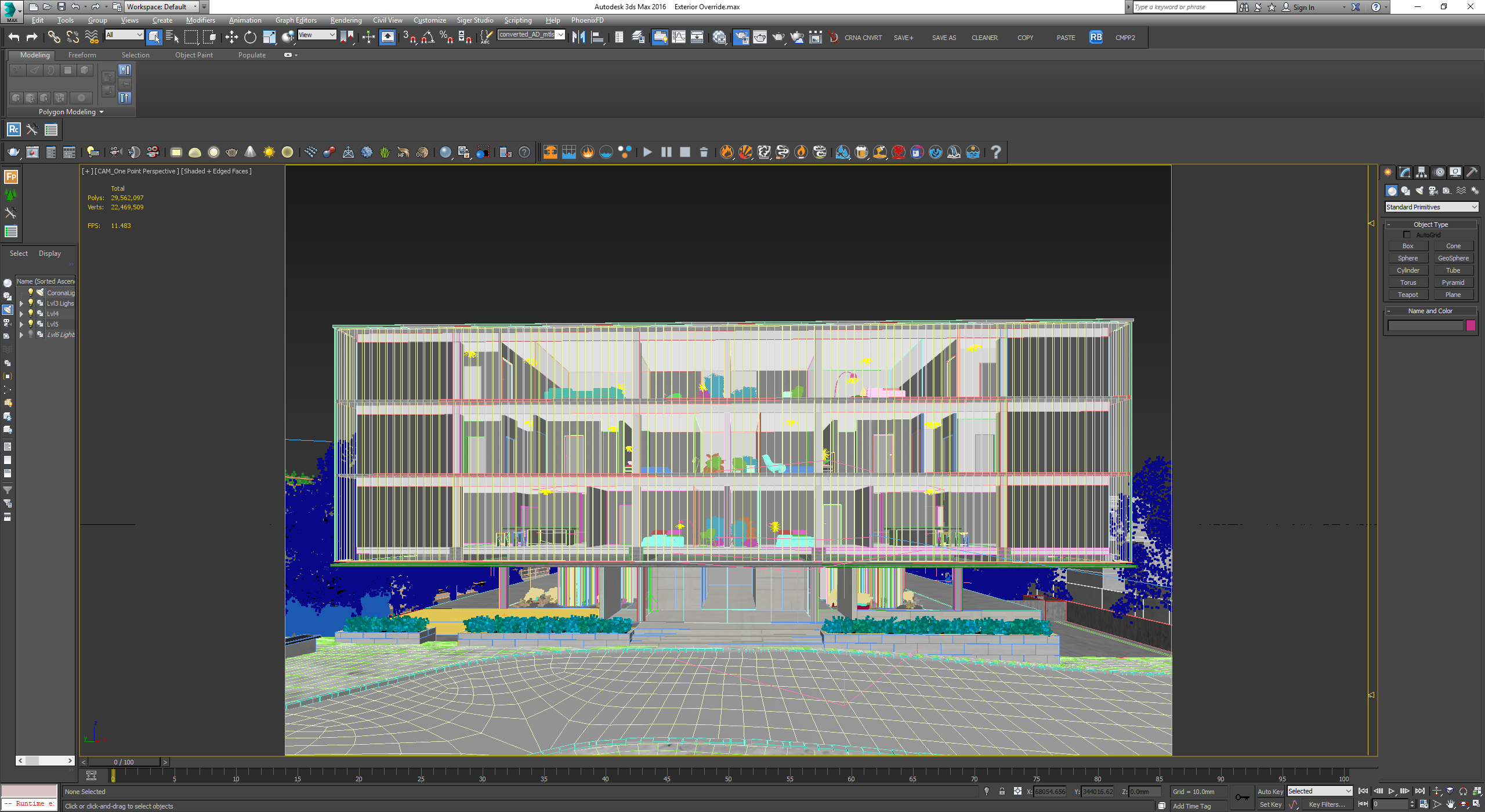
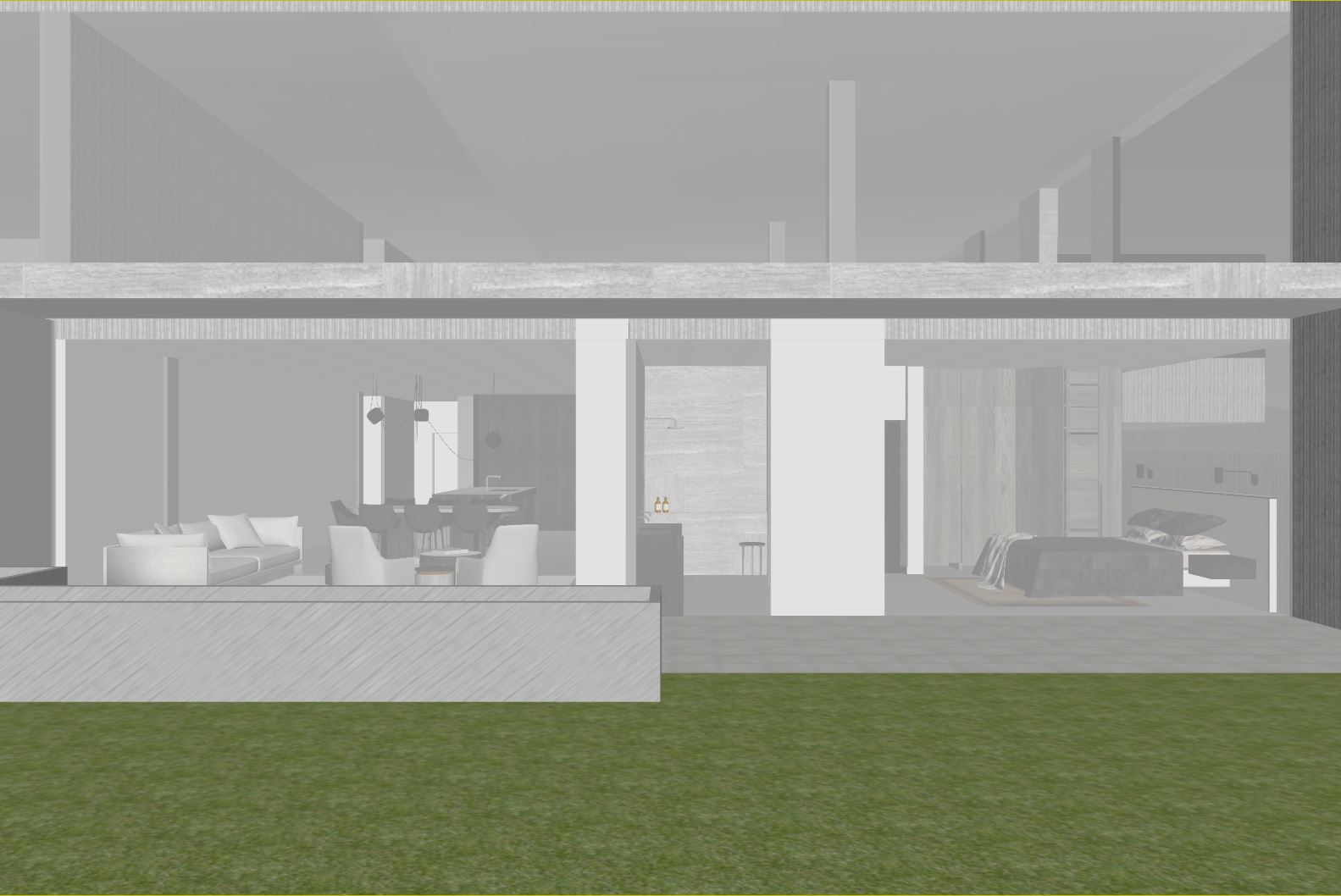
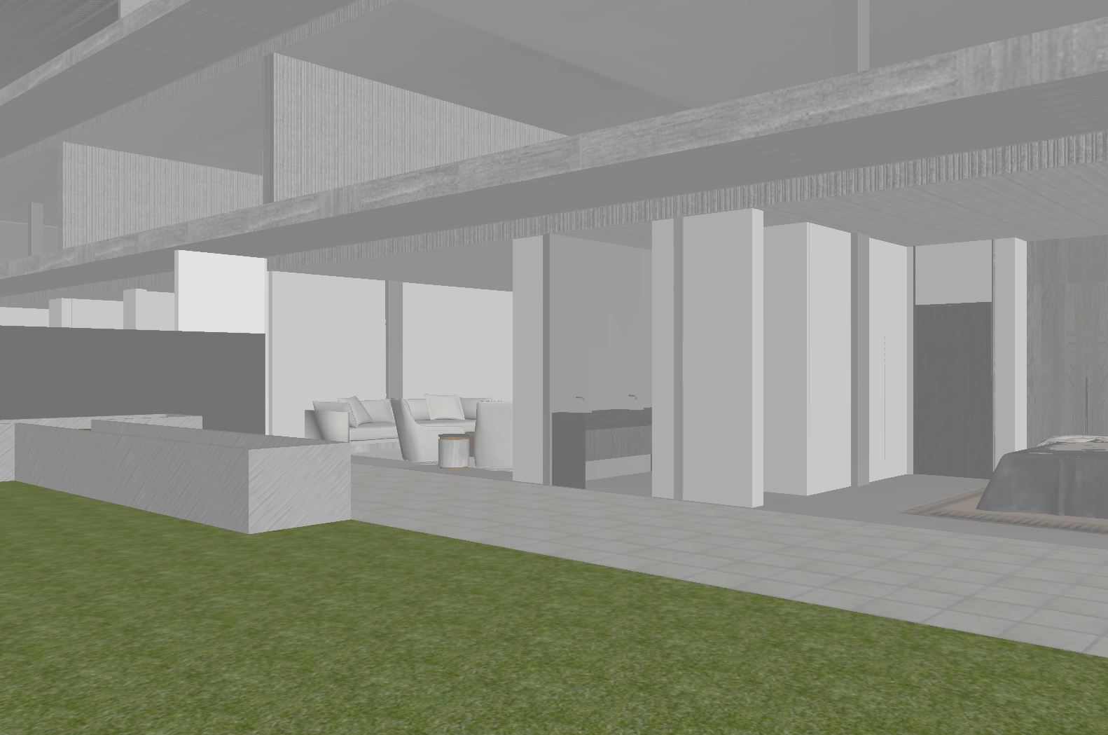
Extent of 3D model
Once the mood and composition were established, we started collecting references online which helped us begin to understand how glass bricks might look in reality. One of the best projects we came across was a beautiful house in Japan that features a large courtyard completely enveloped in glazed bricks.
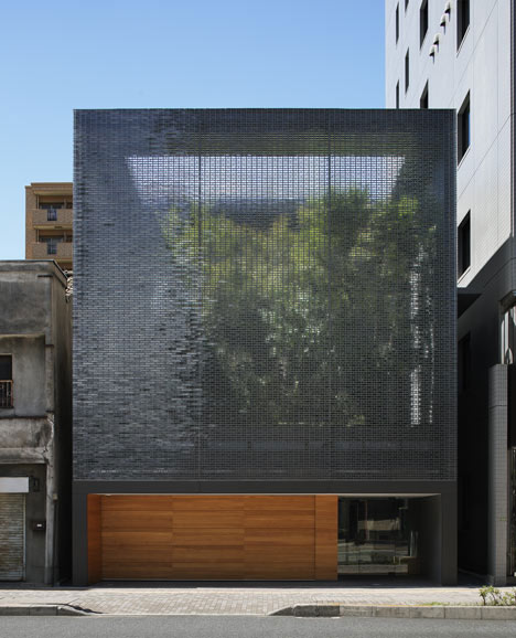
Published in Dezeen – Optical Glass House by Hiroshi Nakamura
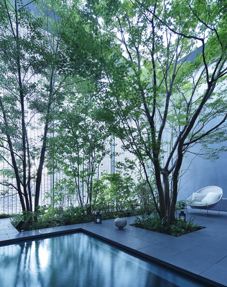
Tonal quality of reflection at desired time of render
Reflection reference
To start, we developed a simple RailClonee of basic cubes and some steel framework roughly similar to what the architects had planned.
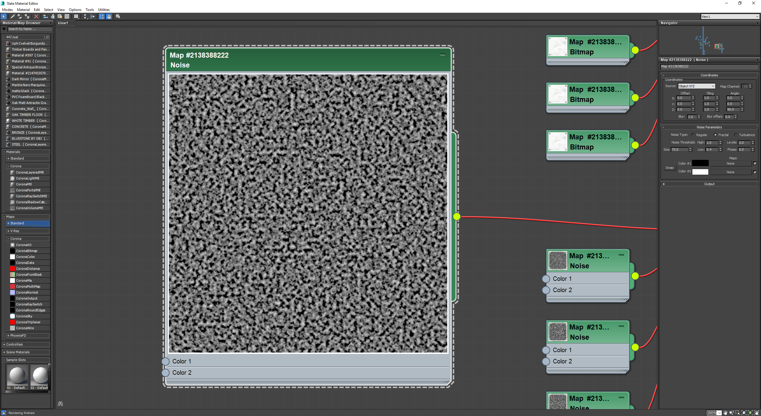
Using this mock-up, we tested reflection glossiness, reflection, and refraction as well as noise patterns that typically occur in glass blocks slotted into the bump channel. After a little R&D and watching…
We modeled a 2-sided glass block and started to create some layouts based on a few different iterations received from the client.
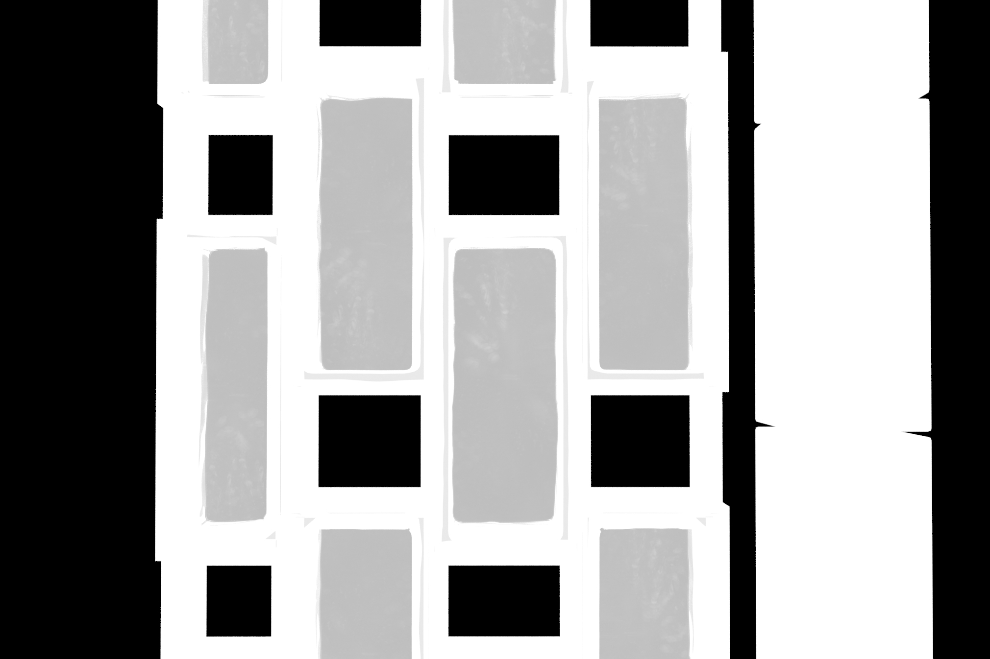
Glazed Brick Modeling
The Modeling involving the glazed facade was pretty basic as the client provided several elevations which enabled us to create the basic Railclone segment.
MODEL EXAMPLES
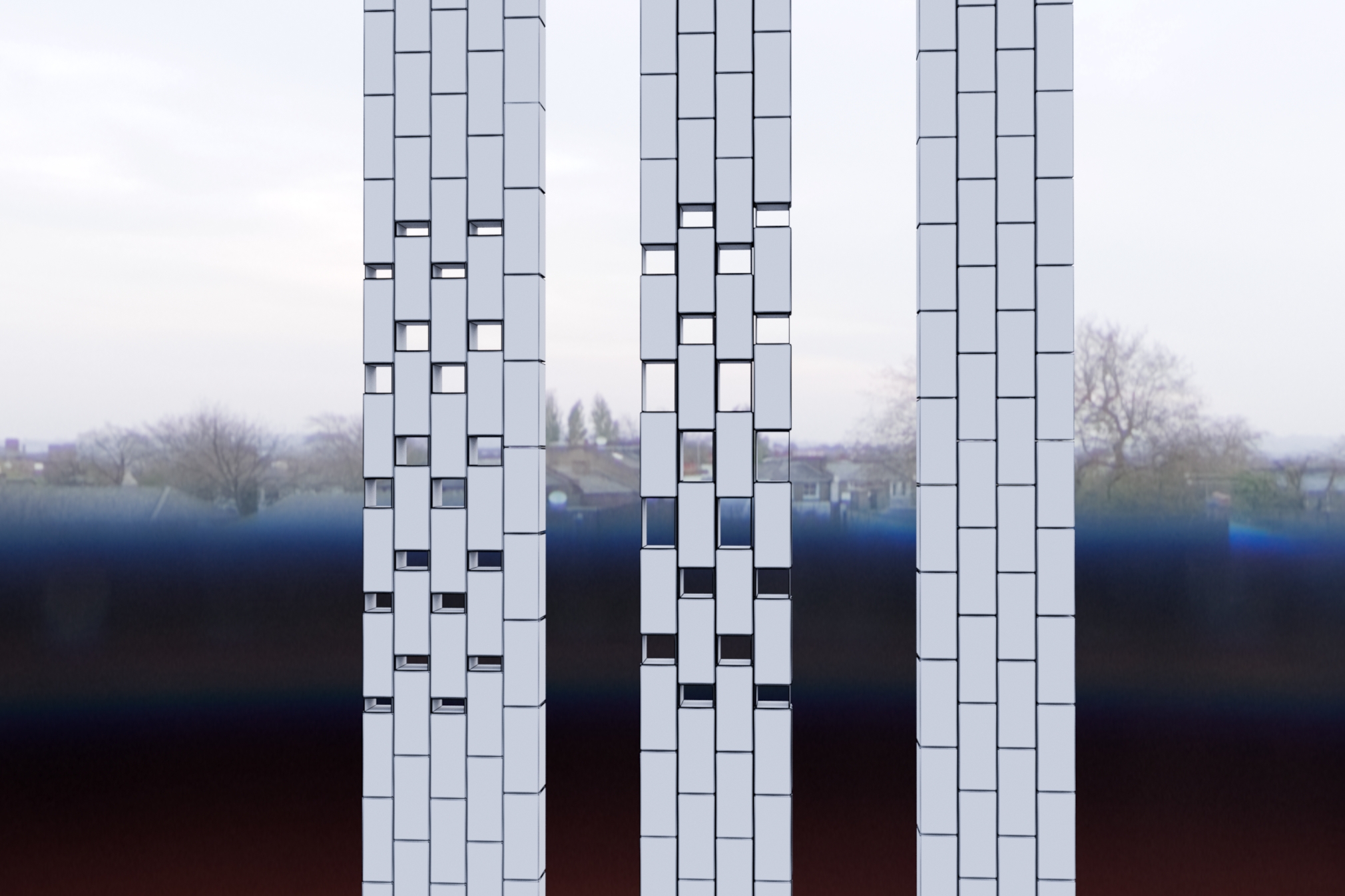
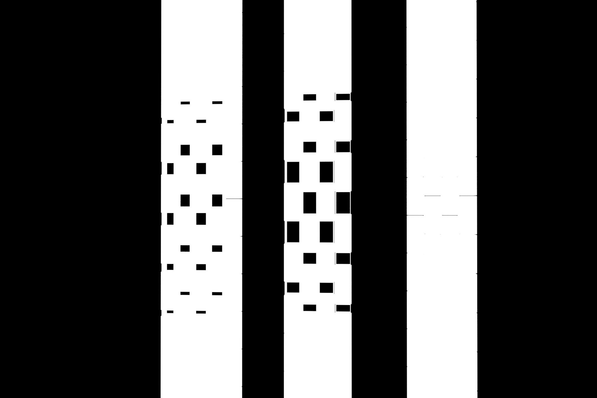
Different brick patterns
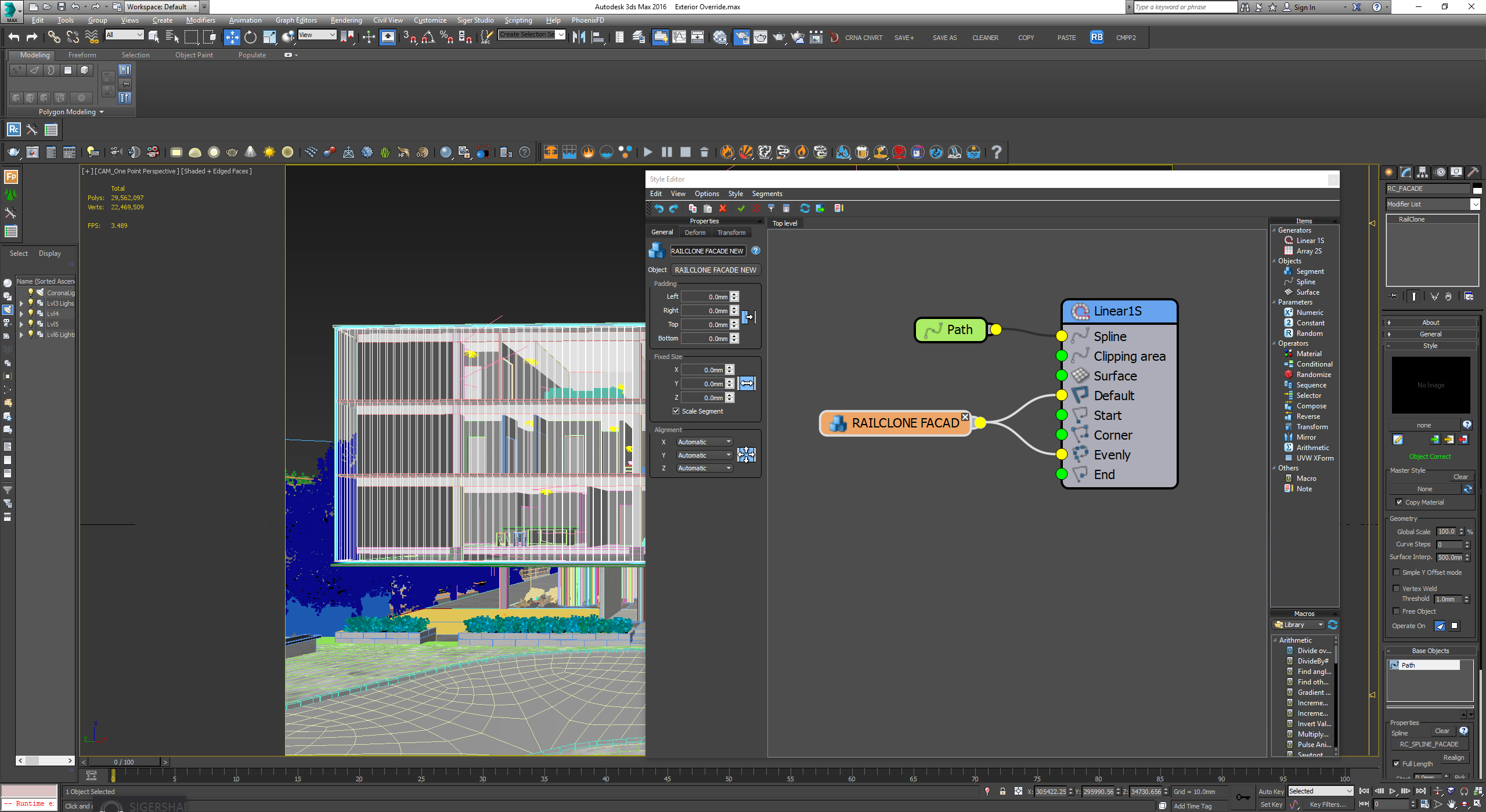
Easiest RailClone ever
Glazed Brick Texturing
Getting the inherently irregular reflections with glass blocks took the most time – but after multiple attempts, we created a very simple shader seen below:
SHADER EXAMPLES
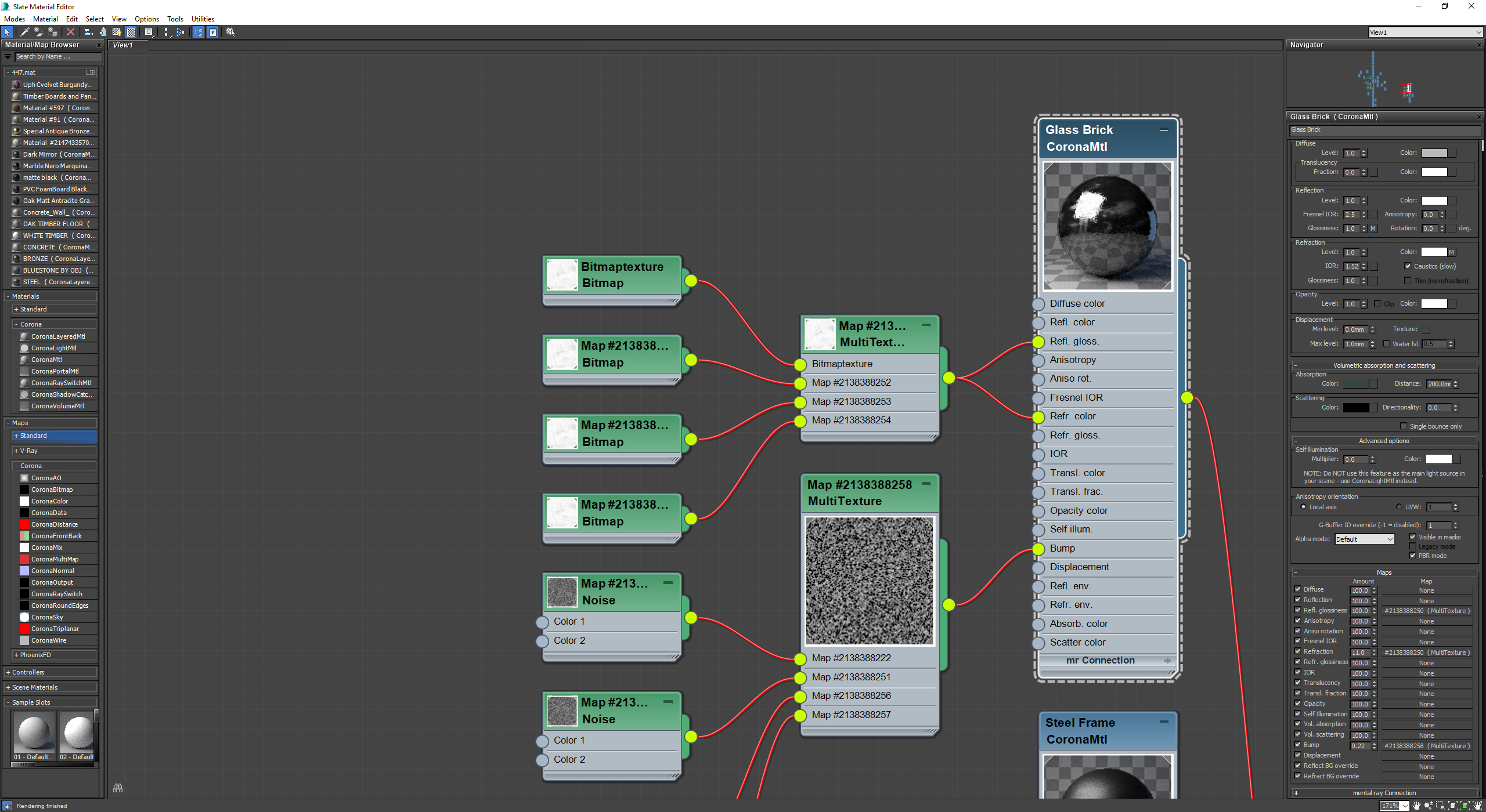
Glazed block material
Glazed block bump map
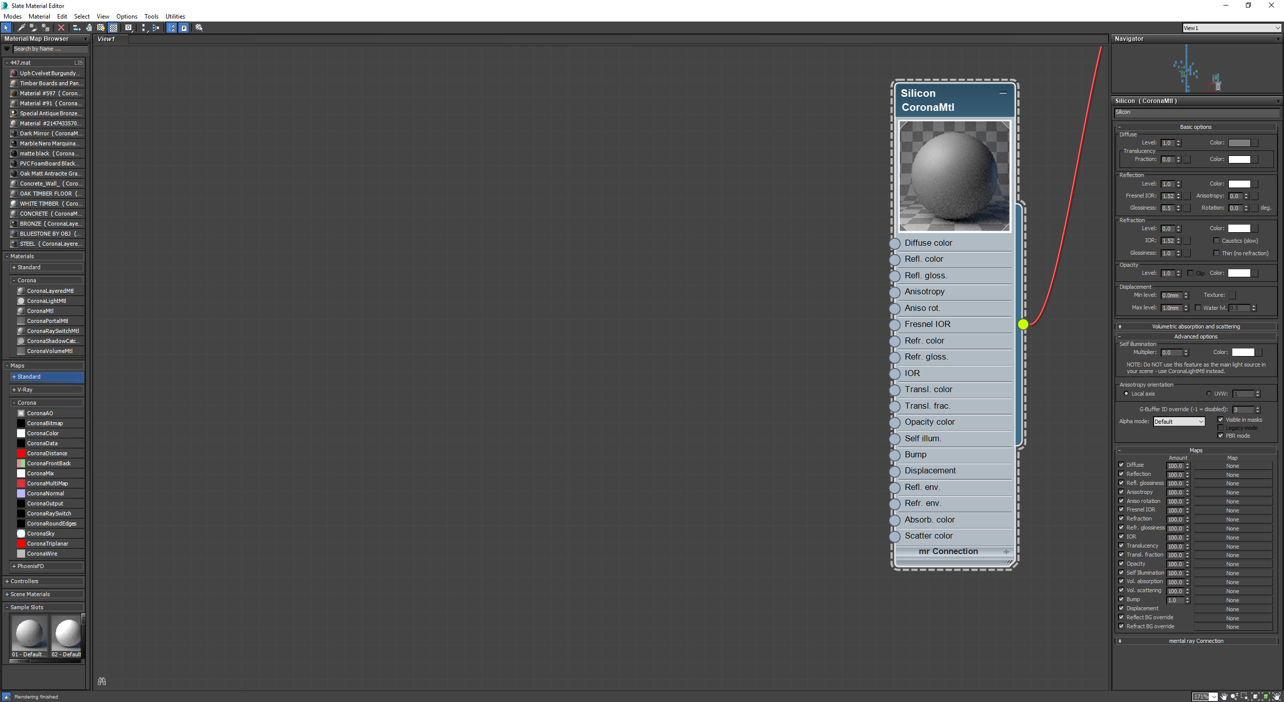
Glazed blocks silicon material
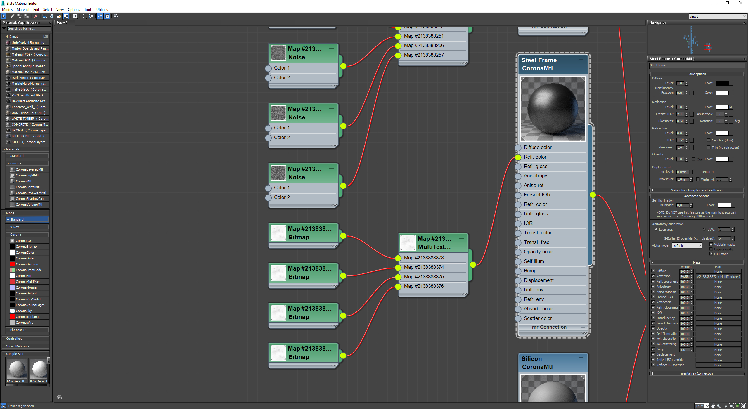
Glazed blocks steel material
Glazed blocks gloss map
material alpha
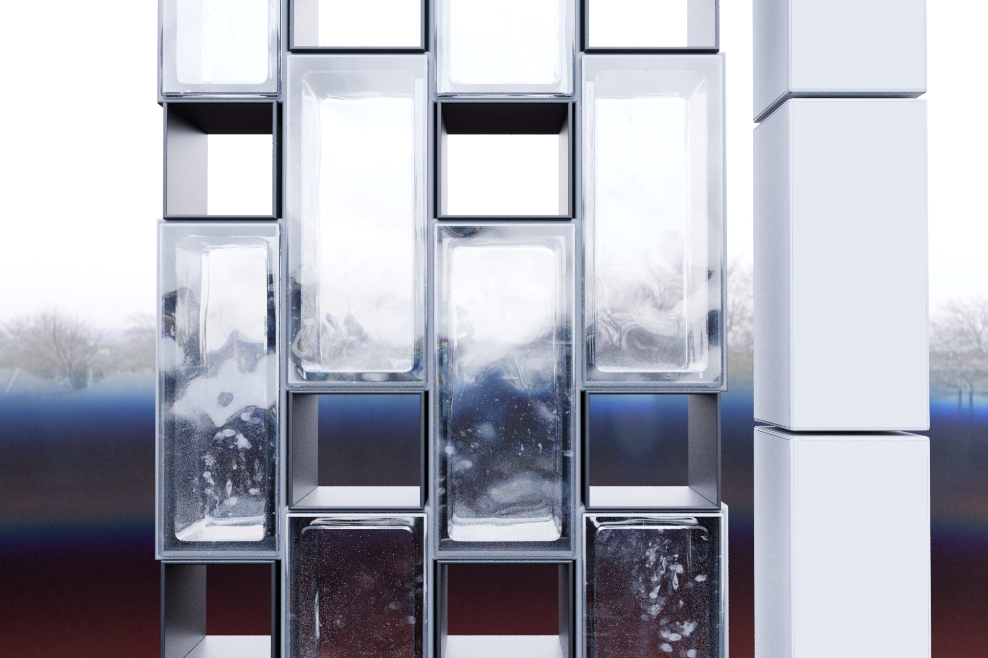
Glazed blocks
Glazed blocks reflection pass
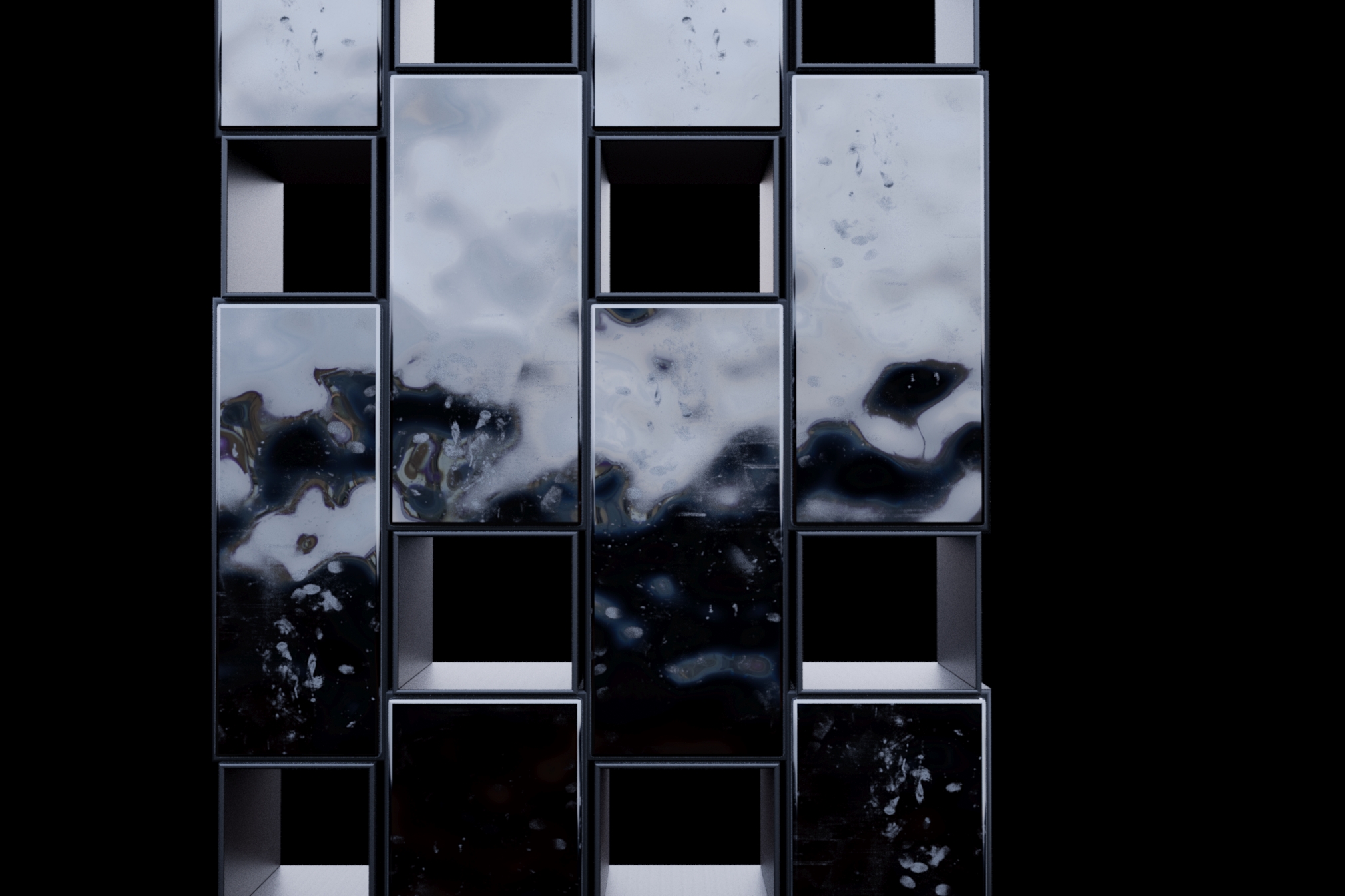
Grading and Post Production
Grading the RAW exterior image was relatively straightforward with only minor tweaking to highlight key architectural elements and to bring a uniform tonality to the final output. The post was done in Photoshop and consisted of 6 layers.
- We started with the raw, intentionally-underexposed render output from Corona’s Interactive Lightmix and gradually added subtle adjustments to exposure and levels.
- The fan favorites and essential corona passes (reflection, refraction, translucency, etc.) were layered with standard blending modes (typically we use screen blend mode at a reduced opacity anywhere between 15-35%).
- A very subtle Z-Depth pass was inverted and screened over top of the image to give an additional bit of atmosphere. We layered corona’s light passes to achieve extra control of highlights and spots of increased exposure.
- Corona’s light passes were used with Linear Dodge and minimal blending values to control spot exposure.
- Grading was done in both Magic Bullet Looks using After Effects (although very, very subtly) and additional color correction was done while grading. We also added a Black and White adjustment layer which uses Overlay with very low opacity as a blending mode to enable increased contrast.
- Final fixes were done to remove any 3d errors contained in the raw image. This is mostly superficial patch tooling or clone stamping.
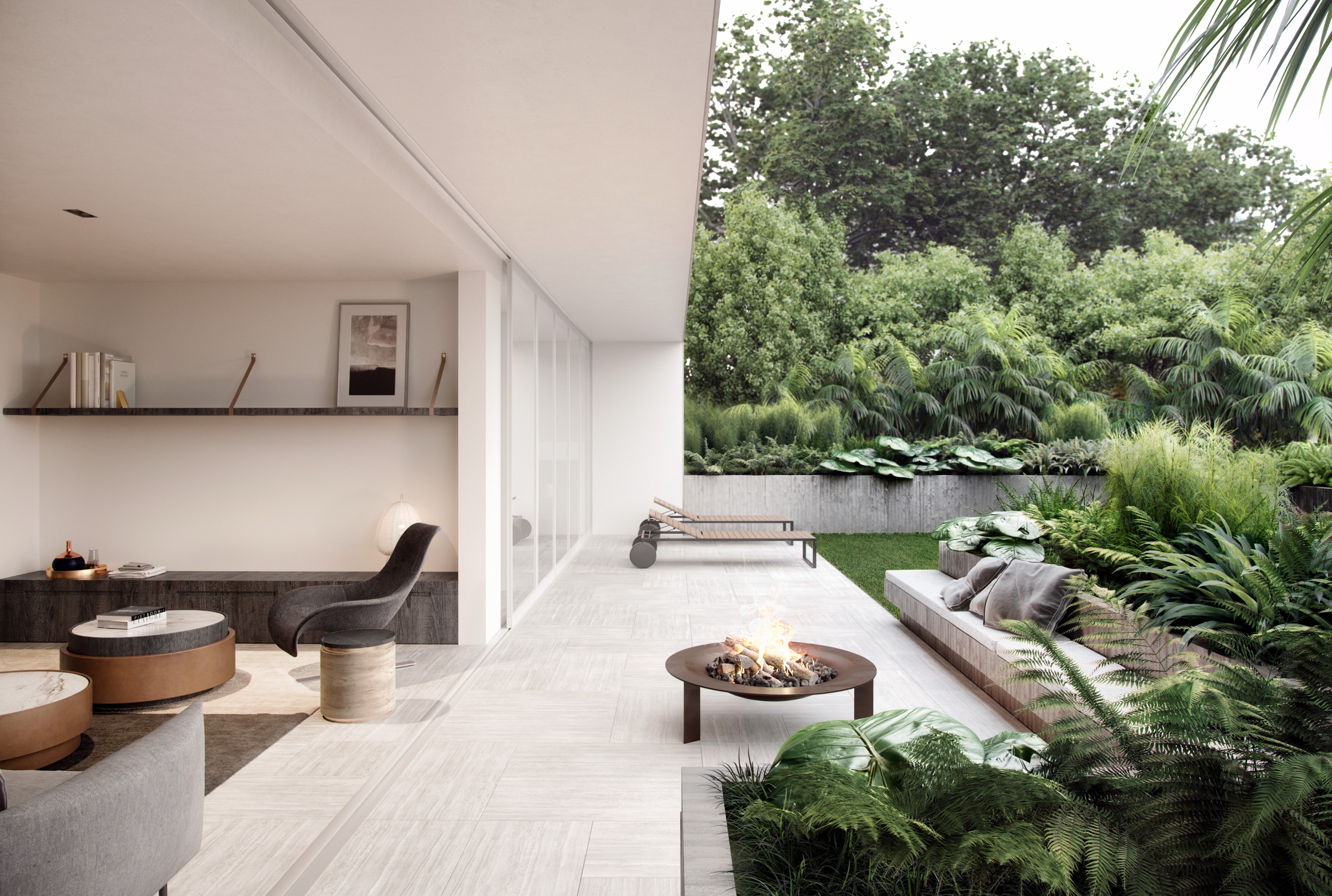
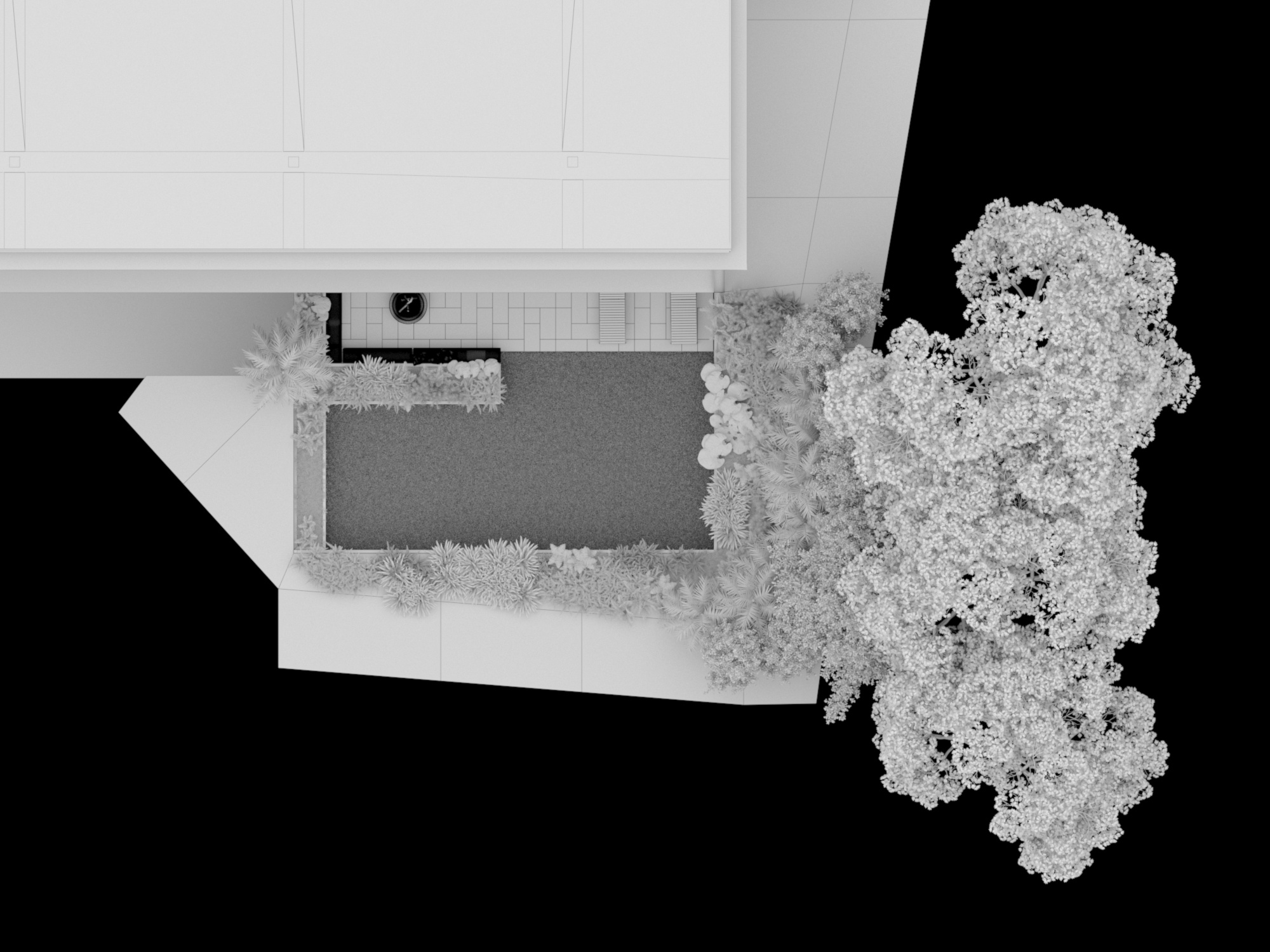
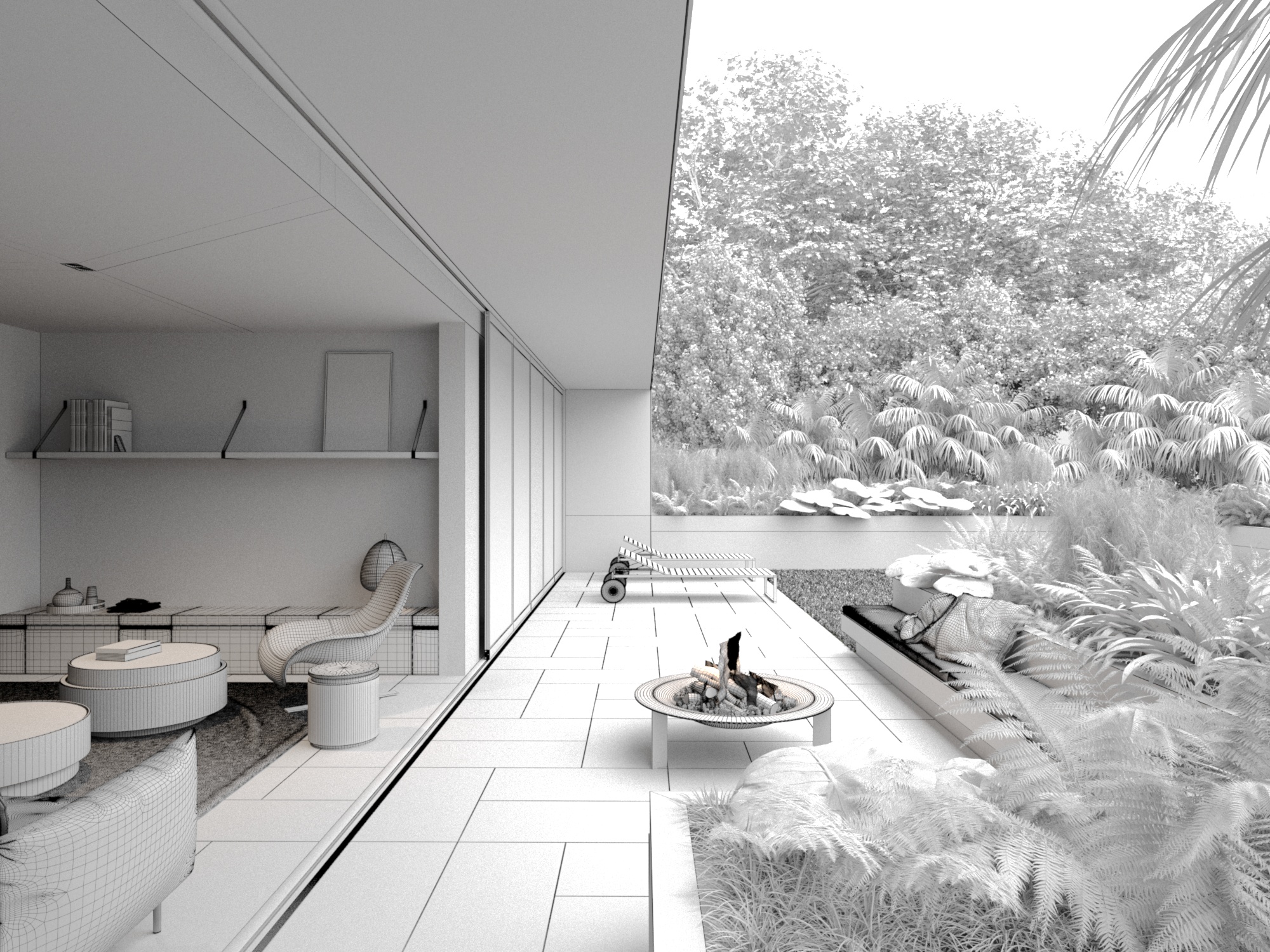
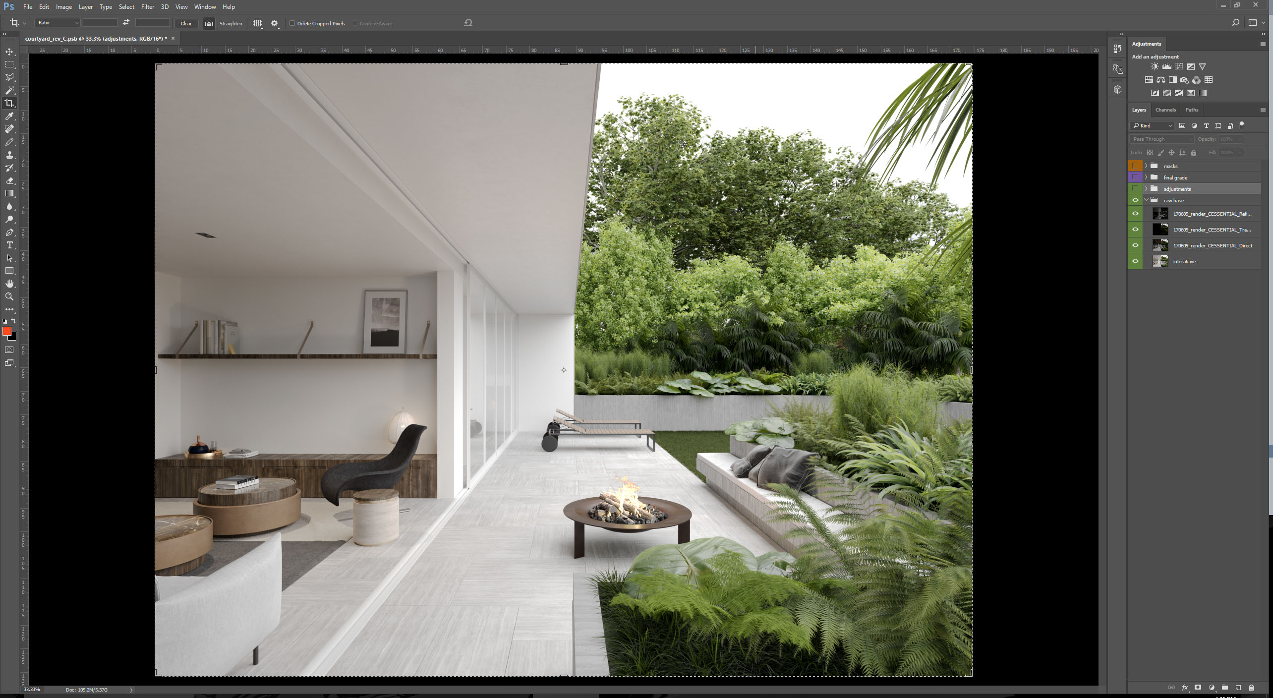
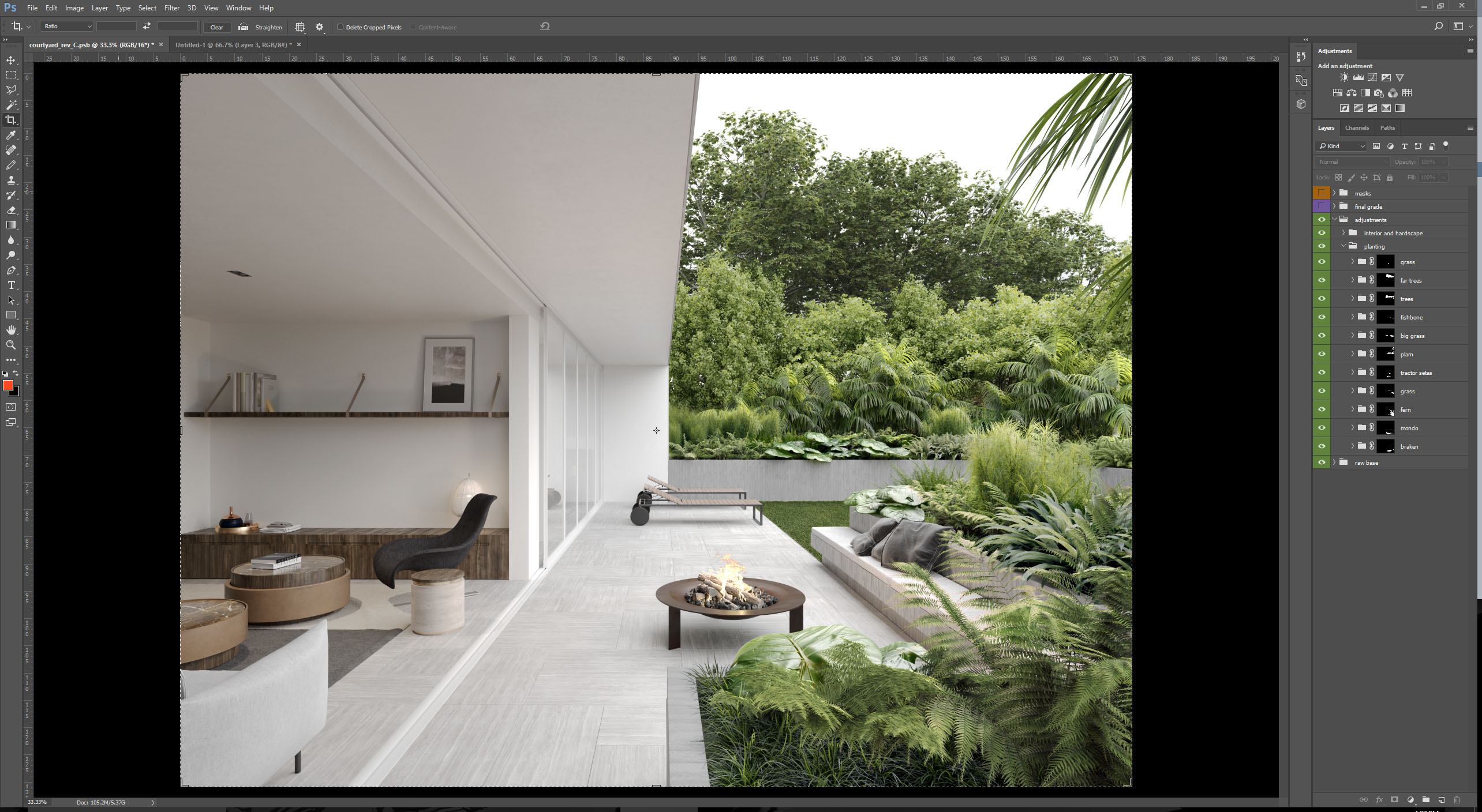
Garden courtyard
The creation of the garden courtyard aimed at highlighting the lush array of subtropical plants that is distinct to New Zealand, while showing off the designs’ blurred connection between in and outdoors.
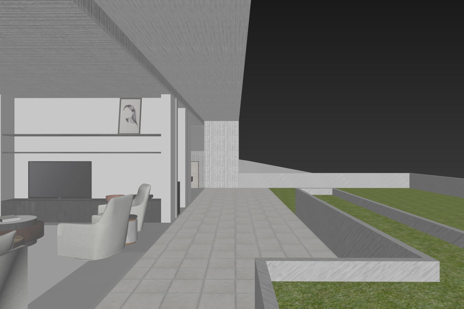
The most significant challenge of this shot was making sure the landscape did not overpower the architecture. Below you will see the basic screen grabs of different camera angles we sent the client before developing a fully formed white card.
Below are screen grabs of angle options…

Preferred angle – Proportionally the balance between the building and landscape works best from this viewpoint, thus highlights the ease of indoor/outdoor living, a major selling point for this apartment.
Once the viewpoint was decided, the planting was roughly composed for the selected camera angle. The plants were matte painted into the screen-grab and lightly color corrected to achieve desired tone and density. As the planting was customized for this image, we wanted to know that we had nailed the brief and client aspirations for the space before spending the time fully working up the white card.
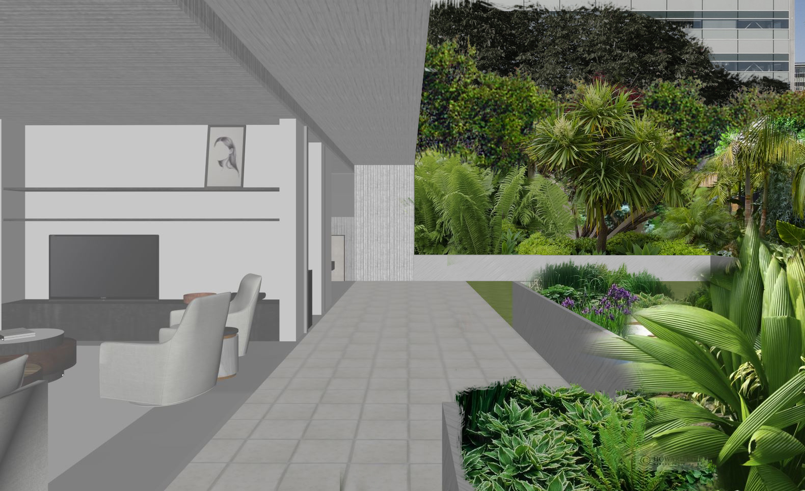
Initial planting concept once angle was agreed with client
Vegetation Scattering and GrowFX
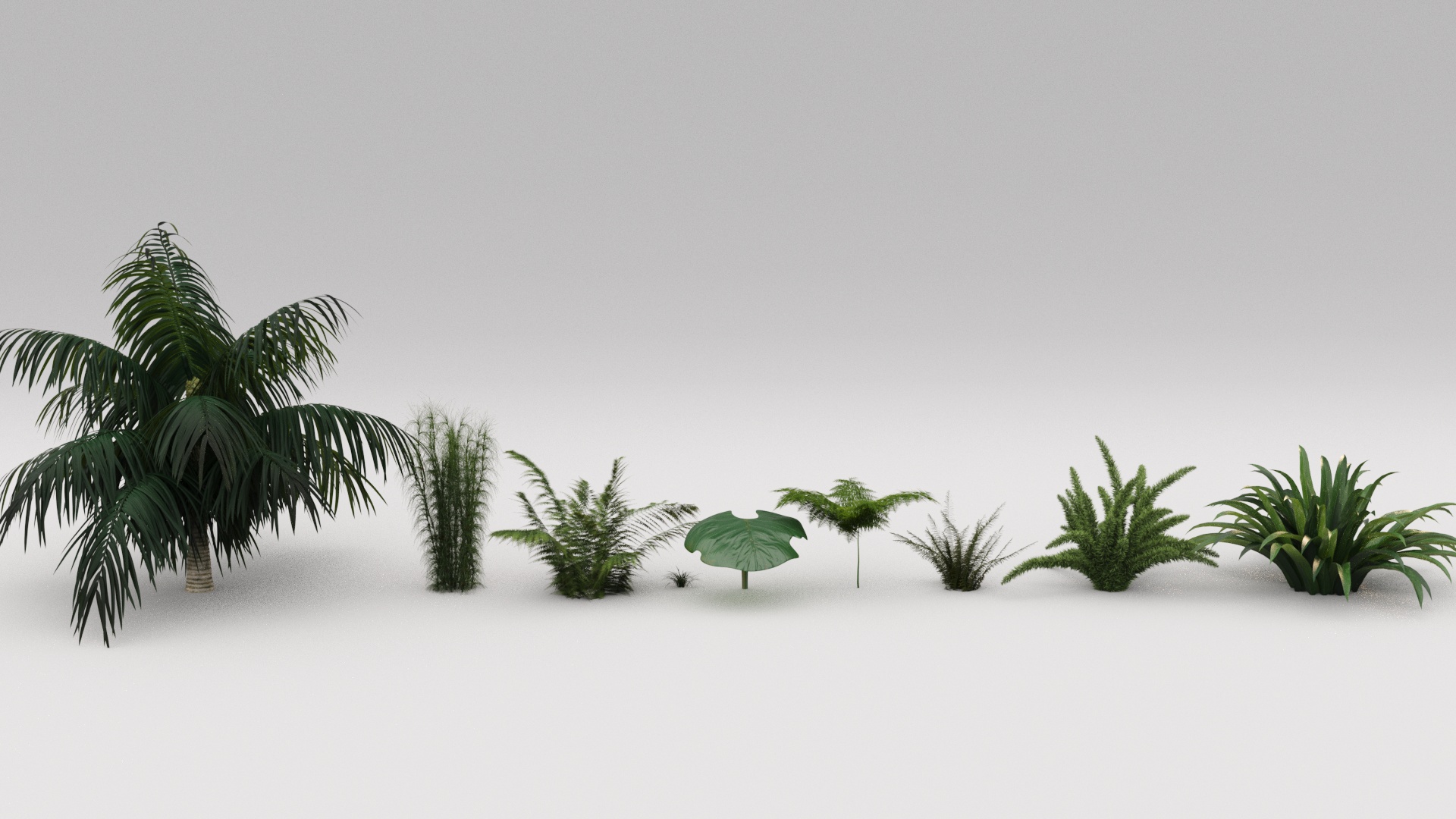
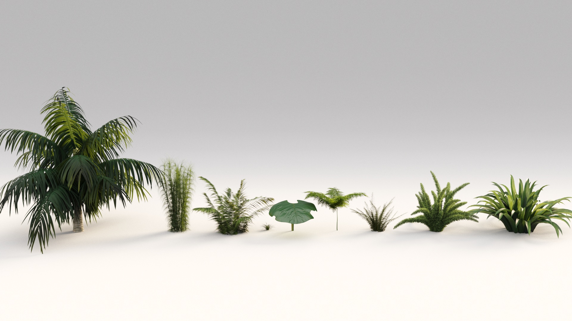
After determining the species needed – we needed to strategize how to best distribute and layer each plant in 3D. We knew most – if not all planting in this scene was due to be custom, so the primary scattering methodology was to layer the plants based on complexity, with the foreground plants having the most and background the least. Each plant type was assigned a separate forest scatter for editing after the fact in tree editor mode which was done to match the matte painting and the client’s landscaping plan.
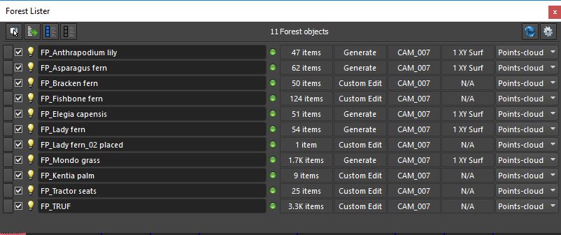
Forest pack layer system by plant type
White card – We always pack as much detail into the white card as possible as the placement of even the smallest accessories can impact your composition. We do not move on from white card until composition, lighting, architectural details and styling has been approved. This allows us to solely focus on finessing materials and textures in the next stage of production – color draft.
The plant creation is relatively straightforward. We now have an extensive library of GrowFX plants, that can be tweaked and changed depending on the type required by design. Most of the time there is a good base plant you can change parameters and maps on, to create something entirely new.
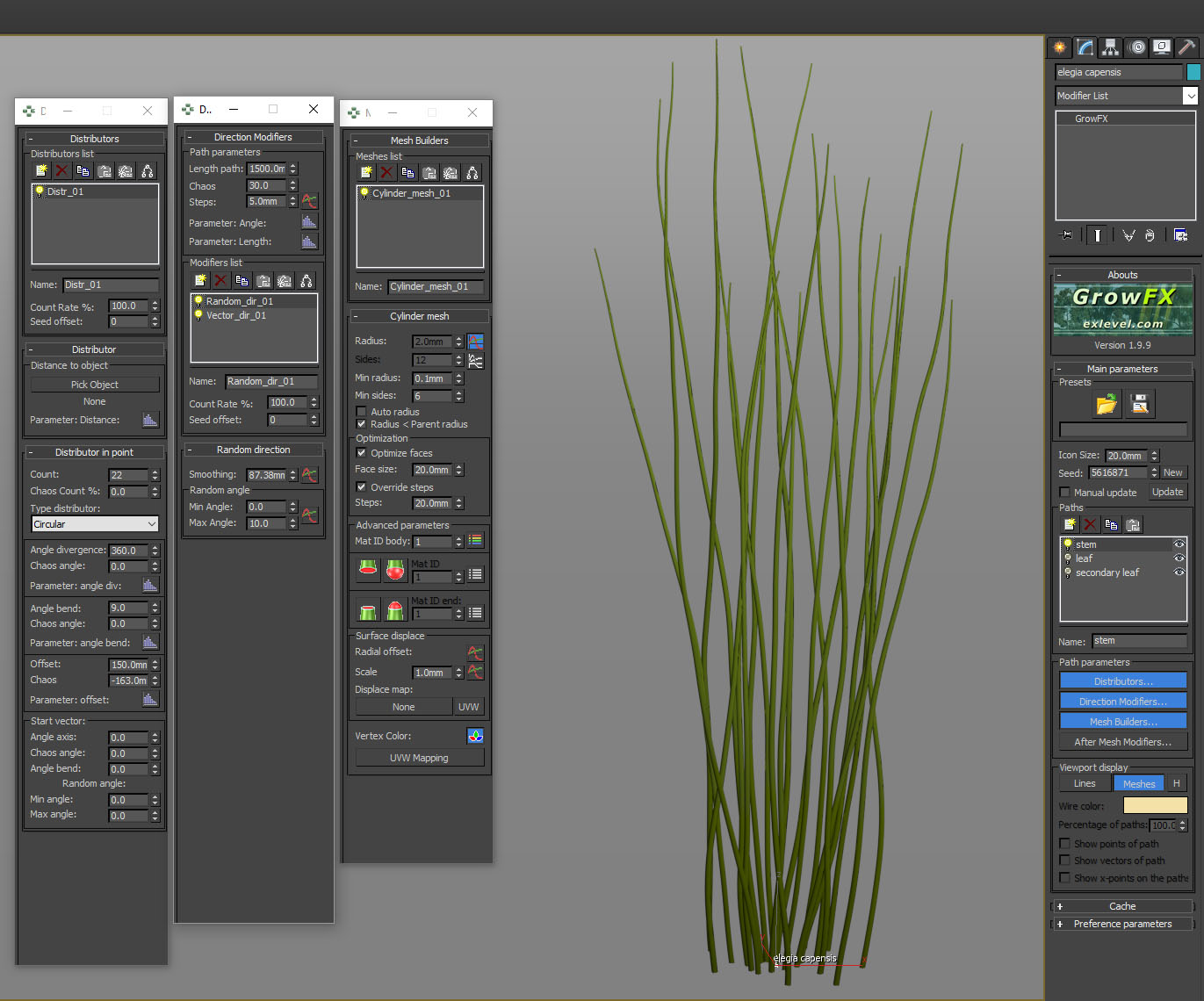
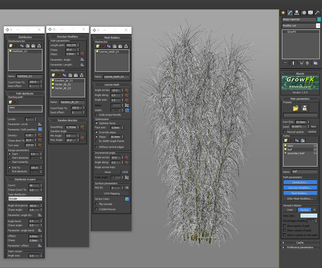
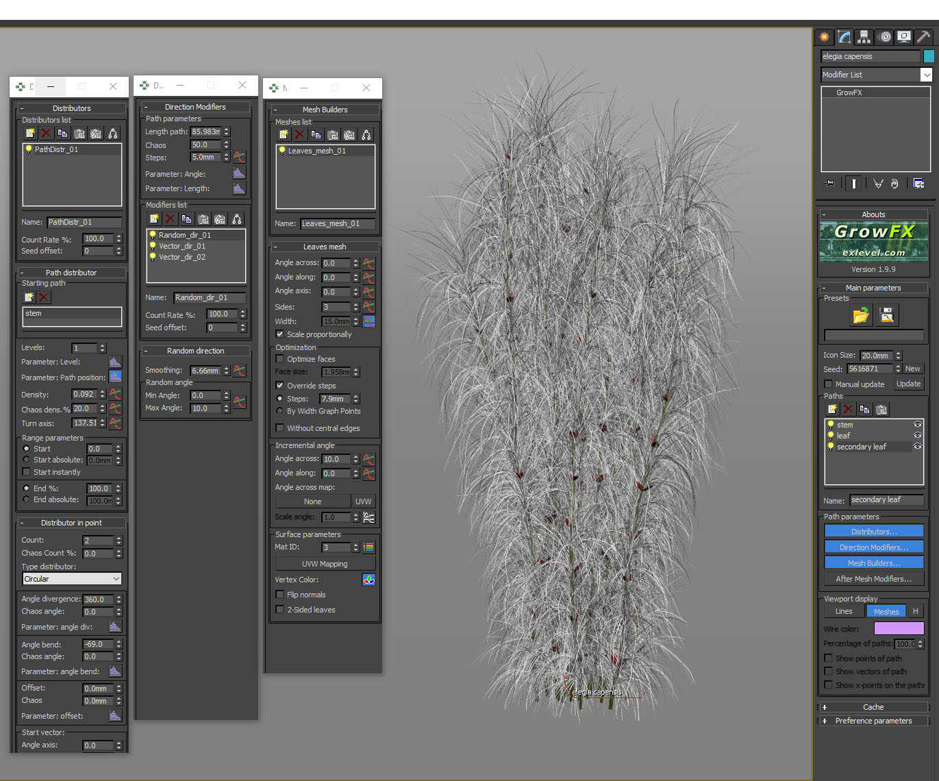
One of the custom plants we created for this job was Elegia capensis (Horsetail restio).
The creation of the plant was fairly simple. A group of stems were offset from their centre point with some random direction added and a vector direction to give them a little bit of downward bend.
plant creation 01
Next, the fine leaves were added along the stems at quite a high density. This ensured that when the light hit the plant, the majority would remain dark with only the sides highlighted by translucency. Random direction and vector direction was added to give it some variation and help convey the idea of movement.
plant creation 02
Last, a small red leaf was added up and down the stem.
plant creation 03
The great thing about creating fine-leaved plants and grasses like this one is that they pick up a lot of light and highlights in the geometry and you can get an impressive result without relying on high-res maps to obtain detail.
Texture Creation
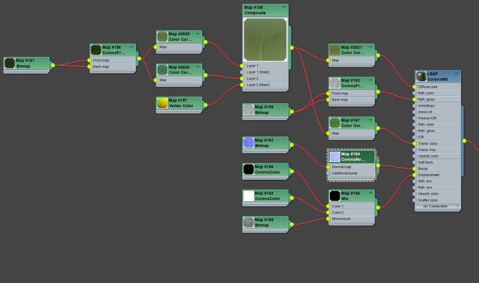
Leaf shader
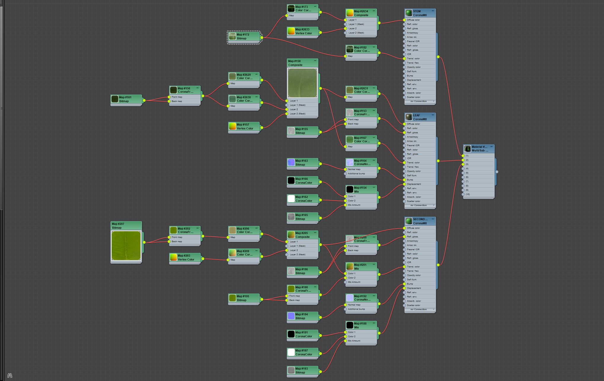
Plant shader
We try not to use too many maps in our textures as it can become quite a tedious task if you have to make changes to your scene. Vertex color helps significantly with plant textures gives the flexibility to tint leaf colors or creates black and white masks that can be blended in a composite node.

Vertex colour with green material applied

Black and white example to show vertex color range
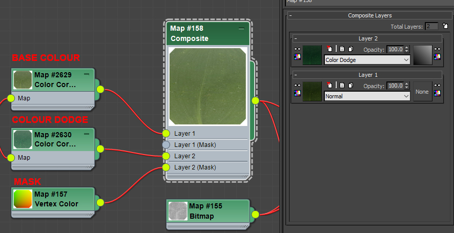
Leaf material vertex
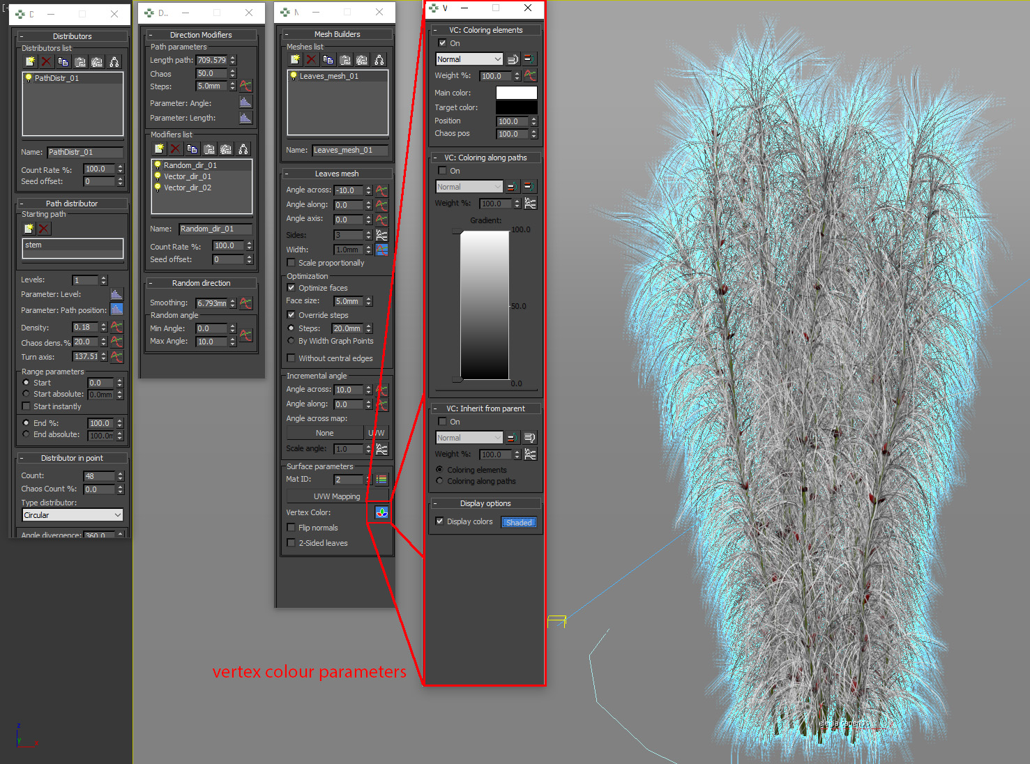
GrowFX vertex Colour
Vegetation Shading
Megascans has changed our workflow – having a selection of high-res maps that are pre-built for you is a game changer. We always tweak these maps to achieve exactly what we want in 3d which allows for the highest level of control.
Lighting
Due to the flat lighting in the shot, a corona renderer sun was added, tinted blue and then turned off in the interactive light mix. This meant that the sun was still visible in all our render elements yet would not affect the beauty (interactive light mix pass). This gave us the flexibility to paint in additional highlights and enhance the translucency on plants that weren’t picked up by the HDRI. (This can be seen in the plant test image).
Translucency Pass which will be added to each plant specie at varying opacity and blend modes
Reflection Pass which will be added to each plant specie at varying opacity and blend modes
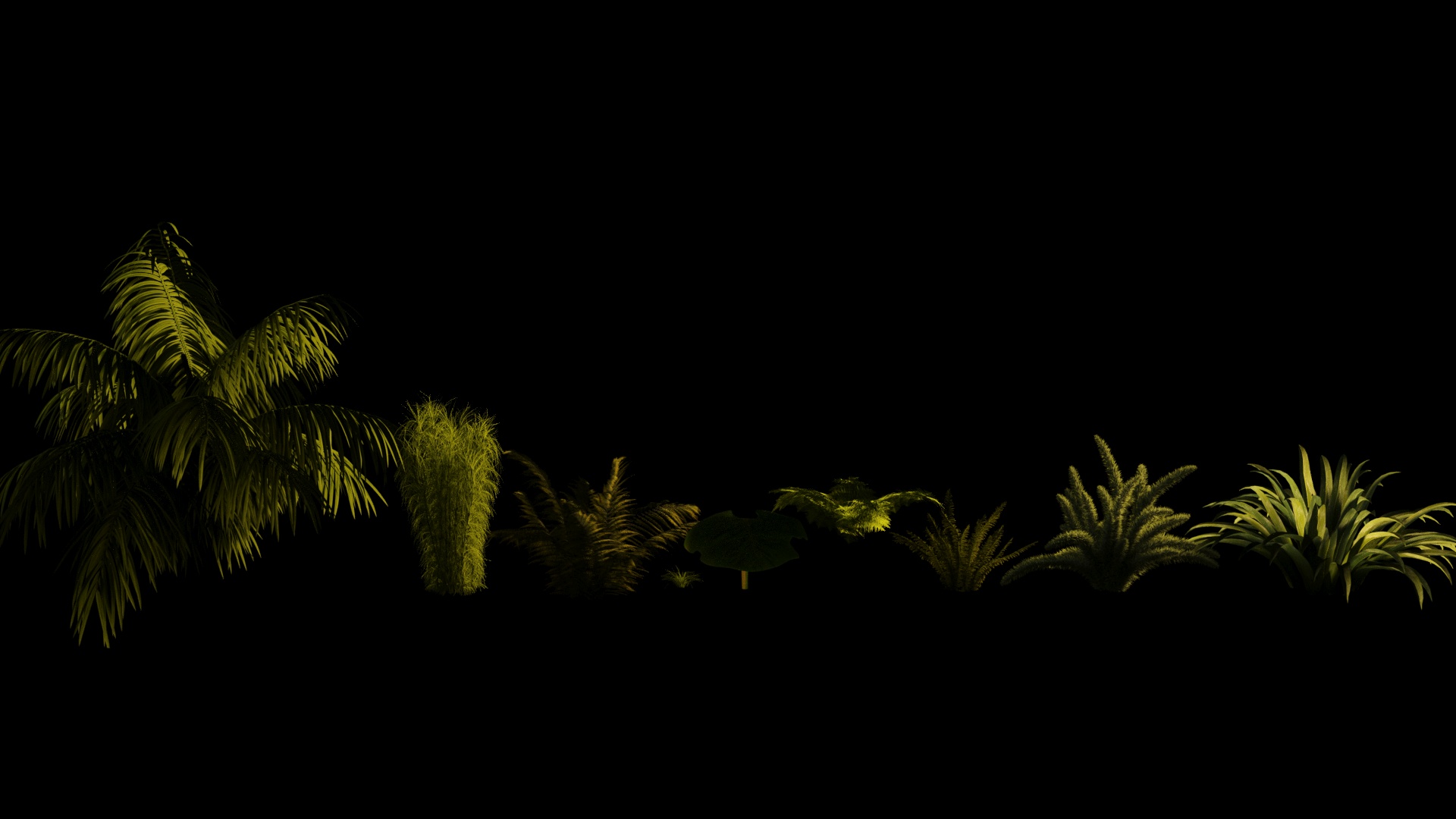
Plants material test – No sunlight
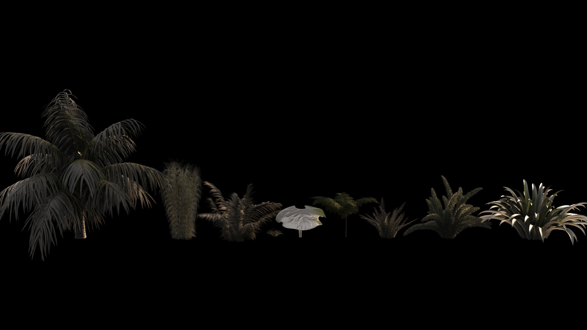
Plants material test – Sunlight
Post Production of Plants
Unlike the hero exterior, this image was post-production heavy.
We like to render the image flat to give more flexibility in post-production. The primary challenge was color correcting the greens so you can distinguish between each layer and species, without the image becoming flat.
We began by splitting each plant species into subfolders and applying a mask to each folder. This allowed us to control the color, contrast and amount of reflection/translucency passes we needed to add per plant type. We prefer this method instead of overlaying the render element pass over the whole image as it allows us to fine-tune each plant species.
The blending modes varied from soft light, overlay, color dodge, linear dodge, and screen. In some of the plants, we even used the reflection pass in 3 or more different blend modes. Following this, we used a ZDepth pass, and by crunching the levels in this pass, it allowed us to separate the foreground and background planting.
Then we add varying amounts of contrast between the foreground and background, plus the ability to blur, bokeh highlight and add noise to the plants in the very distance.
Raw Render
Plants colour graded and passes added individually to each specie
General adjustments
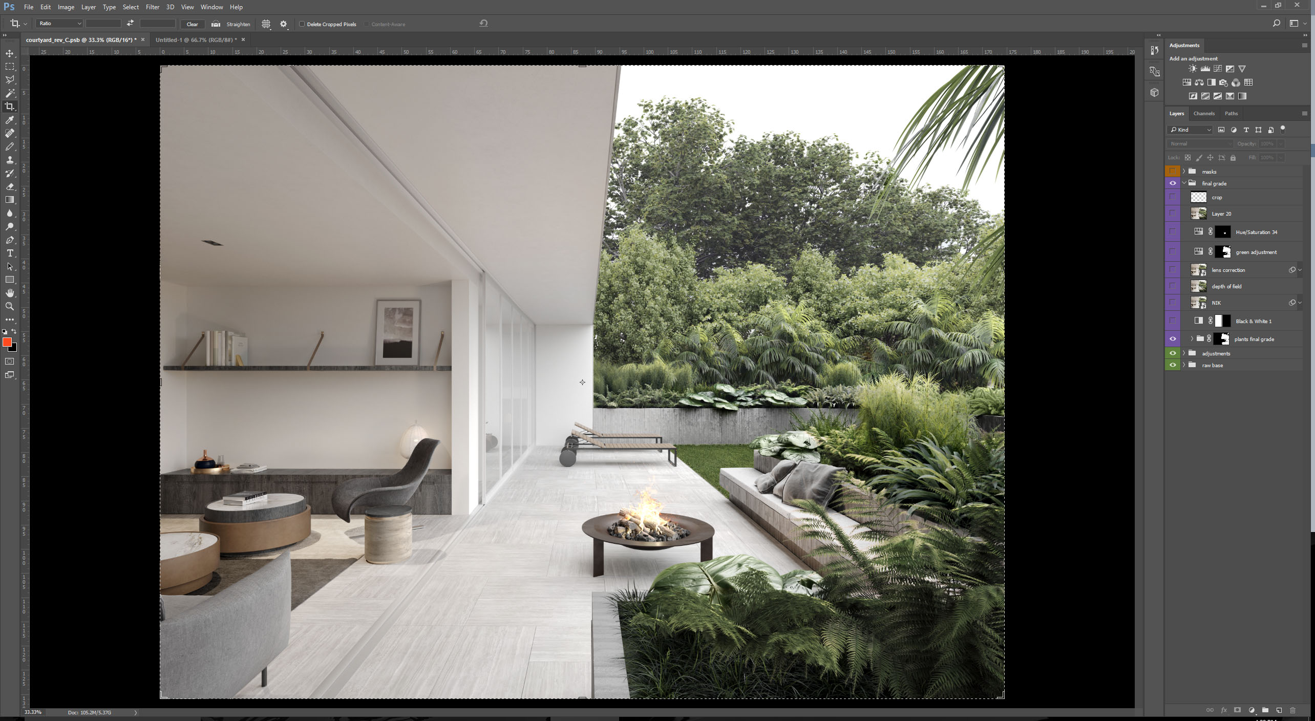
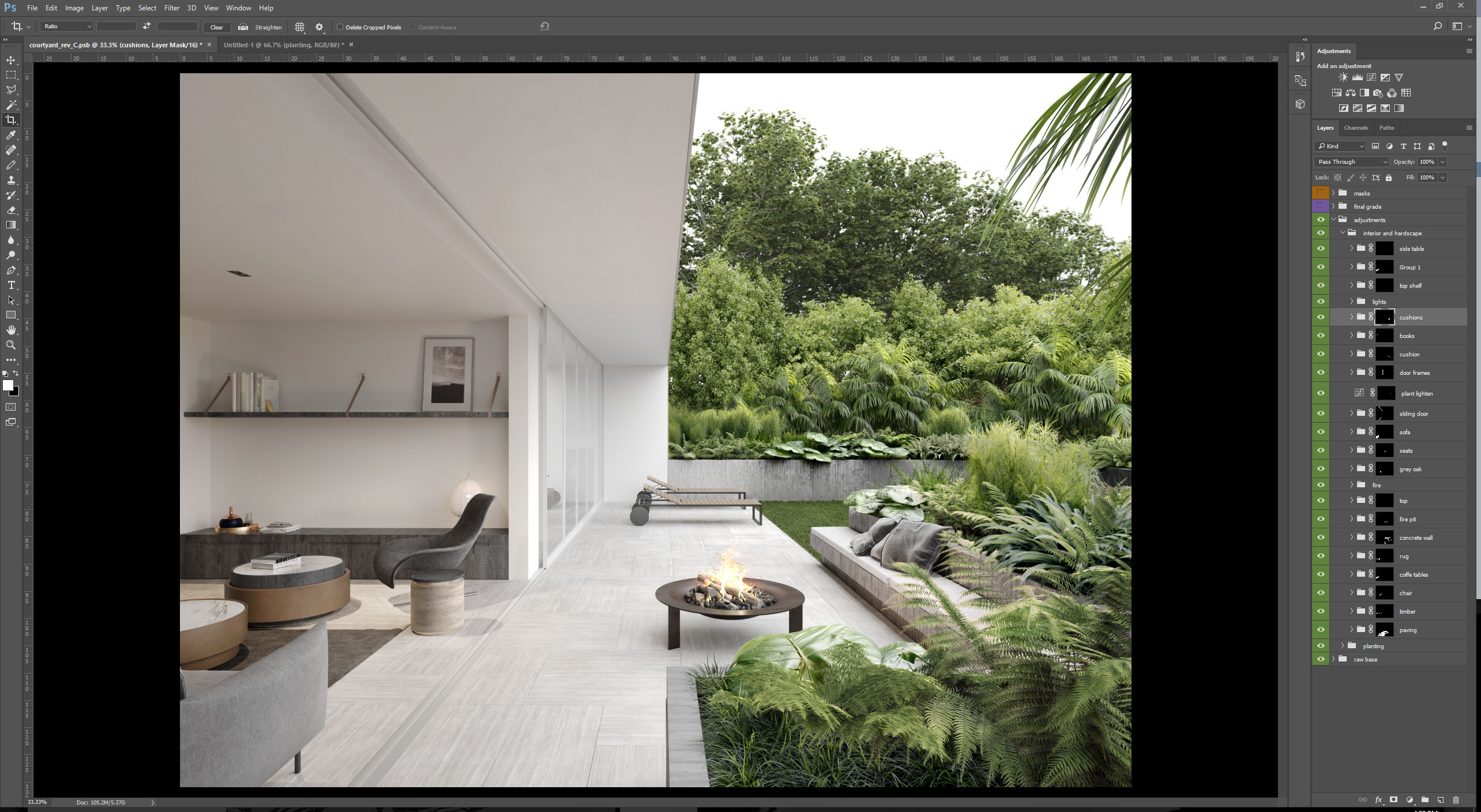
Plants final grade
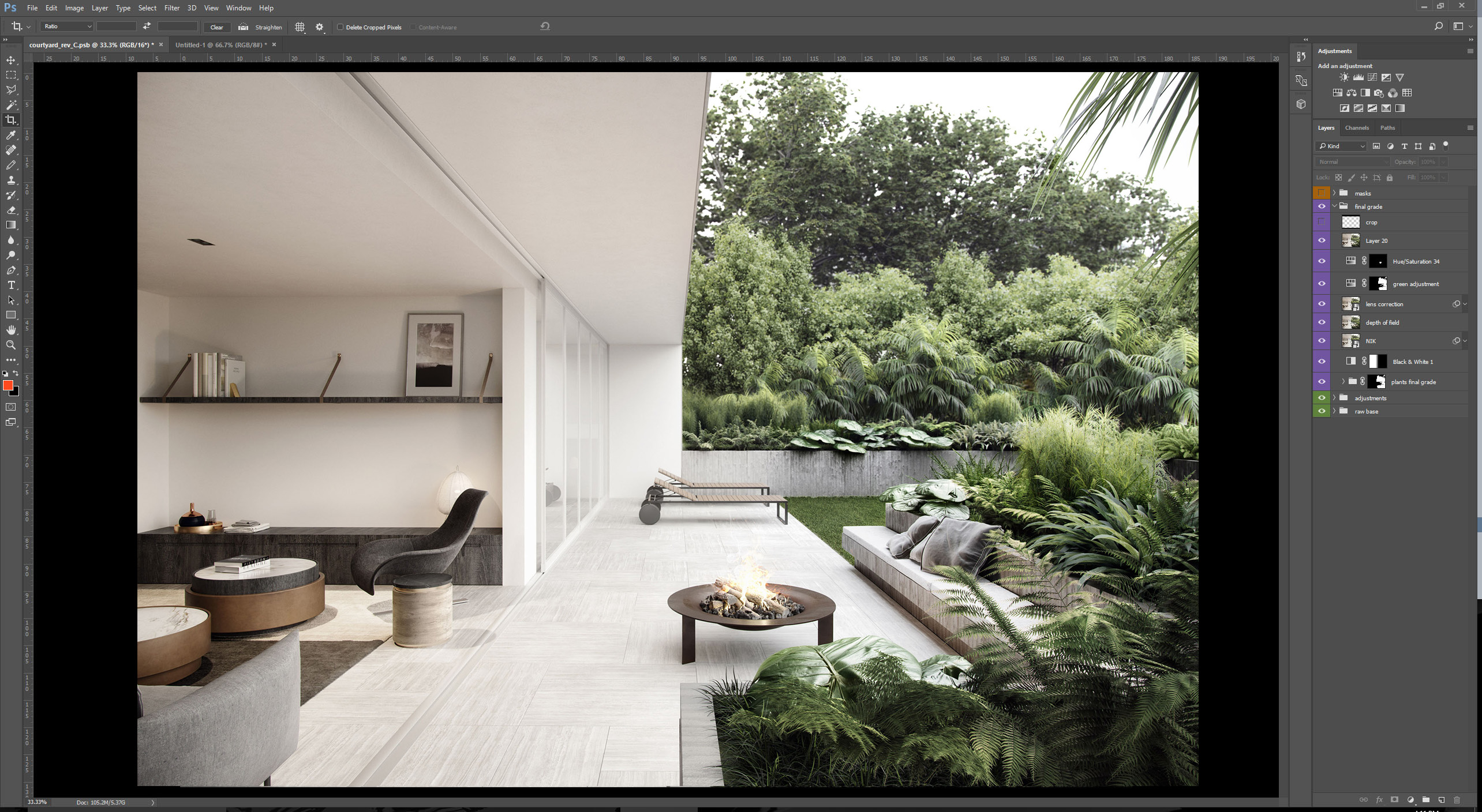
Overall final grade – the finished image.
Making of Edition in Parnell Conclusion
It was great to have a project where the whole team could work together and play a part in delivering one of our best set of images to date.
The images, of course, were driven by great architecture & design (Monk Mackenzie/Bureaux), an open and receptive client (LEP), well-considered branding/marketing/Art Direction (Studio South) and a great site/location (Auckland, NZ). If you are blessed with even 3 of these parameters you should be set up to deliver a great project!
If you would like to see the rest of the images, please visit our website www.mrpstudios.com
TEXTURED PLANT DOWNLOAD
If you would like a new plant for your collection – download here.