Revamp Of An Old Mill

Originally published at: https://www.ronenbekerman.com/?p=135886

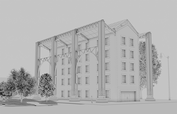
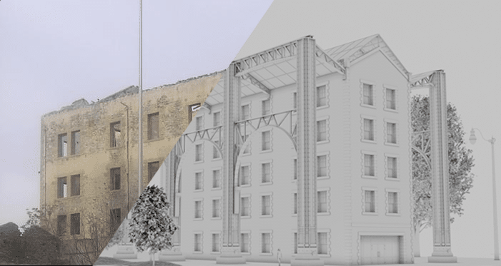
Finally got some time to continue with modeling and start testing the space. As I was exploring the surroundings and the history of the building, I decided to deviate from my original thoughts (a marble column construction) and I decided to invest on an industrial approach that would better match the history and the original purpose of the building.

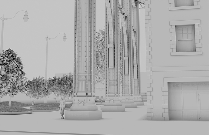
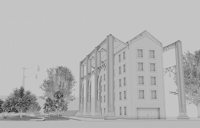
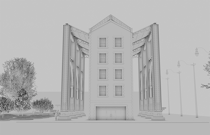
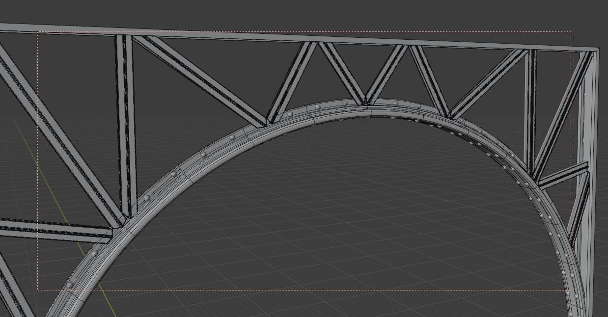
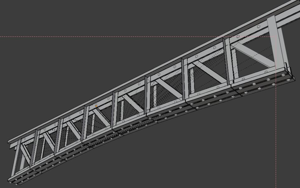
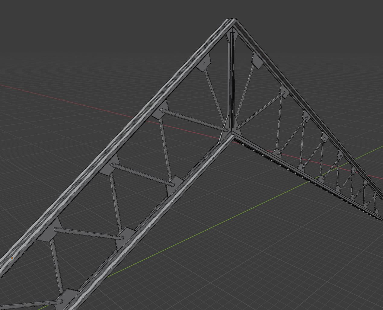
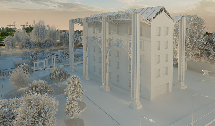
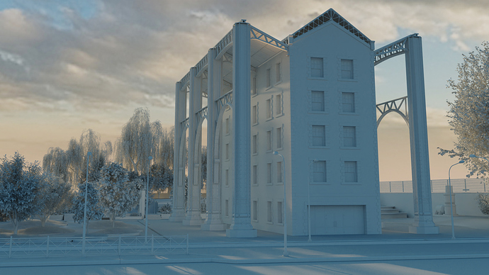
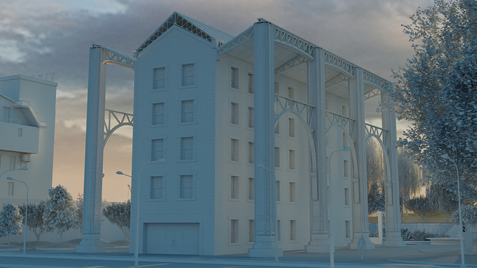
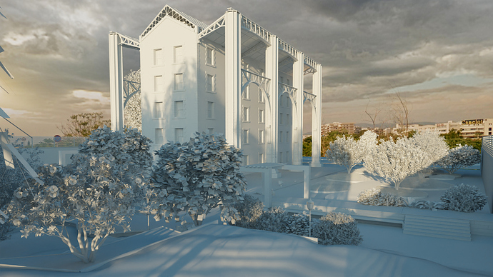
I found that cast iron and stone could work together just fine in producing such an industrial look and feel, so I start “demolishing” and building the new environment. It was important to me that the skin of the building remained the same, so what I’m trying to achieve here is to accent the qualities of the stone and the imposing geometric contours, by creating a metal construction that will embrace the building without superimposing itself on the main structure.

At this point of time I think I have almost finished the core elements of the outside of the building although there will be several more amendments. Once I’m done with that, I will continue with the landscaping (certain elements are already in place) and some of the interior spaces as well (especially the roof garden).

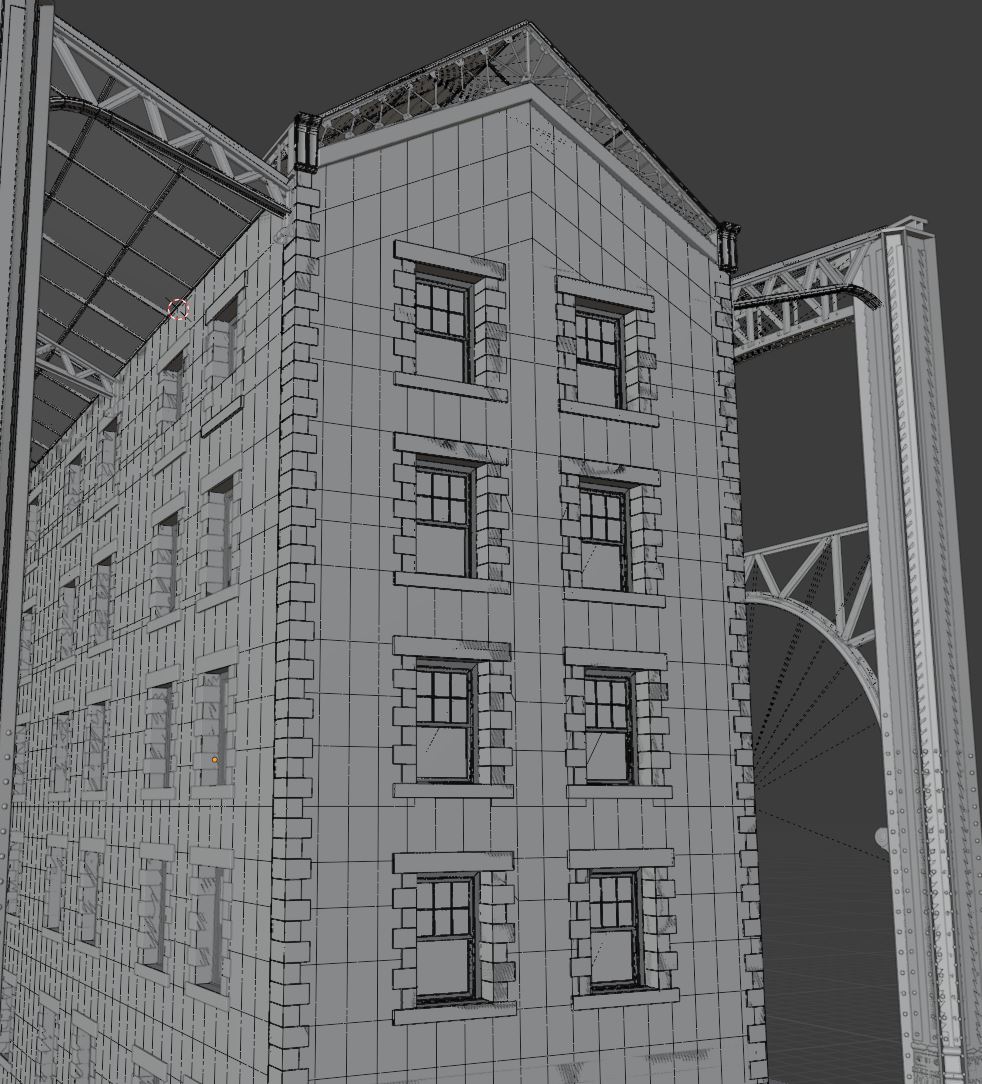
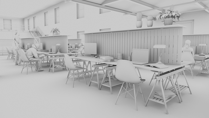
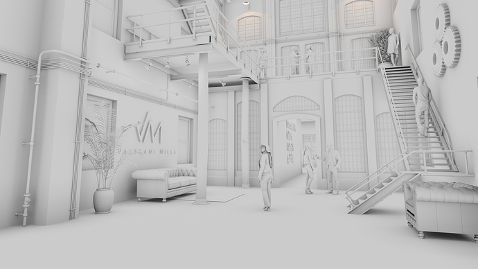
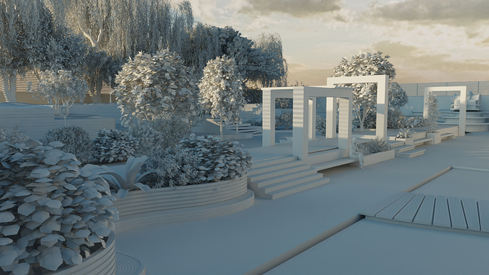
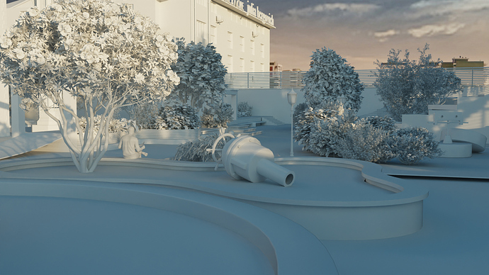
These are some AO renders that usually help me pinpoint any modeling discrepancies prior to continuing with materials and texturing.
Still a lot to be done as I’m not even halfway there, but it’s nice to explore as you go!

1 Like

1 Like

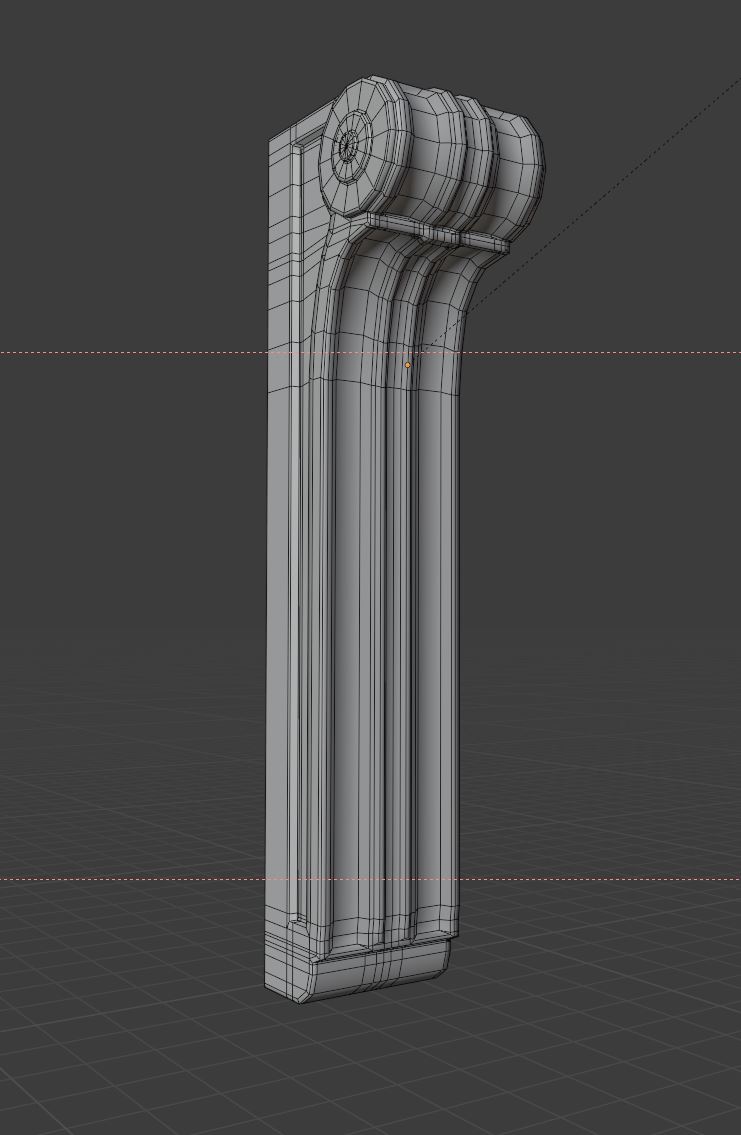
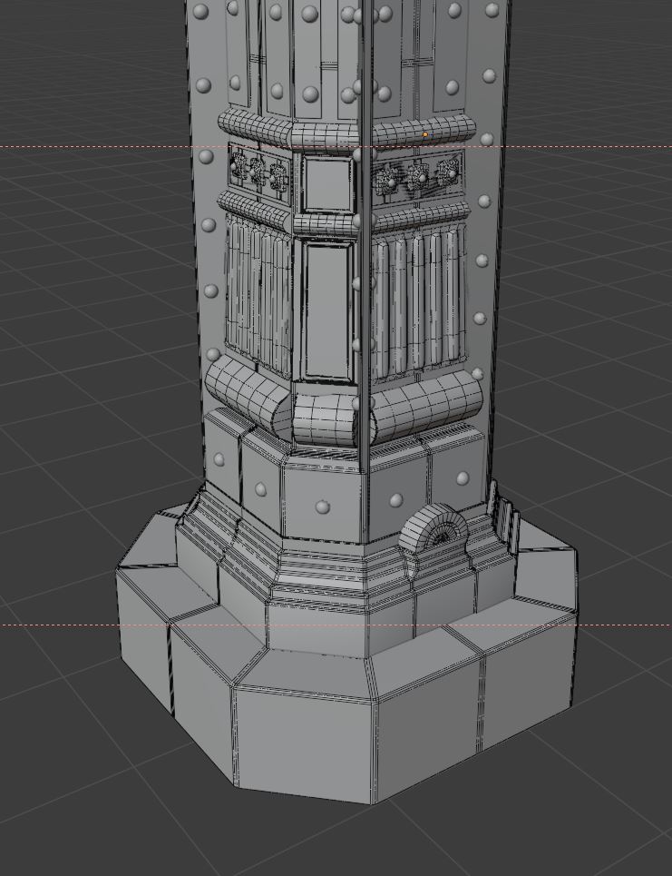
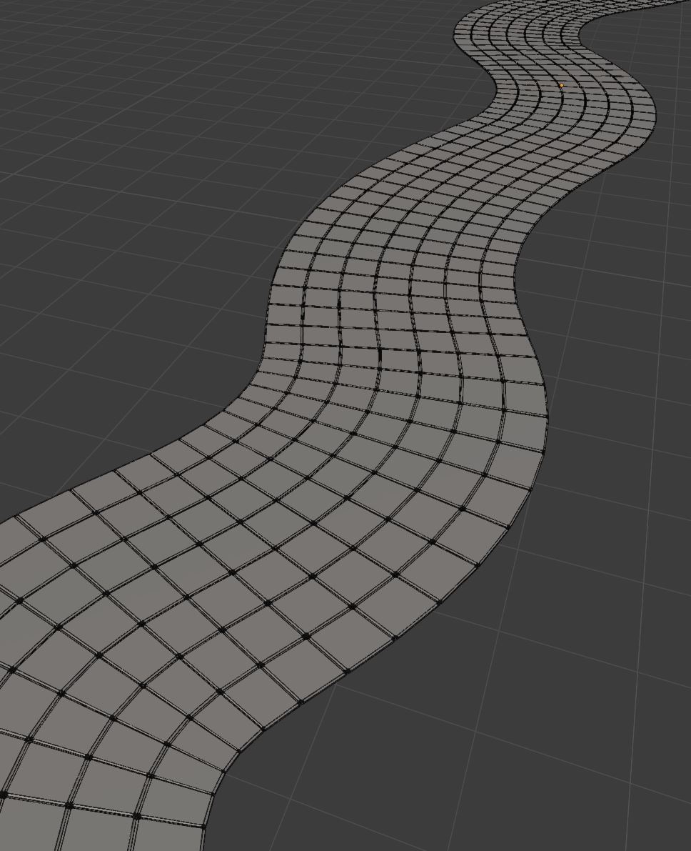
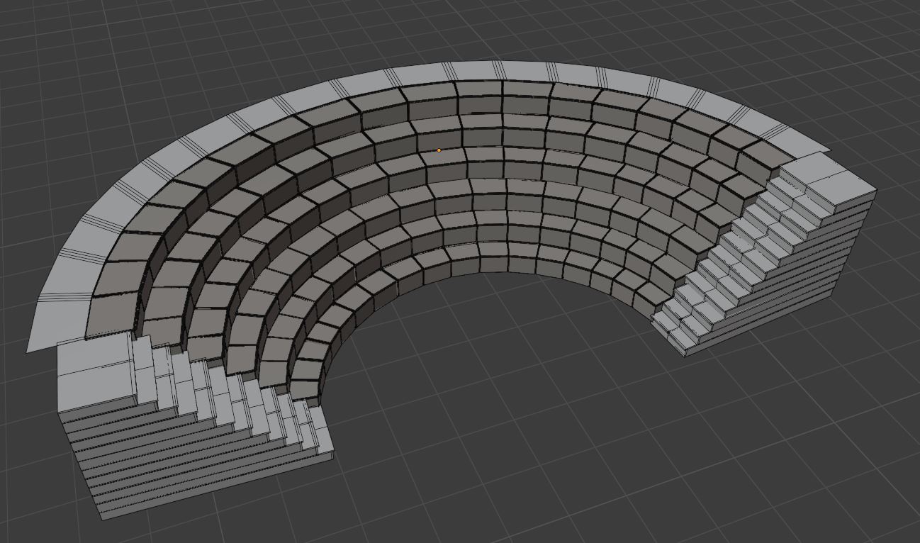
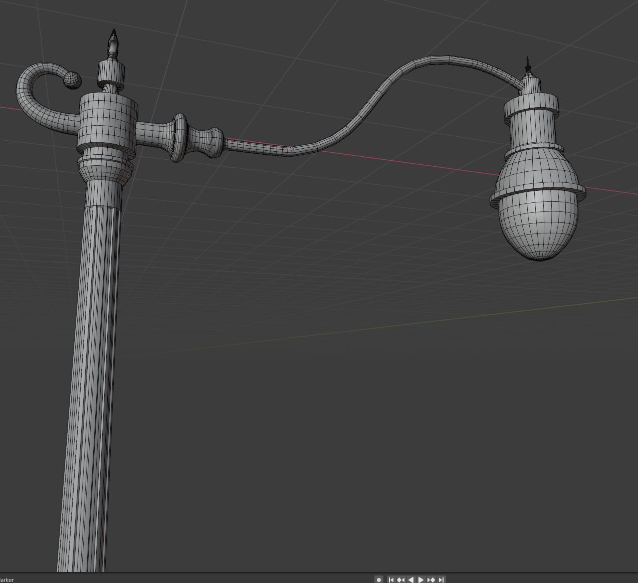
Modeling in progress…

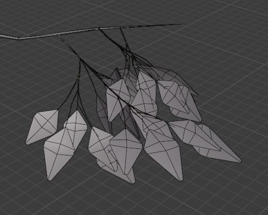
Leaves

1 Like

Looking really good. Love the attention to detail. A fellow Blender user I see :wink:

Thanks Atash!
Yeap, Blender all the way :wink:

Regarding the details, I think I’ve got to stop it at some point soon, otherwise I wont catch up with the deadline…

1 Like

I believe I may have the same problem.

Yes, I saw your wip, which is amazing and so highly detailed!!!

Thanks :slight_smile:
Almost finished with modelling, Then textures and scene population.

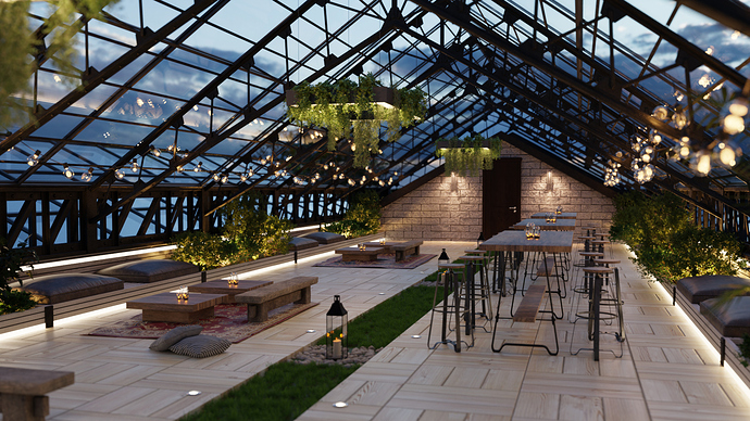
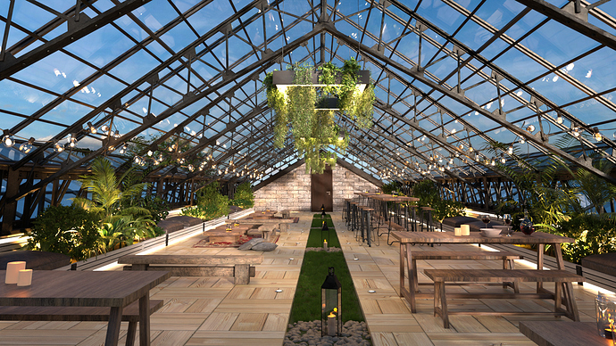
Almost done with modeling and texturing the roof garden. Now I’m testing my materials and the overall space arrangement with different lighting conditions (evening, morning). I believe that it still needs quite a bit of work especially in the morning shots where I need to further adjust the lighting and the angle of the camera.

4 Likes

This looks amazing! Great work!!

Thank you KartikLak!
It still needs a lot of refinement and I hope that I will make it on time :roll_eyes:

You are doing great with the material and the model part! Just a bit of work needed on the eve lighting! Then you are surely good to go!
Wow! your renders look so amazing, these shots made me so excited about this whole challenge and I cant wait to see more from you.
Thanks erfan3p!
Still working on the project…Hopefully I will upload some wip soon, but i’m still far from finalizing it.
Looking forward to your wip as well!

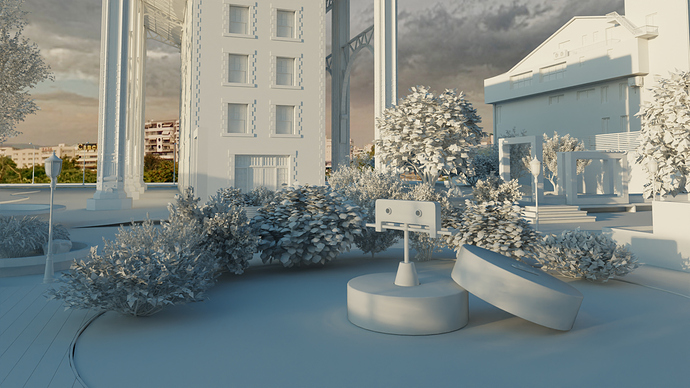
Almost finished with modeling (there are still minor things to be modeled) and now I’m trying to populate my scenes, test the materials and adjust the lighting. I’m actually going for an industrial approach so it should be pretty much brick, steel and concrete along with wooden flooring.

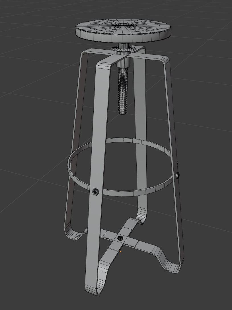
For the exterior, I decided to make it like an “open air” museum, with parts of machines spread around the place. Judging by the references I had, the machines were huge, so I “dismantled” them and placed different parts of them on several places of the exterior, blending them with the surroundings so as to give the visitor a sense of walking through time reliving the history of the building.

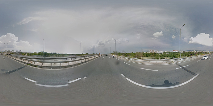
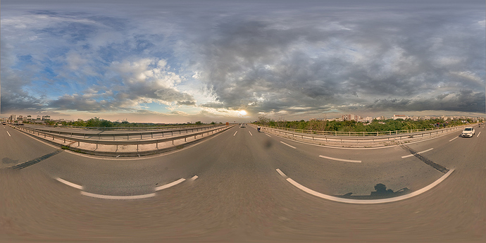
I also downloaded the panoramas matching the exact coordinates and processed them to match the lighting of my hdri sky. That was particularly helpful, since I only had to model just one building from the whole neighborhood and the rest were taken care of by the backdrops I created and by the environment texture.

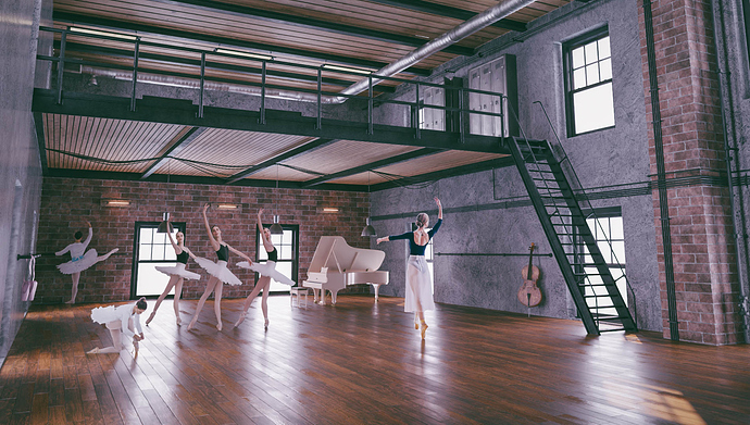
Other minor details included preparing my cutout characters for an interior scene (no ballerina cutouts available out there), and designing the logo for the building.

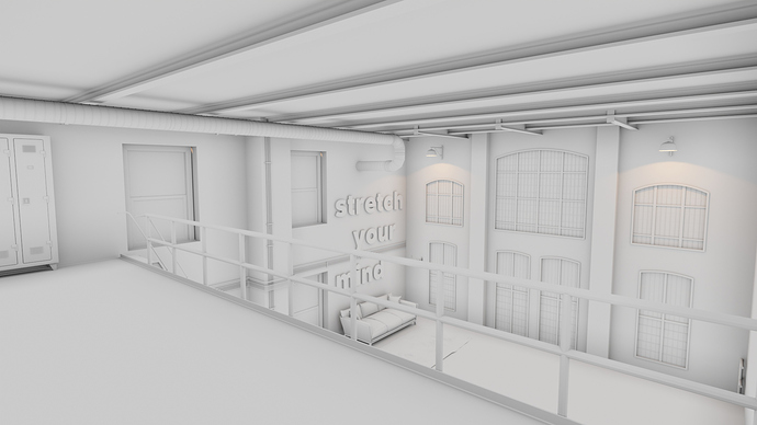
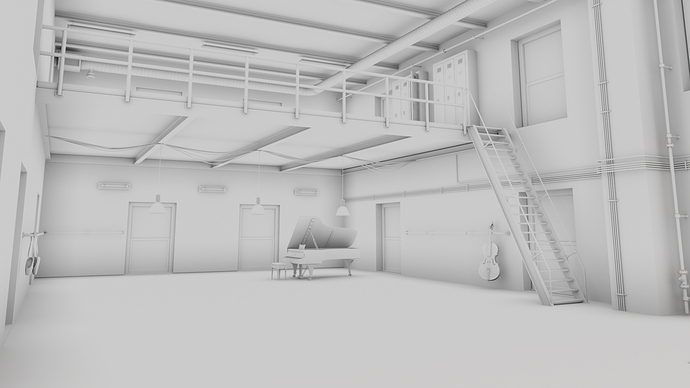
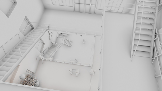
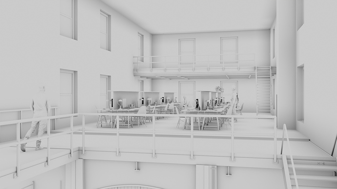
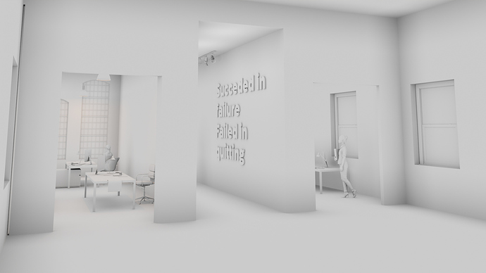
These are some test AO and clay renders along a rough render of the ballet room (still misses proper set-up of characters and lighting).

4 Likes

These are looking great @Artifictial - amazing progress! :slight_smile:

Many thanks Flowstorm! :smile: