rising sea-ty work in progress - composition study by flow

Originally published at: https://www.ronenbekerman.com/?p=127473

Hi everybody,

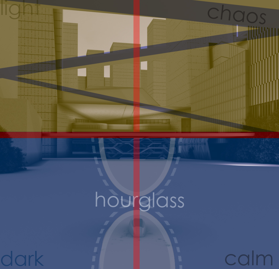
here’s a first composition study for one of the image I would like to submit. The base image (shown below as grayscale conceptual mass) has a squared composition and it is based on these main contrasts:

– light/dark: the upper part is the new city so it has to be lighted and full of life. Meanwhile the lower part has already been taken by Nature so it will be darker

– chaos/calm: the upper part of the image shiuld represent the speed of humans’ life (sloping lines) while the bottom has to represent the calm of the Nature (horizontal lines).

– hourglass: the concept of the project is based on “time”. Humans must quickly readapt their cities in a race against time. The shape of the Vessel and the wake of the boat on the water design a hourglass.

hope you enjoyed

Francesco

Hi Francesco, the idea of using contrast is a great way to tell your story, sending a powerful message to your audience through contrasting between calmness on the seabed, and the prosperity above the sea level.

However, hope you don’t mind I chip in a few opinion here, but I think since you are literally telling your story using 3 contrasting ideas in ONE single image, it might lose a bit of focus here and juggling too much at a time. I think an alternate way of doing it, is spread out the 3 elements into 3 images and tackle one at a time, focus on portraying that one single element through your composition and your subject architecture. This will make your final images more refined and easier to comprehend. It is important that your audience be able to easily understand your image, because after all the point of an image is to communicate and sending your message.

I have this idea because standing in the shoes of an audience, and looking at the image above, it took me a while to understand and form a coherent connection between the 3 elements and your theme. So this is just my 2 cents, hopefully it provides you with a different perspective to approach your concept :slight_smile:

Hi thanks for the reply.
Well I understand that the image I posted may be full of input but it’s just a memorandum of what are the aspects that I want to include in the image(lighting, lines, shapes). Please consider that the contrast is only one: human’s city/nature. The keywords I put into the image should only remind me what’s the “emotional aim” of the final result. For example the contrast light and dark is inside the same contrast city(lit)/nature (dark). The same as the lines city (various lines)/nature (calm of the sea). These words/contrast are referred to different fields as colors (lighting), and composition (shapes). All the most important picture in the past can be studied under those aspects. For example let radeau de la meduse de gericault (just to take one example) could be analyzed by colors and by shapes. Any paint of Michelangelo as well.
Of course…I’m not Michelangelo…
Anyway thanks for sharing your thoughts, I’ll keep them in mind.

F