A tower for you and me by Gabriel Radakovitch

Originally published at: https://www.ronenbekerman.com/?p=127697

Hi all,

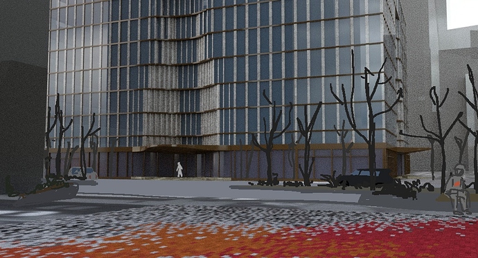
It wasn’t easy to get started. I don’t feel very comfortable with Hudson Yards gigantism and I prefer to work on smaller projects. The solution I found was to work on something simple, at a human scale. The concept is a square vibrant of colour to contrast with the grey glass-cladding buildings of the neighbourhood. In the middle of it will stand a small tower carved of wood and common materials. The tower will act as a public space, a bit like the Vessel. It will be surrounded by benches.

This isn’t very futuristic and might be off the subject but I want to address the issue of glass tower ageing. Beside not being a very ecological solution, glass tower often fade a lot with time in my opinion. In the images, I will try to show the impact of time on Hudson Yards through dirt layered textures. New York tomorrow might not be as wealthy as it is today and taking care of this glass giants is very expensive.

I choose 35 Hudson Yards to be the background of the first image. This is the tallest residential skyscraper in Hudson Yards. However it contains only 143 flats and the less expensive costs $4,250,000. Not affordable for everyone… On the contrary the square will be accessible to all visitors. Contrasts again, I love them !

I modelled the 35 Hudson Yards first. I knew it will play a core role in the images. I will be happy to share the model if anybody needs it. Let me know in the comments. I am quite new to 3DS max so any feedback will be appreciated. Good luck to all !

3 Likes

Hi Gabriel, I think you’re on the good track in terms of concept direction. 2040 doesn’t have to be futuristic and shiny, and who knows it might be dystopian or even a post apocalyptic world!

Have fun with exploring and looking forward to your next round of updates!

1 Like

Thank you for your big generousness of willing to share the 35 HY 3d model Gabriel! :hugs:

I think your proposal reminds us why we usually enjoy an open competition like this as it gives us the chance to see many points of view, some overall aerial canvas along with some particular eye-level pictures.

It definitely a near future for people to look at how public square should be "re-think"ed. Your unique approach is bringing back a lot of childhood memories from me with that tiling-colour palette! And really love how you present your concept by not skipping the abandoned ones to give a sense of brainstorming development.

Can’t wait to see your next update! :+1:
Best wishes,
Duy Phan

1 Like

Welcome to the challenge, Gabriel! If you like - I can host the model as part of the challenge model pack…

1 Like

Hi Duy, thanks for your encouraging message ! It really cheered me up.

1 Like

Hi Ronen, it’s a pleasure to talk with you. Thank you for all you offered to the archviz community so far. Your blog is a gem for every new artist !

I still need to operate some slight modifications on the model. I will post a download link here tomorrow. It isn’t perfect at all and two of the bottom facades are missing. However I’ll be glad if it can help anyone. I’ll let you be the judge of whether it shall be included in the pack or not.

1 Like

Download link for the 35 HY rough model : https://we.tl/t-JgMbAMhvCx

2 Likes

Thanks a lot @gabriel.radakovitch :pray:

Thank you @gabriel.radakovitch

How did you put the material ids on the bricks?

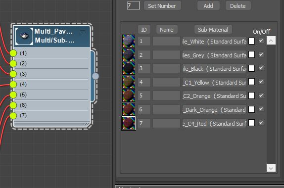
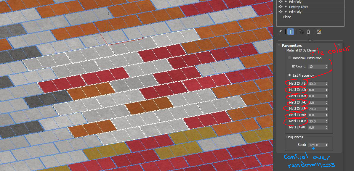
I scattered an object containing 25 bricks all over the square (there is about 600 of them). Each one of the objects has a material by element modifier attached. I created a material for each colour of tile and merged them into a multi sub/object material.

MatbyElement_02

The multi sub/object is applied to all the objects (of 25 bricks) and I can control the percentage of each colour using the Material By Element modifier. The randomness is controlled using the uniqueness parameter.

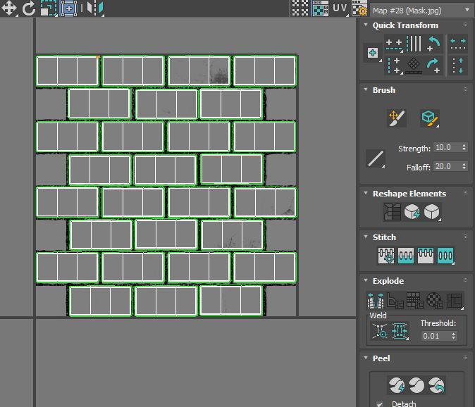
The only problem is that the tiling appears on the plain colourful areas. If I need a close shot of one of this areas, I’ll probably tweak some of the UVmaps (by moving the clusters around) to add some variations.

MatbyElement_03

Hope this is helpful. I am a beginner so any comments or advice is welcome.

1 Like

This is cool! I love the entrance to this building and you’ve done a great job modeling it so far!

1 Like