Originally published at: https://www.ronenbekerman.com/?p=117633
I found an image on the internet that framed part of two spaces, the main hall and the main entrance, they contrasted with each other in such a way that it seemed to me as a good place for a composition that emphazised the interaction between architecture and light.
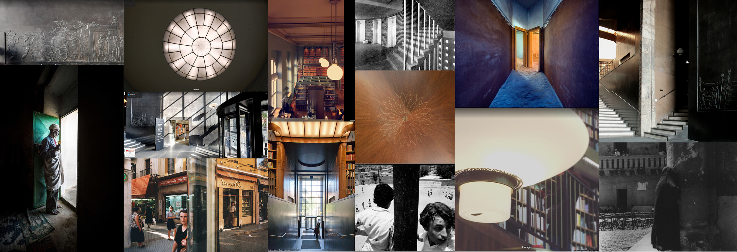
The camera angle was pretty much decided so it was just a matter of fine tunning the position, deciding on the lens and the image aspect ratio. I decided to go for a center composition to accentuate in the contrast between spaces, so that it felt almost like a dyptich. After finding some more references I decided I wanted to for for a contrast of bright lights an deep dark shadows, I also wanted to use color in light in order to diferentiate spaces. A vertical aspect ratio was used in order to narrow the frame and make the image look more dichotomic.
Modeling and shading with detail was pretty essential.
Post was very simple, I just added a little bit of detail and fixed color.

