Green Living #7 by Daryl Tebug

Originally published at: https://www.ronenbekerman.com/?p=128683

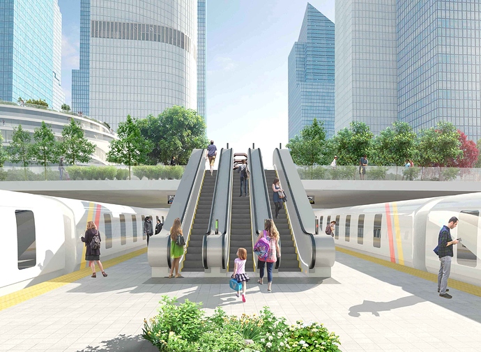
This image shows the transport connection for my chosen building to the rest of the city. I especially like this idea because it shows the building functionality and how it fits within the city’s topology.

1 Like

@tebugd Nice work Daryl, I like the whole clean morning vibe.

If I could offer you a small suggestion for improvement on details, that would be the lighting direction and intensity of the cutouts. Don’t get me wrong, some of the cutouts are fitting in the scene like a glove, but for example the 2 gentlemen by the train on the right, and the guy on the far left running up the escalator, those might require a second look in their lighting direction.

Keep up the hard work, and looking forward to seeing your other entries.

Cheers!

Tony

Hi Daryl, nice work. I would suggest to work both on textures (adding more details) and people. Consider the season when the image take place: some of them are dressed like they are in summer and others in autumn (they wear coats). Then I suggest to have a look at the shadows: the man on the right make a shadow coloured differently than the train’s one despite it should have the same colour (the floor is the same).
I hope this could be useful for you.

Hi Francesco,
Thanks for the critique, i find it valuable. Will take another look at the points made and put it into action.
Hope your project is going well.
Kind regards,
Daryl

Tony,
Thanks for the comments and thanks for liking the progress on the image. I appreciate what you have outlined and I intend to fix them up for the submission.
Hope all goes well with yours too.
Kind regards,
Daryl