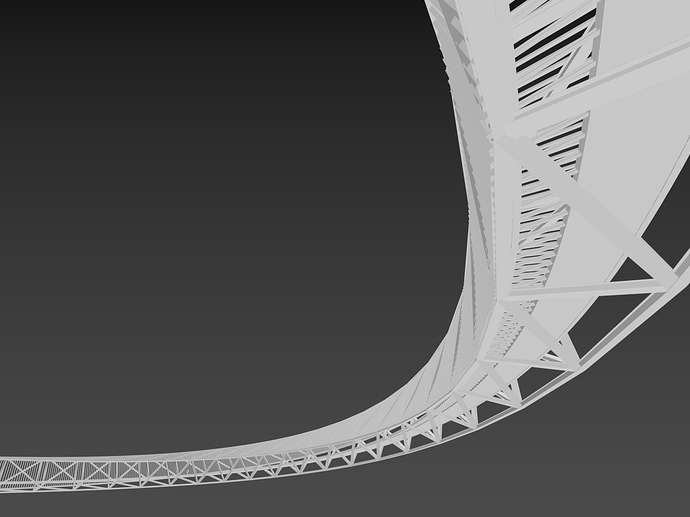
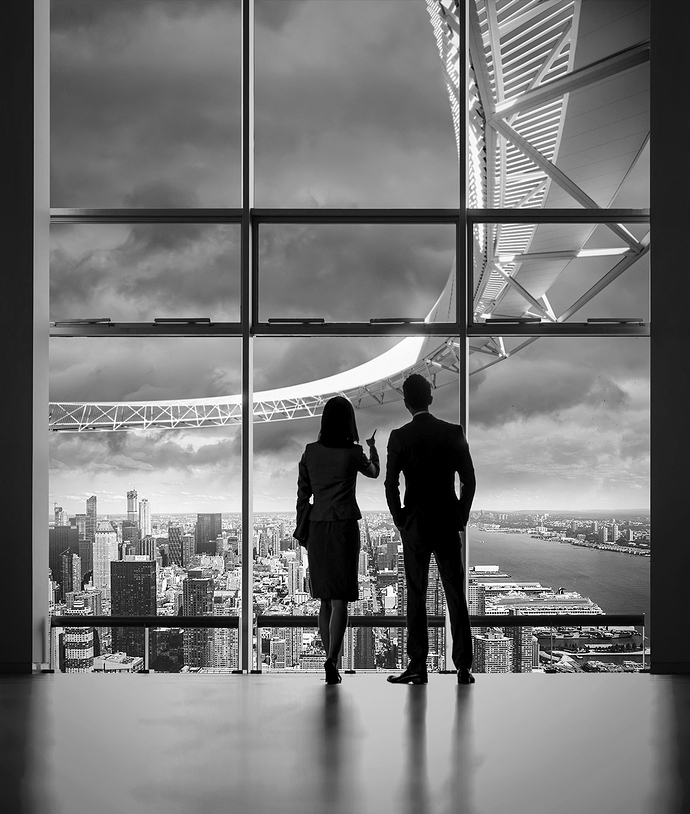
Briefly speaking, What we have for this week update is 3d modelling for the main design and some close-up frame tests.
A . First, Have a look at what I came up with for the ARM model:
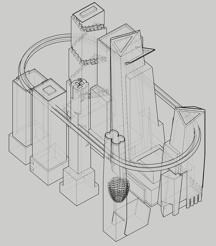
I started with Sketchup from the beginning. Things are still simple back then so it wouldn’t hurt anyone as long as I don’t do anything further than estimating how big the ARM should be and its position according to the surrounding towers.
Sketchup model screenshot
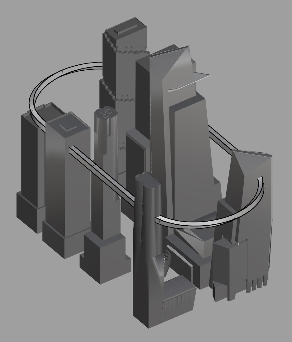
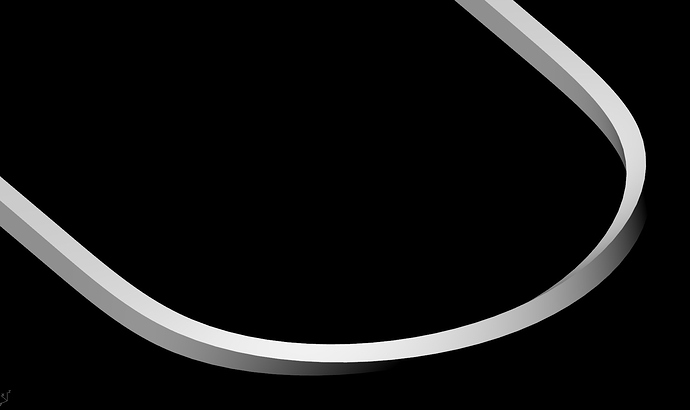
With the estimated dimensions, I remodelled the design in Rhino and started to tweak the massing from there. Considering the ARM as a Sky-Line for pedestrian, there will be a need for providing different visual experiences on this route. By dividing the structure surface into four silk-bands, which is four faces of the squared tube, two out of these silk-bands are selected to perform a curtain lurve. The curtain lurve, along with transparent structure, will gently give a soft visual-transition for the visitors. They parallelly twist side by side each other along the ARM looping-route.
Rhino model screenshot
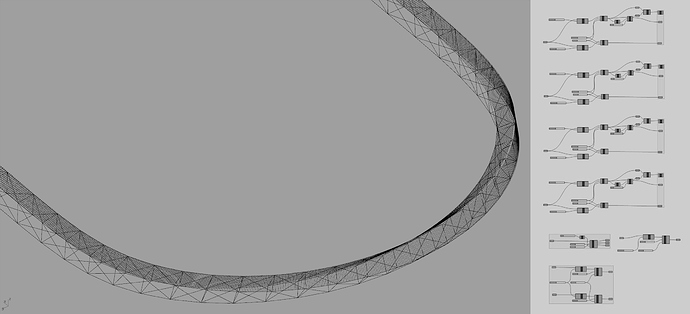
In order to achieve the “right” grid for the twisting tube, I used Grasshopper to populate those faces with triangle modules. When the structure lined-frame seemed right, I export them all into Max and sweep them with the wide-flange profile. A similar method was applied for the beams supporting the standing platform and the platform itself.
Grasshopper in Rhino screenshot
B . Now that we had the basic skin and bones for the design, it’s time for some lighting and composition test:
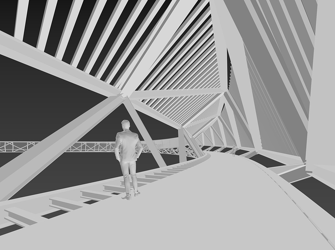
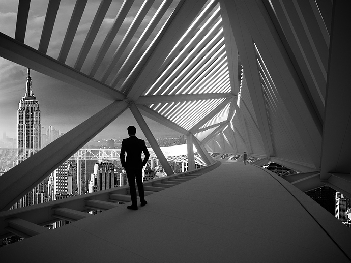
1. Test 01 is a come back for the existing composition of Frame 04 from the last update.
Max T01 screenshot
This image will put the viewer inside the ARM and become the sky-line pedestrian, looking down to the busy street network of NYC while walking around a 300 meters high bridge.
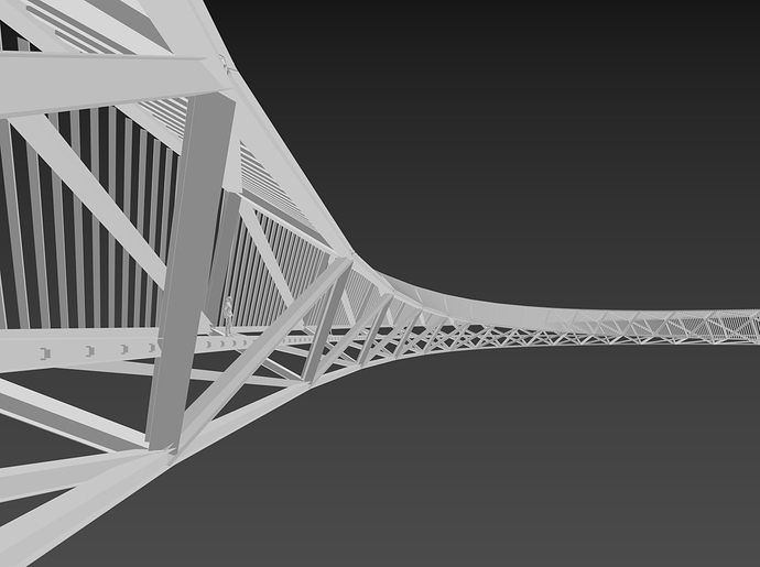
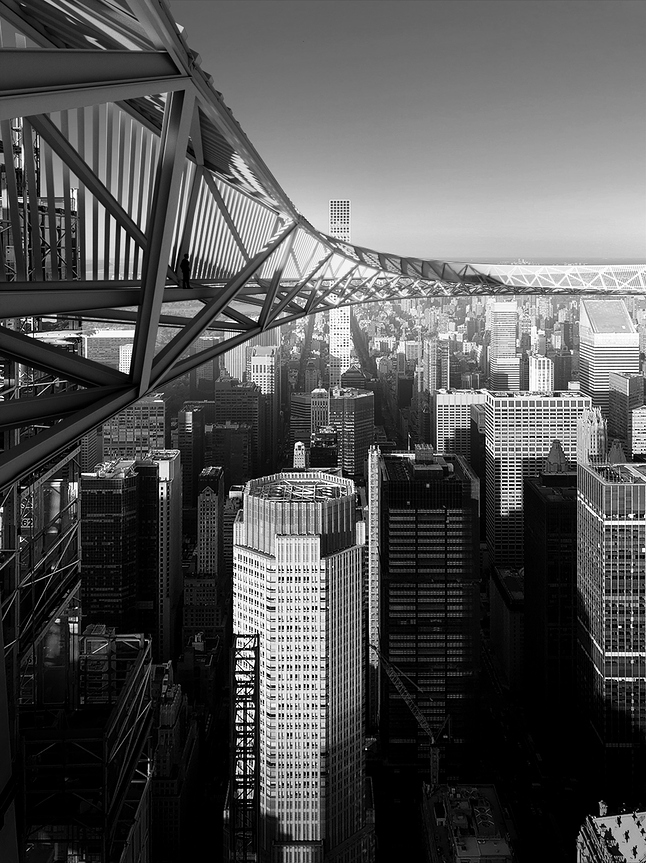
2. Test 02 blends the ARM with NYC concrete-horizon by giving the view-point from an adjacent building terrace with the same level of the standing platform.
Max T02 screenshot
3. Test 03 brings in the experience of the office worker in the attached-towers, looking out of their building windows and mention with each other about their plan of having lunch together over there.
Max T03 screenshot
For the purpose of experimenting and matching the light balance of the render images with its backgrounds, I used black & white for this time. The background images purely played as an investigating factor for composition and shadow-light placing, they might need to change in the next updates.
Thank you for reading all of this and feel free to drop any thoughts if you see things that should be fixed in the comment below.
Best Regards,
Duy Phan


