In between the GAP_Work Process May 16th by Duy Phan

Hi guys,

I hope you are all good and doing great these days! It has been a long process for the competition and it’s fortunate that we have a bit more time thanks to the extended deadline to wrap up our works.

This might be my last milestone update before the final submission so if you guys see anything that could be improved with all the views please feel free to leave your thoughts in the comment, much appreciated! :blush:

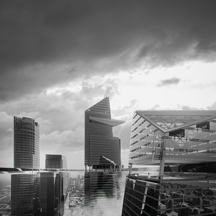
This is the third image in the main three I am after. The view sets the sky horizon right at the ARM level where it slices through all Hudson Yards towers and unites them into a sky platform, visually and physically connecting citizens living within those giants.

I am still on the hunt for a colour scheme of this one so the update sets a B&W as my composition sketch.

After this post I hope I can manage to see you guys in the final and wish you all best luck! :+1:

Regards,

Duy Phan

6 Likes

Oh yeah! That’s what I expected to see… well done. Sincerely…it stands on its own also in B/W. For me is a big yes.
I found this challenge very funny also because it’s possible to talk with other designers and have their suggestions (I’m waiting for your comment on my latest post :wink:)

1 Like

Thank you so much @Flow

So glad you find the B&W interesting! :pray:

And couldn’t agree more with you about how enjoyable we all are so far with the contest! :metal:

I am sure we are all benefiting from interacting with each other the whole time :hugs:

Keep in touch Flow and hopefully I can manage to see you all in the final! :wink:

Cheers,
Duy Phan

1 Like

Hey Duy Phan,

It’s a great view. I love the atmosphere of the picture and how your “ARM” fits into the architecture. Very beautiful!

What I noticed was the reflection on the building in the lower right corner, they are very striking. I would have smoked them up or added an uneven bump on the glass. I also think there’s too much steam at the bottom of the picture and right in the middle.
But that’s my opinion :upside_down_face:
On the whole, I really like your pitch.

And another question, are you going to leave it in black and white?

Thank you for the nice words, I love that we all support each other and give advice, it’s cool! :hugs:

Good luck!
Looking forward to the final images from you :wink:

Regards,
Roman

1 Like

Thank you so much @idesigne4 Roman! :grin:

You’re very right about that corner reflection :sweat_smile:

I am working on it and here you give me a really solid solution to consider! :pray:

Wish you best luck man! :+1:

Cheers,
Duy Phan