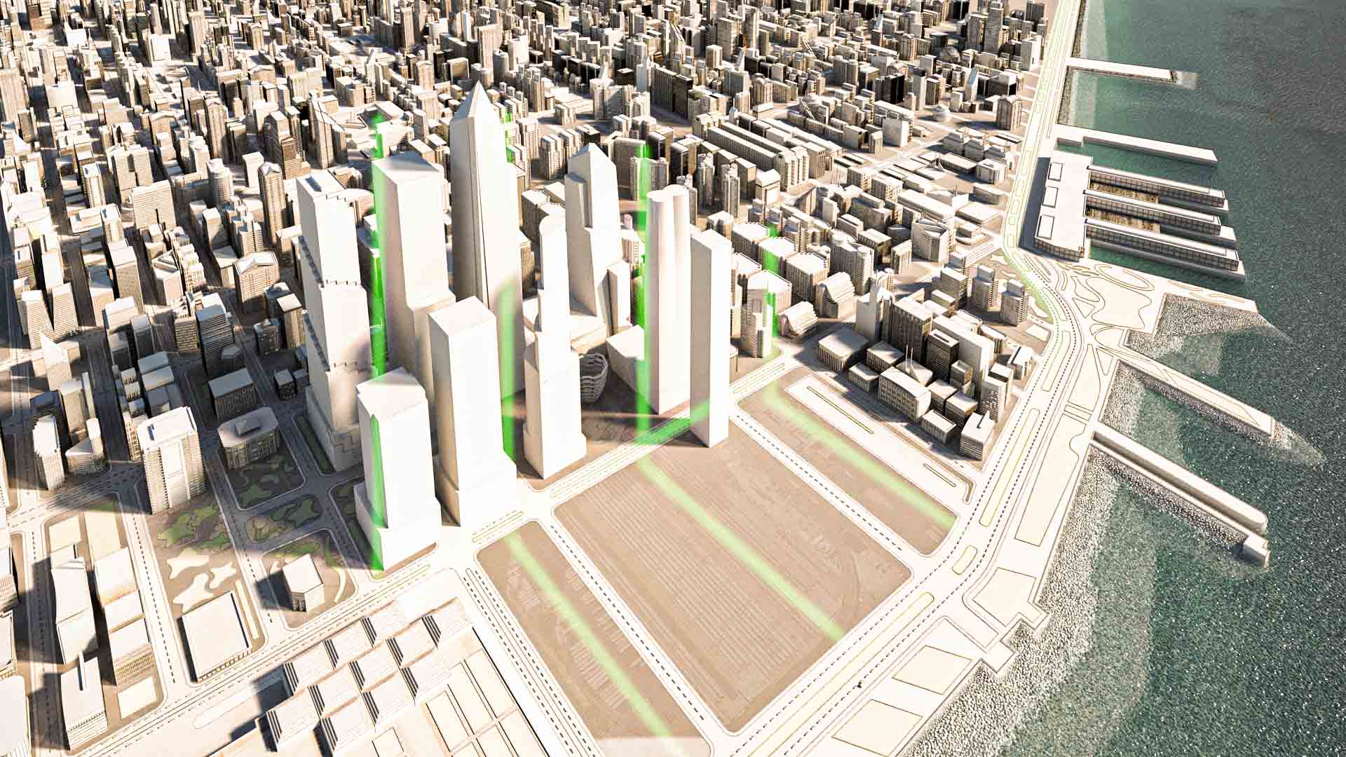
Hi Stefan, great to see a different take, an aerial view, on one of your entries. In terms of feedback, I think for the composition you could give a bit more room for the eye, by extending your scene a bit outward towards Hudson River. Right now your subject (project site) is boxed at the center, which kind of gives an impression of how crowded and surrounded the neighbourhood is.
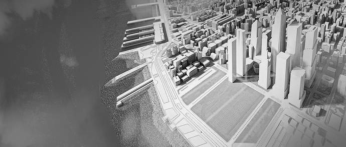
Another thing I could think of that you could play to your advantage is aspect ratio. Right now my guess to your ratio is 1:85:1 ? Try a wider one like 2.35:1 and see how it goes. In general for landscape paintings/shots, a wider aspect ratio naturally guides the audience’s focus to span from Point A to Point B, especially when your landscape plays a primary narrative role.
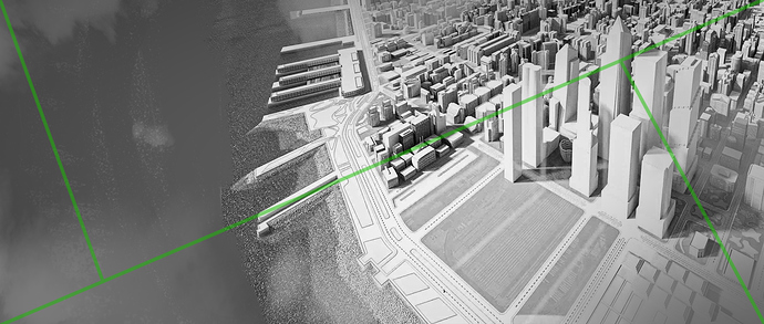
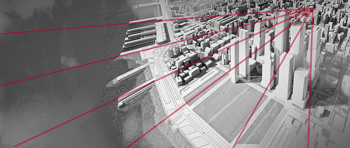
I’ve quickly done a paint over below in 2.35:1 for your reference, which shows the general composition (green lines) and how the attention sweeps across the painting and converses into one single point (red lines). Also, you can frame your subject with elements like clouds, to further limit the audience’s attention from wandering away.


