Meliora #4, work in progress update by Stefan Dimitrov

Originally published at: https://www.ronenbekerman.com/?p=128166

Hello,

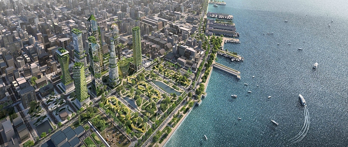
During the past few days I have spent a lot of hours figuring out how to make the transition of the greenery from the ground to the skyscrapers smoothly.
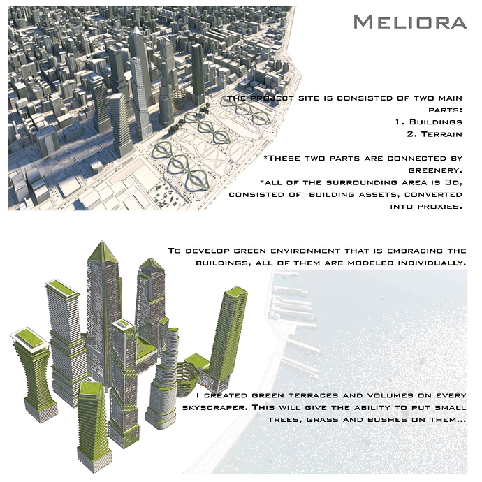
I begun remodeling the basic geometry volumes that was provided for us in the starting pack. I followed some of the following methods during the process. Each skyscraper was remodeled and has gained green surfaces where grass, bushes and small trees are going to be placed. The average depth of the surfaces is around 3-4 metres, with slabs around 1 meter. My research regarding other buildings that are already built in that way showed that this is enough for the greenery. I kept the original silhouette of the skyscrapers, their height and size. By connecting and chamfering the edges I created the elevations with the slabs and the glazing.

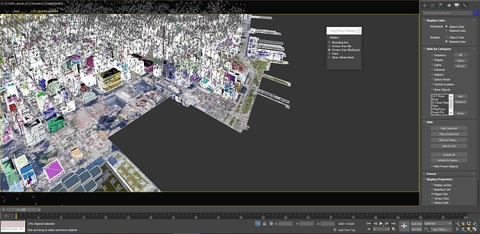
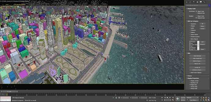
The background is completely created in 3D, using several clusters of building assets. I converted the surrounding building into proxies in advance to save memory and to make the process faster during the time.

When I was ready with the geometry of the buildings, the terrain and the surrounding area i begun testing the best appropriate lightning for this aerial view. I will aim to choose the one that is not throwing shadows on the park development infront of the skyscrapers. It is one of the leading elements of this project.

Thank you for taking your time. I hope that soon will be able to post updates on the other two images for the project.

Bests,

Stefan

1 Like

Very interesting! Gooooooooood job. I love so much the aerial view. May I ask wwhat plugin did you use to scatter buildings? And I would know if you are going to use forest pack for greenery or not.
Thanks

1 Like

Hello Flow,

Thank you for the feedback.
The buildings are scattered by hand. It took me around 16 hours to place the buildings.
Here is the process: I created 7-8 clusters of modeled surrounding low-poly buildings. After that, I spread the proxies along the map according to the sketch-up massing that was provided in the beginning. The massing consists of around 80 repetitive buildings. The total amount is around 1800. To create variety I rotated and scaled them at random. No plugin used for that. (see attached images)

For the large green areas I will use forest pack, yes. For some detailed development I will place the objects by hand for more precisious result.

I hope that this make sense.

Best,

Stefan

1 Like

Wow… thats such a massive view . How big is the file ? Will you blur the neighboring buildings or will they be textured and detailed?

Really looking forward to the final render. Amazing view

1 Like

wonderfull effort man ! great to see it goes in such a nice way ! but a side question whats the specs of ur machine ?

1 Like

Hello Tomahawks619,

Thank you for the questions.
The file size now is around 260.500 KB. To optimize the process, I converted many of the objects into proxies. This reduced the file size too.

I am still testing this view with the surrounding. I want to make the project site to stand out infront of the neighboring buildings. I will make some more tests and will decide for the next update.

Thank you for the kind words.

Have a great day,

Stefan

Hello Muhammed,

The system specifications of my computer are: 2 processors Intel R Xeon R CPU E5-2670, 2.60 GHz, 96.0 GB RAM, Nvidia quadro K200.
I am an architect, not a computer specialist, so I hope that this is enough for your question :smile: is is all I know about the components of my machine.

Best,

Stefan

fair enough Stefan, am an architect too but we need always to optimize our scenes u know, as am using a laptop :smiley: am suffering, anyways lets see how it goes ! but overall ur work is always amazing, well done man !

I like the way you presented your project as well as the concept. It slightly reminds me shots from movies and videogames about extinction of humanity, where buildings are taken by greenery :smile:
Actually I recall two references that I bookmarked on Archdaily, maybe you’ll find them helpful. I like them because of sharp shadows, high sun and just a bit of haziness.
I really admire you for the scale of the project. :sunglasses:
I’m looking forward to seeing updates from you.


2 Likes

Hello BohdanP,

Thank you for the feedback!

I have just revised the references that you have sent. They are really helpful. I will take them into consideration while choosing the most appropriate mood for this image.

Have a great day,

Stefan

Hello,

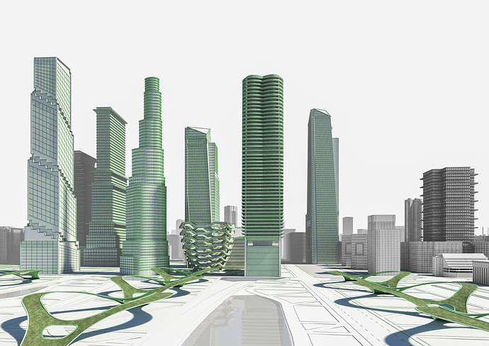
I have just managed to render a clay preview for the second image of the project. I have applied VrayEdgesTex diffuse map to make the main volumes stand out. The main reason to create this semi-aerial proposal is to illustrate the balanced silhouette that Hudson Yards volumes own.

All of the buildings are remodeled completely, holding on to my concept of green development of the site. The original shapes of the main volumes were preserved.
Illustrating the project site from a large distance can show how the updates that we make corresponds to the context.

Stefan

2 Likes

How are you modeling all of these so fast ? :open_mouth:

Looks great, I guess you are going to add all the railings and detailing next ? Can I suggest adding the trees right away . It will fill up the image a lot and might reduce the amount of building and geometry you might be seeing which could save your time .

Hello Tomahawks619,

Thank you for your feedback.

Regarding the buildings - yes. All of them are remodeled according to my concept. I have to create surfaces for the greenery to be placed on.
It is not as much work as it seems. Using ring and loop, connect, inset and extrude into the editable poly menu makes the work much easier.
I agree with you about the trees. They will be added later and will make the composition much more balanced. Thank you once again.

Bests,

Stefan

Hi Stefan,
I’m very curious to see your final result. In the last image you posted see that buildings are unbalanced toward left (so they are in reality) and the central building seem to be not exactly in the centre of the image. Maybe that will not be your final camera angle but I suggest to search symmetry or, if you don’t want to do that, move left away from the centre. You have symmetric rails so I think that a central perspective could be interesting but in that case I would put the central building exactly in the centre.
Only my two cent… : )

Hello Flow,

Thank you for your feedback reagarding the image.
It is always very useful to read another oppinion. I will take in consideration your thoughts and will make some more tests.

Thank you.

Best,

Stefan

Hello,

This is my proposal for the third view of Meliora.
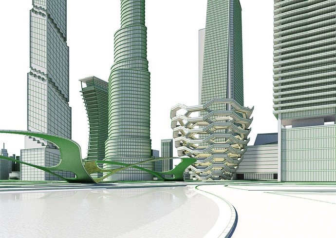
The aim is to show the ground floor level of the project site. In this image is going to be shown how the pedestrian aproach is being developed to the core of Hudson Yards - The Vessel and the skyscrapers.
The “Leaf” structures are a part of my project concept. They are modeled in order to look like leafs, on top of which is going to be placed different kinds of greenery. The connection between the park and the skyscrapers is going to be illustrated by the smooth transition of trees and bushes upwards the buildings.

All of the three images are going to be rendered in a similar way to create one complete pack of visualizations.

Meliora is going to represent one possible alteration of Hudson Yards. The development is closely connected with the people. The need of greener spaces and healthy environment are going to be priorities in architecture in the near future.

I hope all of this is clear and makes sense.

Have a great day!

Stefan

1 Like

Hi Stefan, I like this camera angle so much. It is very well balanced. I think it could became very very interesting with textures. What material are the lower part of the leafs made of? I think that a reflective metal could be interesting in term to reflect caustics from water all around. Is this your proposal?

Hi Flow,

Thank you for your feedback regarding this view.
The lower part of the leaves are covered in metal, yes. I will make different tests of lighting and mood options. I will update this post as soon as I can.

Best,

Stefan

1 Like

Hello everyone,

I have just managed to update my first image for the competition, the aerial view.
The aim is to show how the project site corresponds with the surrounding area of the city.

You can zoom for details.

Looking forward for your thoughts.

Best,

Stefan

5 Likes

Nice Image, i suggest to reduce the noise map on the river, and work more on the sun and sky reflection on the water.