New Yards 2040 Final Images

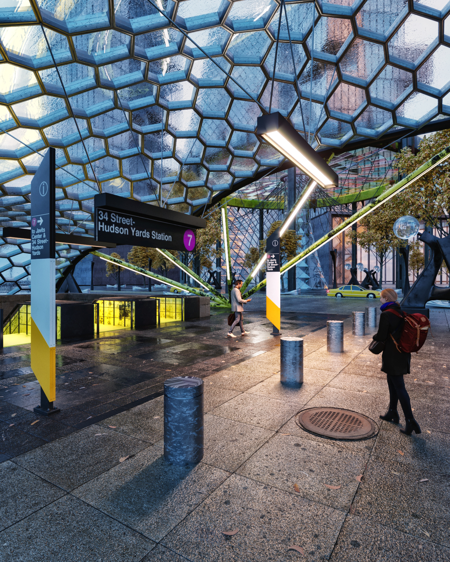
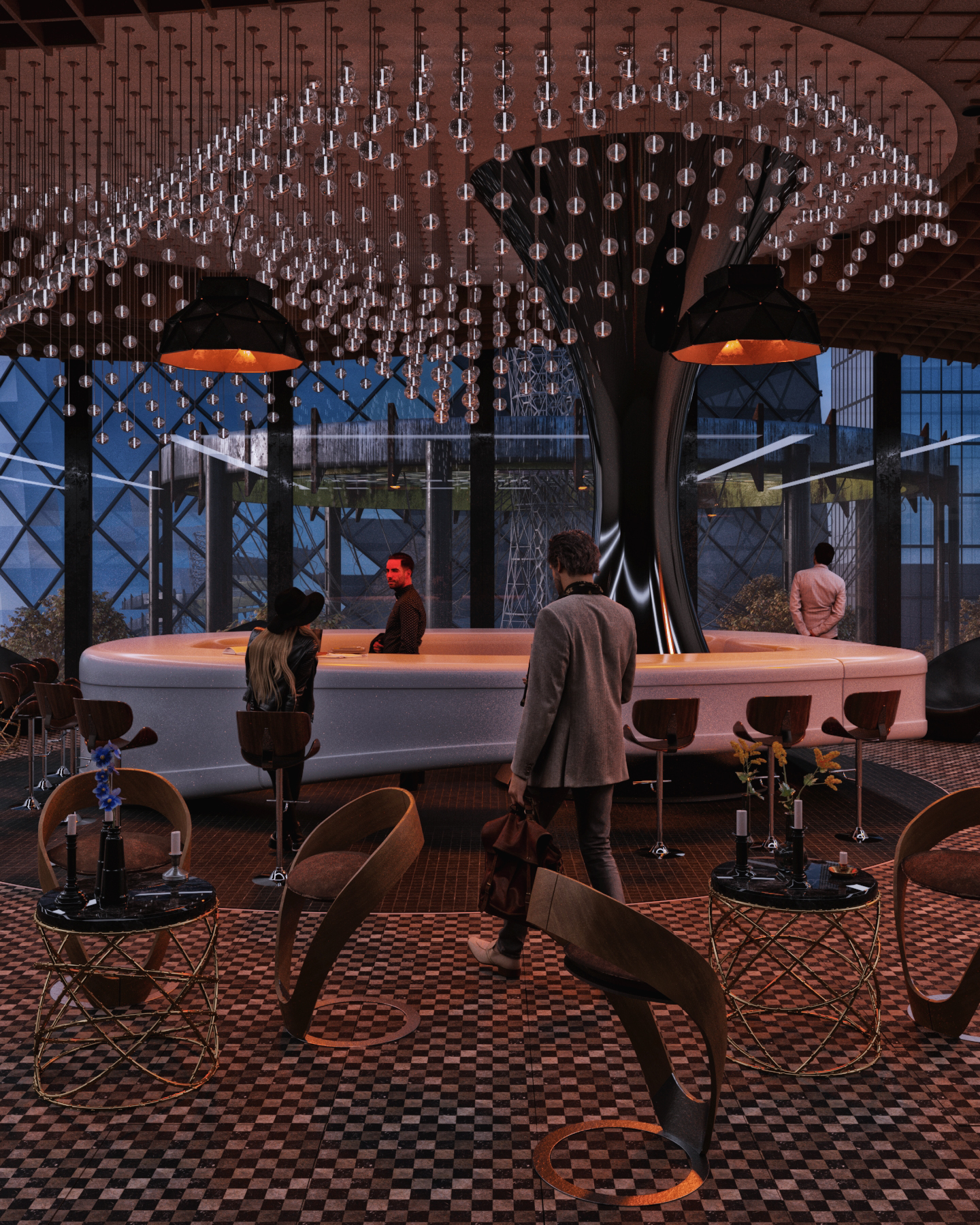
Here is my final images for the competition . I stuck with the narrative of having 3 images from 3 different type of people at the city.

1, Tourist (Instagram View)
2. Commuter (coming to the vessel view)
3. Local coming after work overlooking the vessel view

The structure *vessel is a replica of the 1967 worlds fair structure in Queens. Since so many things are being re imagined and re produced, I thought of using this competition to re imagine having the “new vessel” be a structure which already exist in Queens and honor it for the 75th anniversary (2040).

**PS the entire competition was a way for me to learn Corona since I have always used VRay and it was a pleasant experience while doing this competition.

Hope you guys like the final images, they are fairly moody.

1 Like

@tomahawks619 That’s a very early submission, glad that you are able to wrap up all your shots, congrats!

However, I do have one question in mind: does your screen has an excessive blue tint? Because I notice that the red color in your images such as the bar ambience light and the skin tone are quite exaggerated. So logically I was thinking you had to go heavy-handed on the red to compensate for the blue tint on your screen.

Try to look into that, or even better try to view your images on different screens. Take the remaining week as a buffer (glad you have that) to prioritize fixing this issue. It is affecting your cutout integration especially in the 3rd one. Your lovely bartender turned into Hellboy, holy smoke.

Yea post it here again once you have looked into the color issue, we have a community of artists to check it for you. :wink:

Cheers,

Tony

Great visuals like the top one with rain on roof. I have to agree about the reds in the bottom image. especially on the guys face, there doesnt seem to be any red lights shining on him to create such a red intensity. Like the angle on the top one makes it look really dinamic and helps with the idea of transport in a way.