Originally published at: https://www.ronenbekerman.com/?p=127799
Hi everybody
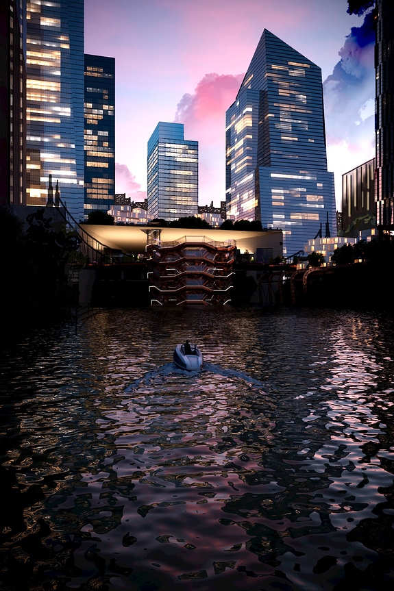
I decided to follow your suggestion and revise my first image’s composition (thanks so much to you all).
I wish I give more breath to the view so I streched up the size.
There’s much more work to do specially in modeling and texturing but I just wanted to be sure that I was on the right way.
So i exported a quick render and decided to paint over the image in PS to have a clear idea in mind.
then I had a look at the desaturated image to have an overview of lighting.
I know it could be better…but I haven’t a graphic table yet (should arrive soon) so I did all the work with a mouse…please have mercy on me.
On the other hand…It’s only a work in progress : )

